I would recommend Hanley’s & McNeil’s 1982 paper ‘The meaning and use of the area under a receiver operating characteristic (ROC) curve’.
Example
They have the following table of disease status and test result (corresponding to, for example, the estimated risk from a logistic model). The first number on the right is the number of patients with true disease status ‘normal’ and the second number is the number of patients with true disease status ‘abnormal’:
(1) Definitely normal: 33/3
(2) Probably normal: 6/2
(3) Questionable: 6/2
(4) Probably abnormal: 11/11
(5) Definitely abnormal: 2/33
So there are in total 58 ‘normal’ patients and ‘51’ abnormal ones. We see that when the predictor is 1, ‘Definitely normal’, the patient is usually normal (true for 33 of the 36 patients), and when it is 5, ‘Definitely abnormal’ the patients is usually abnormal (true for 33 of the 35 patients), so the predictor makes sense. But how should we judge a patient with a score of 2, 3, or 4? What we set our cutoff for judging a patients as abnormal or normal to determines the sensitivity and specificity of the resulting test.
Sensitivity and specificity
We can calculate the estimated sensitivity and specificity for different cutoffs. (I’ll just write ‘sensitivity’ and ‘specificity’ from now on, letting the estimated nature of the values be implicit.)
If we choose our cutoff so that we classify all the patients as abnormal, no matter what their test results says (i.e., we choose the cutoff 1+), we will get a sensitivity of 51/51 = 1. The specificity will be 0/58 = 0. Doesn’t sound so good.
OK, so let’s choose a less strict cutoff. We only classify patients as abnormal if they have a test result of 2 or higher. We then miss 3 abnormal patients, and have a sensitivity of 48/51 = 0.94. But we have a much increased specificity, of 33/58 = 0.57.
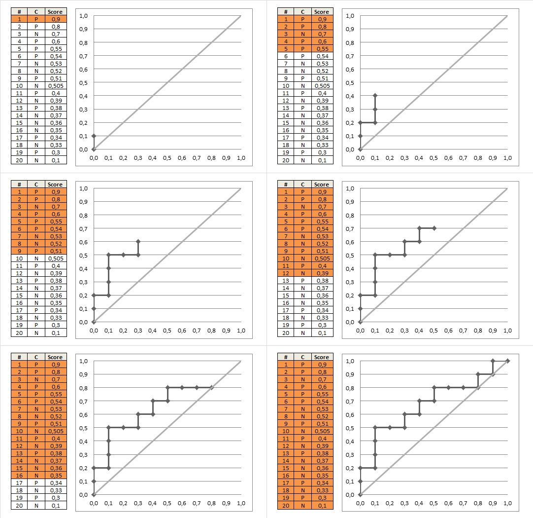
We can now continue this, choosing various cutoffs (3, 4, 5, >5). (In the last case, we won’t classify any patients as abnormal, even if they have the highest possible test score of 5.)
The ROC curve
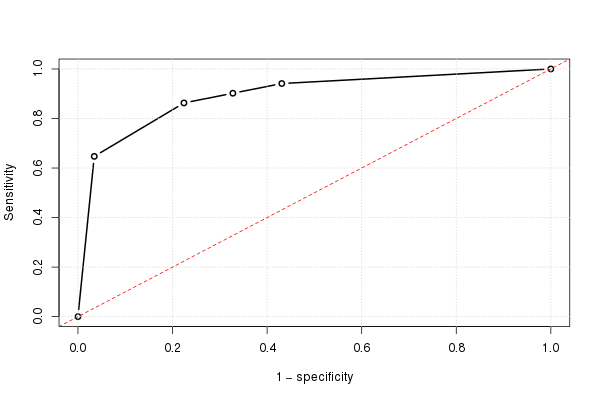
If we do this for all possible cutoffs, and the plot the sensitivity against 1 minus the specificity, we get the ROC curve. We can use the following R code:
# Data
norm     = rep(1:5, times=c(33,6,6,11,2))
abnorm   = rep(1:5, times=c(3,2,2,11,33))
testres  = c(abnorm,norm)
truestat = c(rep(1,length(abnorm)), rep(0,length(norm)))

# Summary table (Table I in the paper)
( tab=as.matrix(table(truestat, testres)) )
The output is:
        testres
truestat  1  2  3  4  5
       0 33  6  6 11  2
       1  3  2  2 11 33
We can calculate various statistics:
( tot=colSums(tab) )                            # Number of patients w/ each test result
( truepos=unname(rev(cumsum(rev(tab[2,])))) )   # Number of true positives
( falsepos=unname(rev(cumsum(rev(tab[1,])))) )  # Number of false positives
( totpos=sum(tab[2,]) )                         # The total number of positives (one number)
( totneg=sum(tab[1,]) )                         # The total number of negatives (one number)
(sens=truepos/totpos)                           # Sensitivity (fraction true positives)
(omspec=falsepos/totneg)                        # 1 − specificity (false positives)
sens=c(sens,0); omspec=c(omspec,0)              # Numbers when we classify all as normal
And using this, we can plot the (estimated) ROC curve:
plot(omspec, sens, type="b", xlim=c(0,1), ylim=c(0,1), lwd=2,
     xlab="1 − specificity", ylab="Sensitivity") # perhaps with xaxs="i"
grid()
abline(0,1, col="red", lty=2)

Manually calculating the AUC
We can very easily calculate the area under the ROC curve, using the formula for the area of a trapezoid:
height = (sens[-1]+sens[-length(sens)])/2
width = -diff(omspec) # = diff(rev(omspec))
sum(height*width)
The result is 0.8931711.
A concordance measure
The AUC can also be seen as a concordance measure. If we take all possible pairs of patients where one is normal and the other is abnormal, we can calculate how frequently it’s the abnormal one that has the highest (most ‘abnormal-looking’) test result (if they have the same value, we count that this as ‘half a victory’):
o = outer(abnorm, norm, "-")
mean((o>0) + .5*(o==0))
The answer is again 0.8931711, the area under the ROC curve. This will always be the case.
A graphical view of concordance
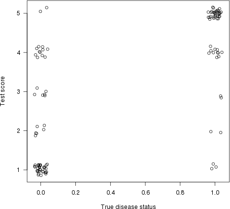
As pointed out by Harrell in his answer, this also has a graphical interpretation. Let’s plot test score (risk estimate) on the y-axis and true disease status on the x-axis (here with some jittering, to show overlapping points):
plot(jitter(truestat,.2), jitter(testres,.8), las=1,
     xlab="True disease status", ylab="Test score")

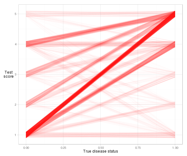
Let us now draw a line between each point on the left (a ‘normal’ patient) and each point on the right (an ‘abnormal’ patient). The proportion of lines with a positive slope (i.e., the proportion of concordant pairs) is the concordance index (flat lines count as ‘50% concordance’).
It’s a bit difficult to visualise the actual lines for this example, due to the number of ties (equal risk score), but with some jittering and transparency we can get a reasonable plot:
d = cbind(x_norm=0, x_abnorm=1, expand.grid(y_norm=norm, y_abnorm=abnorm))
library(ggplot2)
ggplot(d, aes(x=x_norm, xend=x_abnorm, y=y_norm, yend=y_abnorm)) +
  geom_segment(colour="#ff000006",
               position=position_jitter(width=0, height=.1)) +
  xlab("True disease status") + ylab("Test\nscore") +
  theme_light()  + theme(axis.title.y=element_text(angle=0))

We see that most of the lines slope upwards, so the concordance index will be high. We also see the contribution to the index from each type of observation pair. Most of it comes from normal patients with a risk score of 1 paired with abnormal patients with a risk score of 5 (1–5 pairs), but quite a lot also comes from 1–4 pairs and 4–5 pairs. And it’s very easy to calculate the actual concordance index based on the slope definition:
d = transform(d, slope=(y_norm-y_abnorm)/(x_norm-x_abnorm))
mean((d$slope > 0) + .5*(d$slope==0))
The answer is again 0.8931711, i.e., the AUC.
The Wilcoxon–Mann–Whitney test
There is a close connection between the concordance measure and the Wilcoxon–Mann–Whitney test. Actually, the latter tests if the probability of concordance (i.e., that it’s the abnormal patient in a random normal–abnormal pair that will have the most ‘abnormal-looking’ test result) is exactly 0.5. And its test statistic is just a simple transformation of the estimated concordance probability:
> ( wi = wilcox.test(abnorm,norm) )
    Wilcoxon rank sum test with continuity correction

data:  abnorm and norm
W = 2642, p-value = 1.944e-13
alternative hypothesis: true location shift is not equal to 0
The test statistic (W = 2642) counts the number of concordant pairs. If we divide it by the number of possible pairs, we get a familar number:
w = wi$statistic
w/(length(abnorm)*length(norm))
Yes, it’s 0.8931711, the area under the ROC curve.
Easier ways to calculate the AUC (in R)
But let’s make life easier for ourselves. There are various packages that calculate the AUC for us automatically.
The Epi package
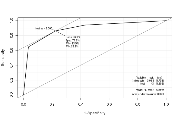
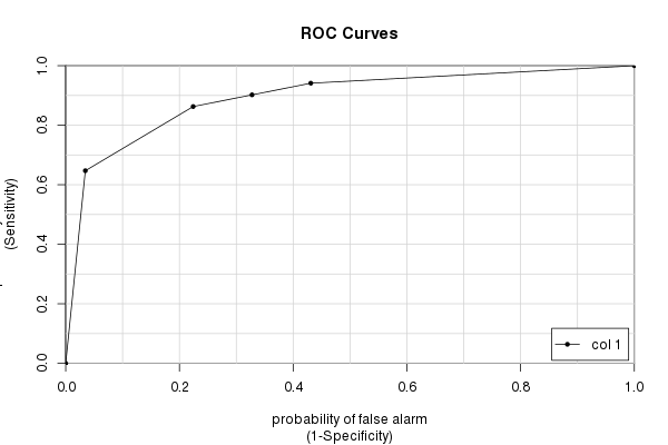
The Epi package creates a nice ROC curve with various statistics (including the AUC) embedded:
library(Epi)
ROC(testres, truestat) # also try adding plot="sp"

The pROC package
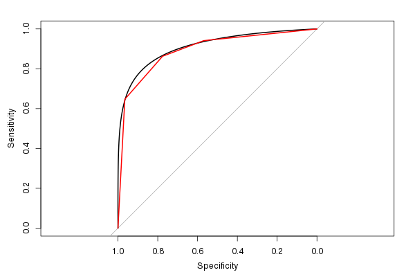
I also like the pROC package, since it can smooth the ROC estimate (and calculate an AUC estimate based on the smoothed ROC):

(The red line is the original ROC, and the black line is the smoothed ROC. Also note the default 1:1 aspect ratio. It makes sense to use this, since both the sensitivity and specificity has a 0–1 range.)
The estimated AUC from the smoothed ROC is 0.9107, similar to, but slightly larger than, the AUC from the unsmoothed ROC (if you look at the figure, you can easily see why it’s larger). (Though we really have too few possible distinct test result values to calculate a smooth AUC).
The rms package
Harrell’s rms package can calculate various related concordance statistics using the rcorr.cens() function. The C Index in its output is the AUC:
> library(rms)
> rcorr.cens(testres,truestat)[1]
  C Index
0.8931711
The caTools package
Finally, we have the caTools package and its colAUC() function. It has a few advantages over other packages (mainly speed and the ability to work with multi-dimensional data – see ?colAUC) that can sometimes be helpful. But of course it gives the same answer as we have calculated over and over:
library(caTools)
colAUC(testres, truestat, plotROC=TRUE)
             [,1]
0 vs. 1 0.8931711

Final words
Many people seem to think that the AUC tells us how ‘good’ a test is. And some people think that the AUC is the probability that the test will correctly classify a patient. It is not. As you can see from the above example and calculations, the AUC tells us something about a family of tests, one test for each possible cutoff.
And the AUC is calculated based on cutoffs one would never use in practice. Why should we care about the sensitivity and specificity of ‘nonsensical’ cutoff values? Still, that’s what the AUC is (partially) based on. (Of course, if the AUC is very close to 1, almost every possible test will have great discriminatory power, and we would all be very happy.)
The ‘random normal–abnormal’ pair interpretation of the AUC is nice (and can be extended, for instance to survival models, where we see if its the person with the highest (relative) hazard that dies the earliest). But one would never use it in practice. It’s a rare case where one knows one has one healthy and one ill person, doesn’t know which person is the ill one, and must decide which of them to treat. (In any case, the decision is easy; treat the one with the highest estimated risk.)
So I think studying the actual ROC curve will be more useful than just looking at the AUC summary measure. And if you use the ROC together with (estimates of the) costs of false positives and false negatives, along with base rates of what you’re studying, you can get somewhere.
Also note that the AUC only measures discrimination, not calibration. That is, it measures whether you can discriminate between two persons (one ill and one healthy), based on the risk score. For this, it only looks at relative risk values (or ranks, if you will, cf. the Wilcoxon–Mann–Whitney test interpretation), not the absolute ones, which you should be interested in. For example, if you divide each risk estimate from your logistic model by 2, you will get exactly the same AUC (and ROC).
When evaluating a risk model, calibration is also very important. To examine this, you will look at all patients with a risk score of around, e.g., 0.7, and see if approximately 70% of these actually were ill. Do this for each possible risk score (possibly using some sort of smoothing / local regression). Plot the results, and you’ll get a graphical measure of calibration.
If have a model with both good calibration and good discrimination, then you start to have good model. :)

