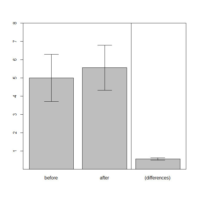
It isn't "wrong" necessarily, and it isn't "completely uninformative". But it provides information that pertains to a largely unrelated question, and so is likely to be misleading. When you run a paired samples $t$-test, you are really conducting a one-sample $t$-test of whether the mean of the differences is equal to $0$. Because this is a one-sample test, a corresponding figure would have one bar showing the mean difference (with error bars).
To see how this could be misleading, consider these data (coded with R):
set.seed(4868)  # this makes the example exactly reproducible (if you use R)
b = c(2, 4, 6, 8)
a = b + rnorm(4, mean=.5, sd=.1)
a = round(a, digits=3)
d = data.frame(before=b, after=a, differences=a-b)
d
#   before after differences
# 1      2 2.679       0.679
# 2      4 4.597       0.597
# 3      6 6.592       0.592
# 4      8 8.366       0.366
t.test(a, b, paired=T)
#  Paired t-test
#
# data:  a and b
# t = 8.3117, df = 3, p-value = 0.003649
# alternative hypothesis: true difference in means is not equal to 0
# 95 percent confidence interval:
#   0.3446575 0.7723425
# sample estimates:
# mean of the differences
#                  0.5585
The $t$-test is highly significant. However, what impression would people get if you plotted the bars on the left vs. the bar on the right?

