deleted 1 character in body
Source Link
Flounderer
  • 10.9k
  • 1
  • 39
  • 47

It is true that a qq plot from a multi modelmultimodal distribution would look like this (with bumps), but assuming that none of the points in the picture are on top of each other, you only have 29 data points. The data could easily be normally distributed and yet have a qq plot that looks just like this. To check, you can simulate data sets of size 30 from a normal distribution and make qq plots of them.

Here are 16 which I made with the commands

for (i in 1L:16){x<-rnorm(30);qqnorm(x);abline(0,1)}

enter image description here

By coincidence, in this case the bottom left hand plot looks very much like yours!

It is true that a qq plot from a multi model distribution would look like this (with bumps), but assuming that none of the points in the picture are on top of each other, you only have 29 data points. The data could easily be normally distributed and yet have a qq plot that looks just like this. To check, you can simulate data sets of size 30 from a normal distribution and make qq plots of them.

Here are 16 which I made with the commands

for (i in 1L:16){x<-rnorm(30);qqnorm(x);abline(0,1)}

enter image description here

By coincidence, in this case the bottom left hand plot looks very much like yours!
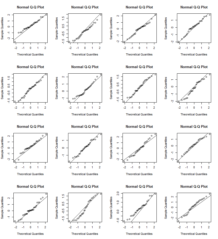
It is true that a qq plot from a multimodal distribution would look like this (with bumps), but assuming that none of the points in the picture are on top of each other, you only have 29 data points. The data could easily be normally distributed and yet have a qq plot that looks just like this. To check, you can simulate data sets of size 30 from a normal distribution and make qq plots of them.

Here are 16 which I made with the commands

for (i in 1L:16){x<-rnorm(30);qqnorm(x);abline(0,1)}

enter image description here

By coincidence, in this case the bottom left hand plot looks very much like yours!

Source Link
Flounderer
  • 10.9k
  • 1
  • 39
  • 47

It is true that a qq plot from a multi model distribution would look like this (with bumps), but assuming that none of the points in the picture are on top of each other, you only have 29 data points. The data could easily be normally distributed and yet have a qq plot that looks just like this. To check, you can simulate data sets of size 30 from a normal distribution and make qq plots of them.

Here are 16 which I made with the commands

for (i in 1L:16){x<-rnorm(30);qqnorm(x);abline(0,1)}

enter image description here

By coincidence, in this case the bottom left hand plot looks very much like yours!