Tweeted twitter.com/StackStats/status/1256644637055385600
Updated to include figures and example data
Source Link
TJC
  • 95
  • 1
  • 6

[EDITED 28/04/2020]

I have included an example of how my data is structured below:

    Row      id      Method             Time      Outcome
-------------------------------------------------------------
    1       122    Method A                9    10.374115
    2       122    Method A               11    10.321619
    3       122    Method A               26    12.061685
    4       122    Method A               34    12.642345
    5       122    Method A               44    13.665468
    6       122    Method A               51    14.151617
    7       122    Method A               56    14.324933
    8       122    Method A               63    15.175470
    9       122    Method A               74    15.332778
    10      122    Method A               84    15.979175
    11      122    Method A              106    16.479397
    12      122    Method B                9     5.407808
    13      122    Method B               11     5.344450
    14      122    Method B               26     7.155621
    15      122    Method B               34     7.759154
    16      122    Method B               44     8.814453
    17      122    Method B               51     9.313105
    18      122    Method B               56     9.493768
    19      122    Method B               63    10.388376
    20      122    Method B               74    10.538343
    21      122    Method B               84    11.208679
    22      122    Method B              106    11.697866
    23      137    Method A                8    10.000000
    24      137    Method A               15    10.252286
    25      137    Method A               22    10.371262
    26      137    Method A               33    11.217497
    27      137    Method A               33    10.965507
    28      137    Method A               44    12.191451
    29      137    Method A               55    11.824798
    30      137    Method A               66    12.892554
    31      137    Method A               84    15.038724
    32      137    Method A               97    15.230533
    33      137    Method A              115    17.052102
    34      137    Method A              140    16.755750
    35      137    Method A              156    17.318535
    36      137    Method B                8     5.000000
    37      137    Method B               15     5.229901
    38      137    Method B               22     5.338714
    39      137    Method B               33     6.120323
    40      137    Method B               33     5.889458
    41      137    Method B               44     7.036846
    42      137    Method B               55     6.699954
    43      137    Method B               66     7.703832
    44      137    Method B               84     9.761504
    45      137    Method B               97     9.975060
    46      137    Method B              115    11.677906
    47      137    Method B              140    11.437684
    48      137    Method B              156    11.973593
 

There are a total of 40 subjects, with each subject having Outcome measured by Method A and Method B at identical points in time.

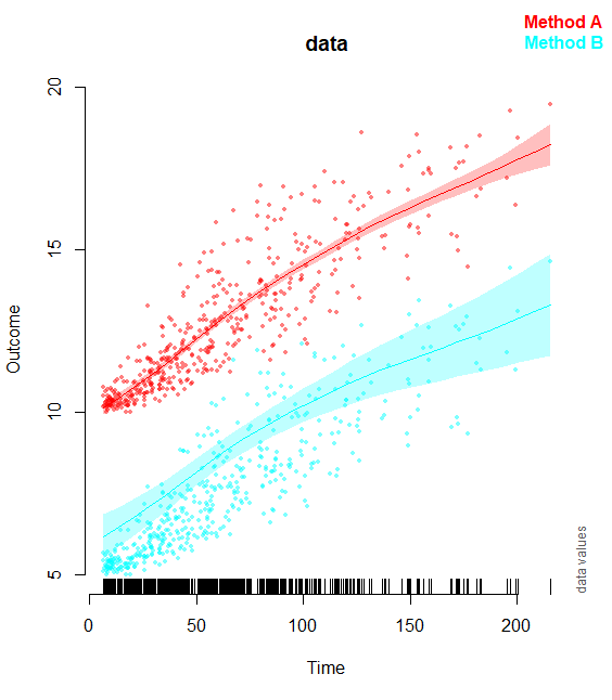
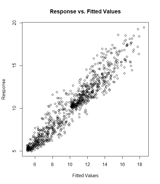
I get a reasonable fit to the data if I do not include ANY random effect terms in my GAM. This model has the form of:

mdl1 <- gam(Outcome ~ Method + s(Time) + s(Time, by=Method), data=foo, method=REML)

The Response-v-Fitted values and the overall trend plots look like this for mdl1:
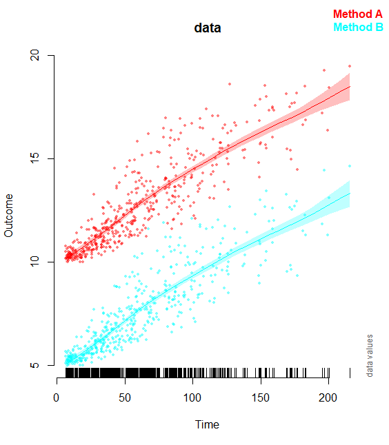
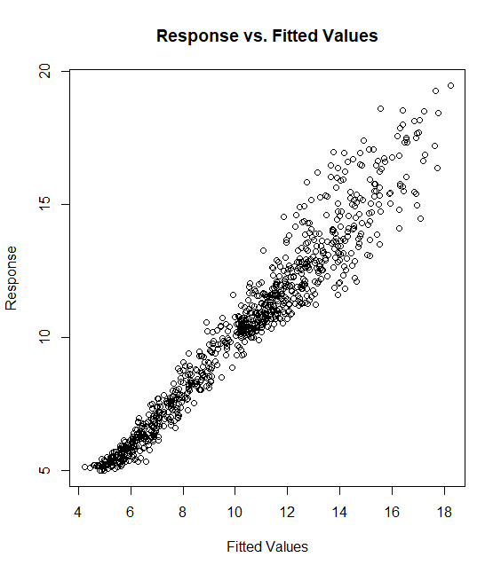
However, when I try the model suggested by @gavin I get this strange offset where the smooth looks like it follows the data well for Method A, but is for some reason displaced higher up the y-axis for Method B. This model takes the formula of:

mdl2 <- gam(Outcome ~ Method + s(Time) + s(Time, by=Method, m=1) + s(Time, id, bs='fs', by=Method), data=foo, method=REML)

The Fitted v Response and trend plots for this model look like this:

After trying various forms of random effects (s(id,bs='re'),s(Time,id,bs='re'), etc.) I get similar results, where the overall fixed effect trend seems to take on a reasonable shape, but is offset vertically from the observed data by variable amounts.

Perhaps it is something to do with how my data is coded? Something related to the fact that the two levels of Method (A and B) are observed twice within a given subject?

[EDITED 28/04/2020]

I have included an example of how my data is structured below:

    Row      id      Method             Time      Outcome
-------------------------------------------------------------
    1       122    Method A                9    10.374115
    2       122    Method A               11    10.321619
    3       122    Method A               26    12.061685
    4       122    Method A               34    12.642345
    5       122    Method A               44    13.665468
    6       122    Method A               51    14.151617
    7       122    Method A               56    14.324933
    8       122    Method A               63    15.175470
    9       122    Method A               74    15.332778
    10      122    Method A               84    15.979175
    11      122    Method A              106    16.479397
    12      122    Method B                9     5.407808
    13      122    Method B               11     5.344450
    14      122    Method B               26     7.155621
    15      122    Method B               34     7.759154
    16      122    Method B               44     8.814453
    17      122    Method B               51     9.313105
    18      122    Method B               56     9.493768
    19      122    Method B               63    10.388376
    20      122    Method B               74    10.538343
    21      122    Method B               84    11.208679
    22      122    Method B              106    11.697866
    23      137    Method A                8    10.000000
    24      137    Method A               15    10.252286
    25      137    Method A               22    10.371262
    26      137    Method A               33    11.217497
    27      137    Method A               33    10.965507
    28      137    Method A               44    12.191451
    29      137    Method A               55    11.824798
    30      137    Method A               66    12.892554
    31      137    Method A               84    15.038724
    32      137    Method A               97    15.230533
    33      137    Method A              115    17.052102
    34      137    Method A              140    16.755750
    35      137    Method A              156    17.318535
    36      137    Method B                8     5.000000
    37      137    Method B               15     5.229901
    38      137    Method B               22     5.338714
    39      137    Method B               33     6.120323
    40      137    Method B               33     5.889458
    41      137    Method B               44     7.036846
    42      137    Method B               55     6.699954
    43      137    Method B               66     7.703832
    44      137    Method B               84     9.761504
    45      137    Method B               97     9.975060
    46      137    Method B              115    11.677906
    47      137    Method B              140    11.437684
    48      137    Method B              156    11.973593
 

There are a total of 40 subjects, with each subject having Outcome measured by Method A and Method B at identical points in time.

I get a reasonable fit to the data if I do not include ANY random effect terms in my GAM. This model has the form of:

mdl1 <- gam(Outcome ~ Method + s(Time) + s(Time, by=Method), data=foo, method=REML)

The Response-v-Fitted values and the overall trend plots look like this for mdl1:
However, when I try the model suggested by @gavin I get this strange offset where the smooth looks like it follows the data well for Method A, but is for some reason displaced higher up the y-axis for Method B. This model takes the formula of:

mdl2 <- gam(Outcome ~ Method + s(Time) + s(Time, by=Method, m=1) + s(Time, id, bs='fs', by=Method), data=foo, method=REML)

The Fitted v Response and trend plots for this model look like this:
After trying various forms of random effects (s(id,bs='re'),s(Time,id,bs='re'), etc.) I get similar results, where the overall fixed effect trend seems to take on a reasonable shape, but is offset vertically from the observed data by variable amounts.

Perhaps it is something to do with how my data is coded? Something related to the fact that the two levels of Method (A and B) are observed twice within a given subject?

Source Link
TJC
  • 95
  • 1
  • 6

How do I correctly specify a GAMM formula to model interactions of random and fixed effects?

I am hoping for advice on how best to specific a GAMM (mgcv) that specifies random smooths for each subject at separate levels of a repeated measures factor.

My dataset includes the following variables:

  1. id - subject id factor
  2. Time - continuous covariate with repeated observations within each subject (0, 1, 2, 3 mins, etc.)
  3. Method - factor variable denoting which method was used to produce the Outcome variable. This factor is repeated within a subject. The two levels of this variable is "old" and "new" (coded as 0 and 1).
  4. Outcome - continuous covariate of a physiological variable (e.g., blood pressure) determined by either the "new" or "old" method.

I have tried fitting the following GAMM to the data:

mdl <- gam(Outcome ~ Method + ti(Time) + ti(Time, by=Method) + s(id, Time, bs = 'fs')

However, the fitted response is a little absurd and does not describe the general nonlinear trend in data (e.g., fitted response is . I figure that part of this issue is because I am not correctly specifying that the random smooths should be fit to each level of Method within each subject. I do not know what syntax to use to achieve this goal - does anyone have any suggestions/advice?

Thanks in advance!