2
$\begingroup$

I applied applied ARIMA to my time series data (24 hours of a day) which is this:

Sdate               Speed
2012-12-11 00:00:00 0.823237  
2012-12-11 01:00:00 0.633637  
2012-12-11 02:00:00 1.10858  
2012-12-11 03:00:00 1.30435  
2012-12-11 04:00:00 1.35649  
2012-12-11 05:00:00 0.998616  
2012-12-11 06:00:00 0.742183  
2012-12-11 07:00:00 -0.966582  
2012-12-11 08:00:00 -2.12219  
2012-12-11 09:00:00 -1.31213  
2012-12-11 10:00:00 -0.401101  
2012-12-11 11:00:00 -0.220982  
2012-12-11 12:00:00 -0.408211  
2012-12-11 13:00:00 -0.476941  
2012-12-11 14:00:00 -0.288764  
2012-12-11 15:00:00 -0.487369  
2012-12-11 16:00:00 -1.14101  
2012-12-11 17:00:00 -1.91742  
2012-12-11 18:00:00 -0.518653  
2012-12-11 19:00:00 0.450674  
2012-12-11 20:00:00 0.573439  
2012-12-11 21:00:00 0.654967  
2012-12-11 22:00:00 0.756403  
2012-12-11 23:00:00 0.858787 

So,

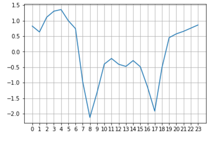
Plotting the data:

enter image description here

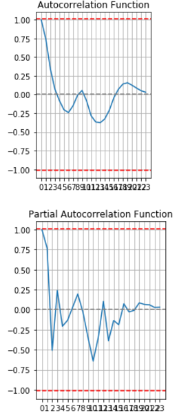
 ACF graph and PACF graph:

enter image description here

I took an AR(1) and MA(1) with differencing of 1.

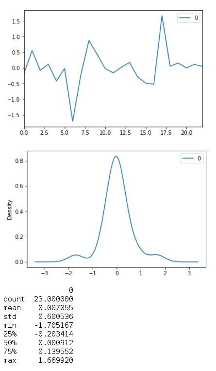
Applying the ARIMA model, I get:

 ARIMA(1,1,1):

enter image description here

The results for ARIMA model I get:

                             ARIMA Model Results                              
==============================================================================
Dep. Variable:                    D.y   No. Observations:                   23
Model:                 ARIMA(1, 1, 1)   Log Likelihood                 -20.539
Method:                       css-mle   S.D. of innovations              0.586
Date:                Mon, 06 Nov 2017   AIC                             49.079
Time:                        11:43:53   BIC                             53.621
Sample:                             1   HQIC                            50.221

==============================================================================
                 coef    std err          z      P>|z|      [0.025      0.975]
------------------------------------------------------------------------------
const         -0.0082      0.182     -0.045      0.964      -0.365       0.348
ar.L1.D.y     -0.0659      0.311     -0.212      0.835      -0.676       0.544
ma.L1.D.y      0.6066      0.236      2.575      0.018       0.145       1.068
                                    Roots                                    
=============================================================================
                 Real           Imaginary           Modulus         Frequency
-----------------------------------------------------------------------------
AR.1          -15.1848           +0.0000j           15.1848            0.5000
MA.1           -1.6484           +0.0000j            1.6484            0.5000
-----------------------------------------------------------------------------

I then predict and I covert it back to the original scale. I do, hat(Y)t+1 = Yt + hat(z)t+1, where hat(z)t+1 is the difference value of t+1.

The following code does that:

forecast = model_fit.predict()
prediction = pd.Series(forecast, copy=True)
prediction.ix[0] = prediction.ix[0] + (prediction.ix[0] - mon_two_speed.ix[0].values)
print(prediction.ix[0])
for i in range(len(prediction) - 1):
    prediction.ix[i+1] = prediction.ix[i+1] + (prediction.ix[i + 1] - prediction.ix[i])

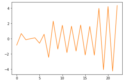
Plotting the prediction gives me bizarre values:

 The graph: 

enter image description here

I am fairly new to this, so I don't have much idea as of what to expect and infer from the results I get. I am not sure what I am doing wrong and any suggestions will be appreciated. Thanks.

$\endgroup$
2
  • 2
    $\begingroup$ Do you really have only one day's worth of data? What kind of "speed" are you measuring? Would multiple days show a pronounced seasonality? Or even a weekly pattern that differs on weekends? And can you reformat your pictures? I find your post very hard to read if a single graphic takes up the entire screen. $\endgroup$ Commented Nov 6, 2017 at 14:54
  • 1
    $\begingroup$ @StephanKolassa, It's the average speed of the vehicles on that road for that hour. Yes, multiple days would show a 24 hour seasonality. And similar on weekends. But, I am just trying to use this day's data to forecast and understand the model first. And, I have reformatted the images. Thanks for the reply. $\endgroup$
    – RPT
    Commented Nov 6, 2017 at 17:18

3 Answers 3

2
$\begingroup$

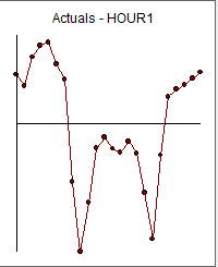
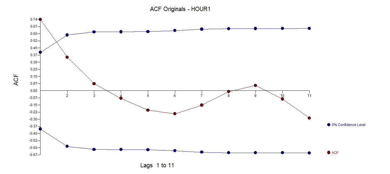
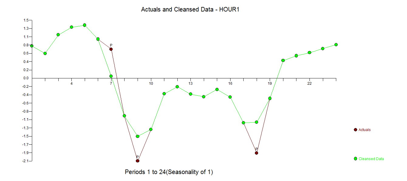
I took your 24 values enter image description here . One of the assumptions underlying using the ACF enter image description here to identify a useful model is that there are no pulses or unusal values in the data. Visually one can "see" three different regimes 1-7 ; 8-19 ; 20-24 suggesting non-stationarity of 1 sort or another. Now using AUTOBOX , the tool of my choice a robust model is identified pointing to three exceptional values i.e. three values that were no predictable simply using the past of the series. This is Data Exploration applied to time series data.

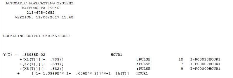
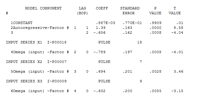
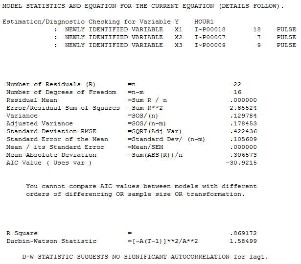
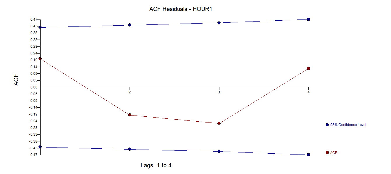
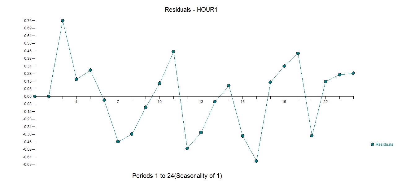
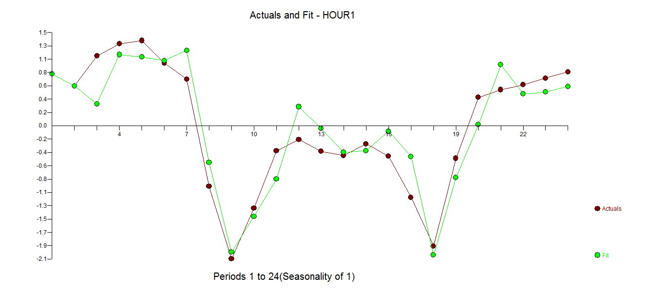
enter image description here and enter image description here and enter image description here . The ACF of the residuals clearly suggests adequacy enter image description here an the residual plot here enter image description here . The Actual and Outlier-Adjusted Series plot is interesting as it points to the periods that were deemed "unusual" enter image description here . Finally the Actual/Fit enter image description heregraph is here

In summary the 24 values are driven NOT by the past but by some exogenous effect , like driver's patterns reflecting work schedules etc.

ARIMA modelling without intervention detection is to be studiously avoided as one of the assumptions oF an ARIMA MODEL is that memory is sufficient. The good news is that assumption validation/checking is available by examining the residuals of a potentially deficient model based upon a bad assumption i.e. no pulses , no level shifts , no seasonal pulses and no time trends.

Continued allegiance to bad software leaning on AIC or whatever to form a model suggests either ignorance of the pitfalls or inablilty to correctly employ statistical methods. Good analysis has effectively "seen" the three different regimes by detecting three anomalies 7,9 and 18 ... roughly 1-7 ; 8-19 ; 20-24 20 in terms of homogenous groupings. In ARIMA terms the presence of an AR structure means that a "pulse" is an indicator of a new level or a change in level. Your 24 values has three levels before the work day, during the work day and after the work day.

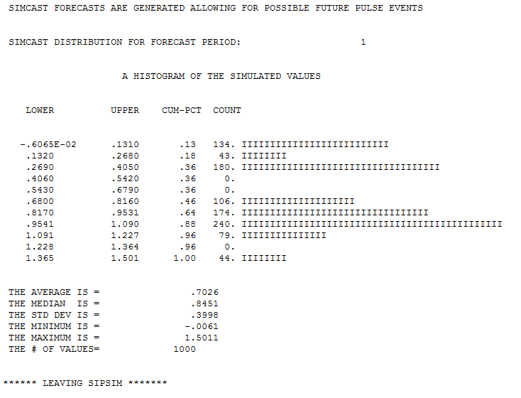
Following is a 1 period simulation via boot-strapping (penalized by future possible pulse outliers) enter image description here

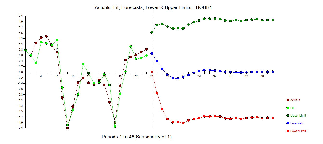
A plot of the forecasts for the next 24 values is here enter image description here suggesting wide uncertainty even though 6 (necssary) parameters were used to separate signal from noise. Note convergence and lack of instability often a clue to a bad model. Any software yielding (1,1,1) is a good example of bad software.

In summary "a model should be as simple as possible BUT not too simple" ..originally ascribed to Einstein but should be repeated daily by statisticans.

$\endgroup$
7
  • 1
    $\begingroup$ Given you have used six parameters to fit just 24 numbers, it would nice to see some strong warnings about how this model has likely overfit the data and some commentary about what that implies for its predictions and estimates. $\endgroup$
    – whuber
    Commented Nov 6, 2017 at 18:42
  • 1
    $\begingroup$ Ah my inspiration i.e. "good angel" has arisen on my shoulder. The width of the forecastiing limits is often a good sign as to "overfitting" I have added the simulation results to my response. Agreed one should only augment a model when necessary and after a 3 parameter arima model was chosen, careful "stepwise-forward type 'procedures" carefully and parsimoniosly were added in order with decreasing alpha values to ensure simplicity. As Einstein one said or was it Tukey, " models should be simple but not too simple" $\endgroup$
    – IrishStat
    Commented Nov 6, 2017 at 18:51
  • $\begingroup$ @IrishStat, thanks for your reply. But, I am finding it a bit hard to understand the results you have got from AUTOBOX. Can you explain what you have done differently that makes your prediction way more sensible from mine? And what improvement can I make on my data and model to obtain better prediction? $\endgroup$
    – RPT
    Commented Nov 6, 2017 at 22:51
  • $\begingroup$ The forecast is no more better than yours because the series is driven by an external factor. My model/approach actually motivates the analyst to find out why there are three paradigms/classes .. It doesn't hide them like yours does but rather puts a spotlight on the issue to find out why there would be 3 distinct classes ... much like discrimination .. $\endgroup$
    – IrishStat
    Commented Nov 6, 2017 at 23:19
  • $\begingroup$ r u on SKYPE .. so we can finish this up .. $\endgroup$
    – IrishStat
    Commented Nov 6, 2017 at 23:21
1
$\begingroup$

new account so I can't comment- but your acf and pacf plots show no significant lag correlation, the shape doesn't seem to suggest an D or Q value, and (since the plots are before differencing) they are already likely stationary. So how did you land on an ARIMA(1,1,1) specification? My understanding is that those two plots show there is no correlation with historical values, so using historical values is inappropriate.

This could be due to a lack of data, and it could be due to the aggregation. Specifically, the average speed last hour may not correlate with the average speed the next hour - but average speed at the same hour yesterday does. Increasing your scope of data and introducing larger aggregation-trends may improve the quality of your forecast. Also, consider that you're only observing a given hour once - if you had multiple days then the relationship between hours may be more apparent.

Given your acf and pact plots, ignoring the lack of significance, and referencing the box-jenkins method of determining p and q (seen here) I would consider re-estimating as just AR(1) model and definitely include more data.

$\endgroup$
2
  • $\begingroup$ I tried using just an AR(1) model with the data, but it more or less gives me the same forecast as I have now. $\endgroup$
    – RPT
    Commented Nov 6, 2017 at 17:37
  • $\begingroup$ Right but there's no reasonable assumption for a (1,1,1) specification. Further, if the (1,1,1) is returning a similar RMSE to the (1,0,0), and the AIC/BIC is similar, then why add additional insignificant regressors? The model output highlights the statistical insignificance as well. I think what you're seeing is the result of improper model specification. $\endgroup$
    – Djones4822
    Commented Nov 6, 2017 at 17:46
1
$\begingroup$

ARIMA is not a good modeling choice for cyclic effects, like systolic blood pressure on a circadian rhythm, ion concentrations during a heartbeat, water level during the tidal ebb and flow, traffic over a week as a number of cars per hour passing a fixed location, and so on. If you know the period of such a cycle, then you may apply forecasting over a relatively short duration using lagged effects as predictors, but you must also incorporate fixed effects for time.

What ARIMA is good at detecting is a "drift" in time series that have been deseasoned. I cannot infer much based on your terse description of these data. If the trends you depict occur as an explicit function of time, they only contribute to the apparent "error" under the assumptions of an ARIMA. Trends like that are frequently an aspect of time series modeling, such as the ramping up of blood pressure prior to awakening, or the congestion of traffic during the rush hours.

Nonetheless, you can use the wrong model and make correct inference. Under the assumption of memorylessness conditional on lagged effects (a possibly inappropriate assumption) the numerical output contains inference suggesting no statistically significant autoregressive or moving average terms.

$\endgroup$

Your Answer

By clicking “Post Your Answer”, you agree to our terms of service and acknowledge you have read our privacy policy.

Not the answer you're looking for? Browse other questions tagged or ask your own question.