1
$\begingroup$

Please change the title if it's not accurate, I might be lacking terminology.

I have two variables ($x,y$) which are directly correlated by pair. For example I have sampled 50 trees in my study area and for each tree I have tree height and annual precipitation at that location. This is what I mean by they are organized by pair. So I plot $x$ vs $y$ and I would like to know if there is any correlation between the two; does annual precipitation predict tree height, or the other way around?

I have used R to test if there is any linear correlation with the function lm(y~x) and have $p<.05$ and $R^2=0.6$, but some of my data seem as if they might be better fitted with a non-linear curve. What are some other types of statistical analysis I should use for such a problem?

$\endgroup$
5
  • 2
    $\begingroup$ You ask, "does annual precipitation predict tree height, or the other way around?" Do you want to learn the causal relationship between the two variables, or just predict one from the other? $\endgroup$ Commented Oct 20, 2014 at 23:56
  • 1
    $\begingroup$ What does the graph plot(x,y) look like? Can you post it here? $\endgroup$
    – rnso
    Commented Oct 21, 2014 at 2:44
  • $\begingroup$ @rnso I have different graphs for several species, some look somewhat linear, others aren't linear at all. postimg.org/image/ny2eoidmb postimg.org/image/n9tk5kewj $\endgroup$ Commented Oct 21, 2014 at 11:04
  • $\begingroup$ @LizzieSilver that's a very good point, at this stage I am just exploring any relationship between the two and then I will leave the biological interpretation to someone else. $\endgroup$ Commented Oct 21, 2014 at 11:09
  • 2
    $\begingroup$ You have separate and long-term precipitation measurements by every tree? That is very impressive data. $\endgroup$
    – Nick Cox
    Commented Oct 21, 2014 at 11:47

3 Answers 3

1
$\begingroup$

Rank correlation coefficients such as Kendall's or Spearman's can be useful to measure the strength of non-linear monotonic relationships, i.e. those that are increasing or decreasing, but not e.g. U-shaped. Calculating confidence intervals for their population values is often considered more useful than simply testing whether they're equal to zero.

If you want to predict tree height from precipitation (or vice versa) there are many approaches (see @Lizzie's links). The most basic extension of simple linear regression is simply to represent the predictor $x$ as a polynomial & estimate a coefficient $\beta_k$ for each term $k$: $$\operatorname{E}Y =\beta_0 + \beta_1 x + \beta_2 x^2 + \beta_3 x^3 + ...$$ where $\operatorname{E}Y$ is the predicted response. With just one predictor you might use F-tests to see how many terms are necessary (too many compared to the number of observations & you'll over-fit the model to the sample data).

$\endgroup$
2
  • $\begingroup$ Thanks for the suggestion, I am not sure how I can have a polynomial when I only have one variable that I am trying to correlate with what i am trying to predict. $\endgroup$ Commented Oct 24, 2014 at 17:00
  • 1
    $\begingroup$ The one variable is $x$ above; you can represent it with more than one term - linear, quadratic, cubic &c. - in the model equation. I'd suggest reading an introductory textbook on regression - Faraway (2002), Practical Regression & ANOVA Using R might be useful, as you're using R. $\endgroup$
    – Scortchi
    Commented Oct 25, 2014 at 20:18
1
$\begingroup$

Kernel regression and smoothing splines will both fit non-linear regression functions very nicely. There's a longer list of methods, with examples, in this R-bloggers post by Wesley.

$\endgroup$
1
$\begingroup$

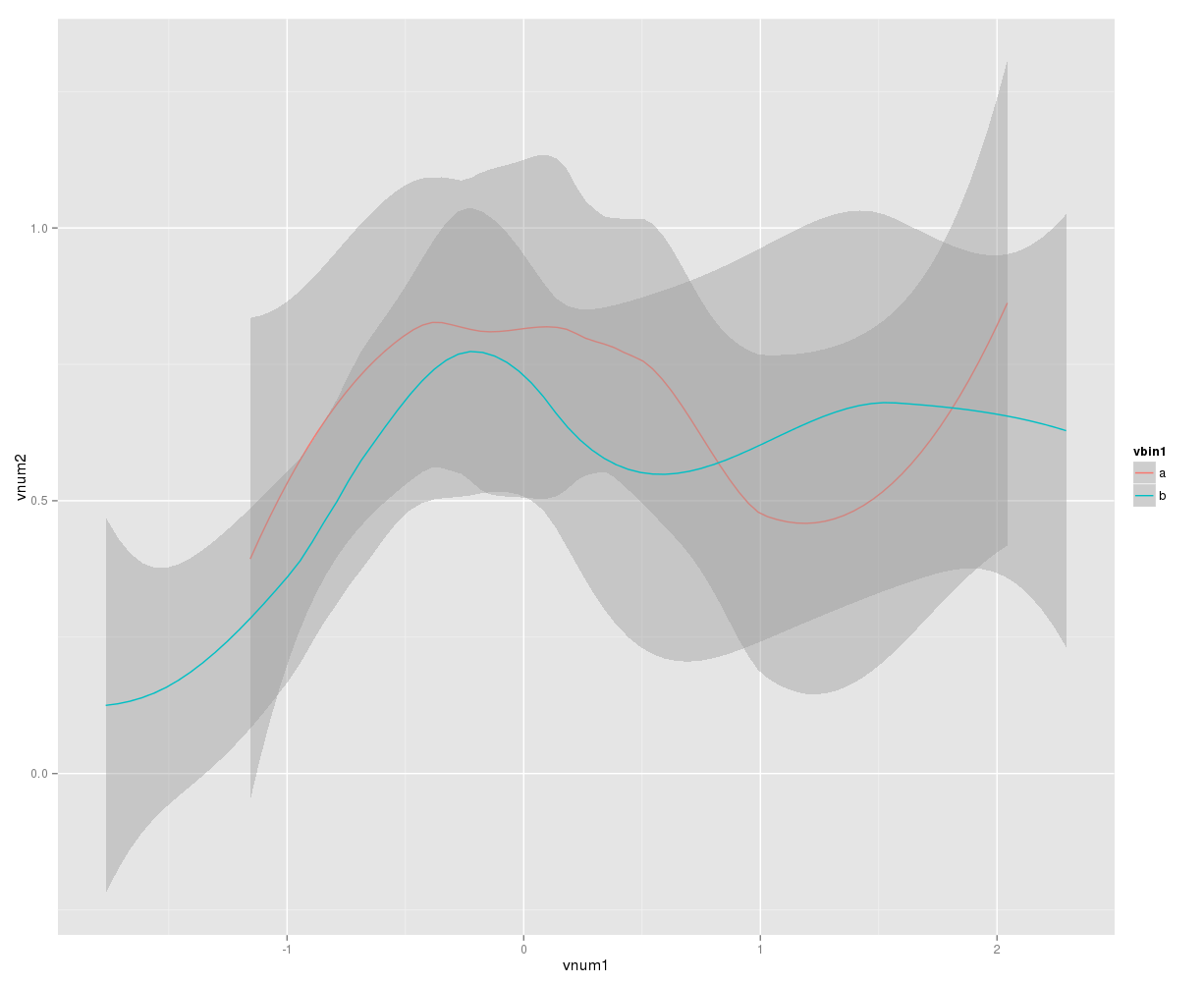
To visualize nonlinear data, try:

library(ggplot2)
ggplot(rndf, aes(x=vnum1, y=vnum2, group=vbin1, color=vbin1))+stat_smooth()

Where vnum1 and vnum2 are your x and y and vbin1 is the species or other grouping column.

enter image description here

Different options can be set in stat_smooth() function.

The shaded areas indicate 95% CI. Overlapping areas would indicate non-significant difference.

$\endgroup$
5
  • $\begingroup$ thanks I have tried that but how do I determine if there is anything statistially significant? $\endgroup$ Commented Oct 21, 2014 at 13:12
  • $\begingroup$ I have added a note regarding visualization of significant difference. I am not sure about calculations. $\endgroup$
    – rnso
    Commented Oct 21, 2014 at 14:18
  • 2
    $\begingroup$ You may be overinterpreting the overlapping areas: after all, overlapping 95% CIs can occur even among highly significant differences. But why are you recommending these plots? How does this set of plots answer the stated question? $\endgroup$
    – whuber
    Commented Oct 21, 2014 at 17:55
  • $\begingroup$ @ whuber: I am suggesting these plots only for an overview of data which may be non-linear. I thought if 95% CI are overlapping, the p value will be >0.05 i.e. not significant difference. But my experience is nowhere compared to yours. Please suggest me some links to refer to or explain briefly. $\endgroup$
    – rnso
    Commented Oct 22, 2014 at 0:53
  • $\begingroup$ There seem to be a lot of posts on our site about overlapping confidence intervals: stats.stackexchange.com/…. $\endgroup$
    – whuber
    Commented Oct 24, 2014 at 15:45

Your Answer

By clicking “Post Your Answer”, you agree to our terms of service and acknowledge you have read our privacy policy.

Not the answer you're looking for? Browse other questions tagged or ask your own question.