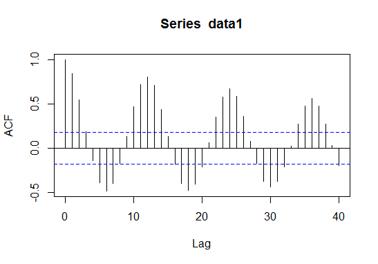
The plot that you show seems very close to the typical ACF of the fundamental
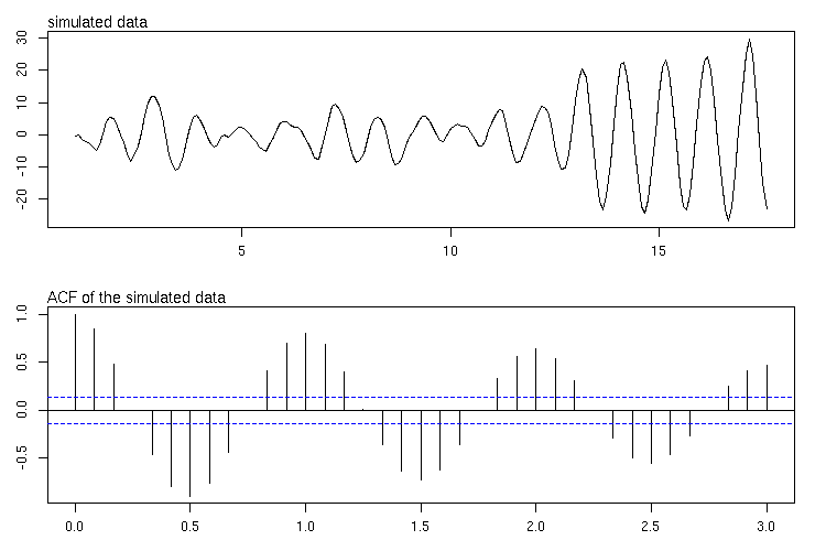
seasonal cycle in a monthly series. The periodicity of this cycle is annual, it is completed once every year. That could explain the 6-months between a peak and a trough in the ACF and the 12 months for the whole cycle peak-trough-peak. The following model generates such seasonal cycle:
$$
y_t = \sqrt{3} y_{t-1} - y_{t-2} + \epsilon_t \,, \quad
\epsilon_t \sim NID(0, \sigma^2) \,.
$$
In R, some data from this model can be generated as follows:
set.seed(123)
n <- 200
eps <- rnorm(n)
x <- rep(0, n)
x[1:2] <- eps[1:2]
for(i in seq.int(3, n))
  x[i] <- sqrt(3) * x[i-1] - x[i-2] - eps[i]
x <- ts(x, frequency = 12)
par(mfrow=c(2,1), mar = c(3,3,2,2))
plot(x)
mtext(side=3, adj=0, text="simulated data", cex = 1.2)
acf(x, lag.max = 36)
mtext(side=3, adj=0, text="ACF of the simulated data", cex = 1.2)

Looking just at the ACF, the presence of an annual cycle seems compelling. However, as @NickCox mentioned, you should look at other plots and sources of information (original data, periodogram, partial autocorrelation,...) in order to choose a model for the data or describe the features of the time series.
There may other relevant cycles in the data. One of your next steps in the analysis could be to check if the filter $1-\sqrt{3}L+L^2$ ($L$ is the lag operator such that $L^iy_t = y_{t-i}$) renders the data white noise or if there is some remaining pattern to be identified:
y <- filter(x, filter = c(1,-sqrt(3),1), sides = 1)
y <- ts(y[-c(1,2)], frequency = 12)
acf(, lag.max = )
pacf(filter(x, filter = c(1,-sqrt(3),1)))


