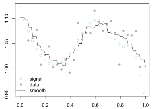
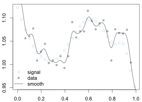
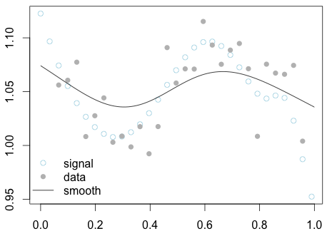
A principled statistical "bucketing" procedure for graphing tends to look not so much like an explicit bucketing procedure. The general name for these generalized bucketing procedures is scatterplot smoothers, which operate on two dimensional data $\{(x_i, y_i)\}$ and produce a "smooth" representative curve.
Probably the closest to explicit bucketing is a rectangular kernel density smoother (it's a mouthful, I know). This is a generalization of the moving average construction - we set an explicit window width $w$, and construct the smoothed data $\hat y(x)$ as an explicit average of the points that fall inside the window
$$ \hat y(x) = Avg(y_i \mid x - w < x_i < x + w) $$
Qualitatively, we construct a window around $x$ of width $w$, and average together all the $y$'s whose corresponding $x$'s lie inside this window. As the window slides from left to right, some $x_i$'s will enter the window and others will fall out, changing the estimate $y(x)$.
The rectangular kernel density smoother produces a stair step looking smooth

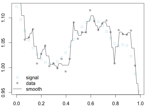
Making the window thinner will fit closer to the data, and make the smooth more jagged

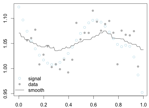
Making the window wider makes the smooth average over more of the data, and makes the smooth less jagged

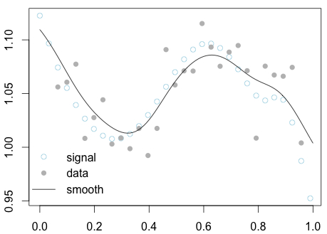
The rectangular kernel always results in a stair step pattern, which is rather unappealing. To get a true smooth curve, we need to avoid points dropping out and entering the window at discrete points in time. To do this, we can use a gaussian window instead of a rectangle
$$ \hat y(x) = \sum_i \left( y_i e^{- \frac{(x_i - x)^2}{w} }\right) / \sum_i \left( e^{- \frac{(x_i - x)^2}{w} } \right) $$
This looks complicated, but is really just a weighted average. We weight the $y_i$ with a gaussian that falls off rapidly away from the point $x$ at which we are calculating the smooth. This results in a beautiful smooth curve

Again, making the width smaller fits closer to the data and results in a pointier smooth

and making it wider fits further from the data

The subject of scatterplot smoothing is one of my favorites. It's very fun and results in some beautiful pictures. A great introduction is chapter 2 of Generalized Additive Models by Hasite and Tibshirani, where you can read about even more exotic ways to "bucket" your data!

