I have very basic experience with time series analysis and I am struggling to figure out the following.
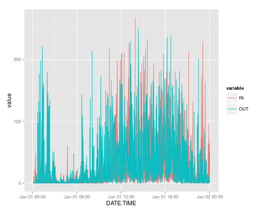
I have this graph which shows the counts of people in and out of a store for a day, the counts were taken every 5 minutes (its a very busy store).

This graph is very noisy and makes it difficult to make observations of trends and patterns. I would like to know if there is a way to smooth the lines so I can make it more readable.
I am not very sure if a time series plot is appropriate to represent discrete values that change through time so I would welcome opinions on other ways to visualize seasonality on data.
