Simple question here and I feel really foolish for not being able to figure this out on my own.
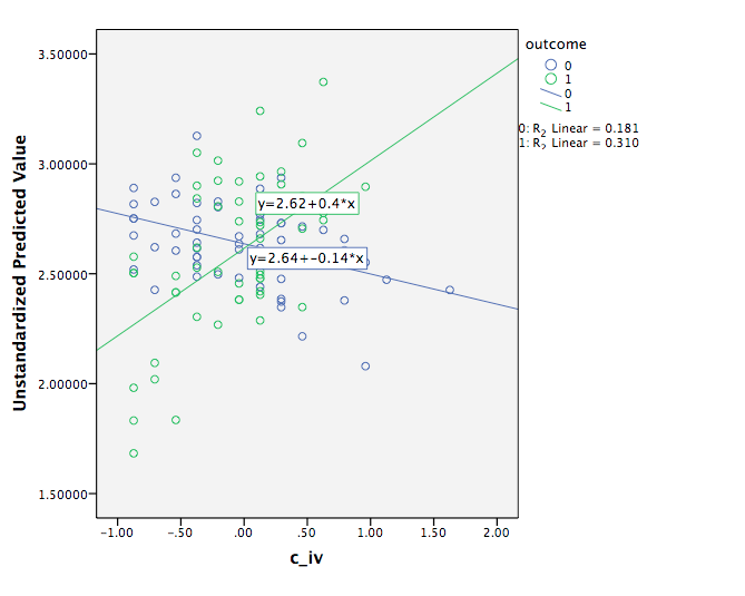
I ran a simple linear regression with a continuous DV, two focal IVs (one dichotomous and one continuous) and controls. I have a significant interaction and graphed it with a scatterplot using the predicted values on the Y and the continuous IV on the X and added the two fit lines at the subgroups for the dichotomous IV. SPSS gave a y = a + bx for each fitted line.
My question: when I use the coefficients in excel and graph the interaction, the graph looks similar but the slope values for the continuous IV are different. They are not similar. I've tried different calculations, so it is not user error. Why would these slopes look different than the ones provided in the scatterplot graph created by SPSS? I've also ran separate regressions for each subgroup, hoping that would help, but the coefficients are still different. They look similar to my calculated ones, but still a little off. What am I doing wrong here???
I'm attaching an image of the scatter with the fit lines at subgroups. Thank you in advance, I've been trying to find a good source to reconcile the difference but can't find one at all. I really just need to know which slopes to report with their p-values, and which slopes to use for my graph in excel. Thanks again to anyone that looks at this! 
