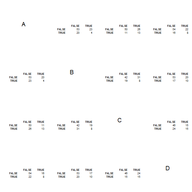
I have a classification problem where I have tested four different algorithms for binary classification. I have performed a 10-fold cross-validation on my training set and generated ROC curves and performance estimates (accuracy, AUC, etc).
I would now like to compare the classifiers at the level of the predictions to understand whether the decisions made by the different classifiers on individual observations are more or less the same.
Does anyone have suggestions/recommendations on how to do this visually?
A simple option would probably be to draw two 4-way Venn diagrams, one for the positive predictions and one for the negative, but I'm wondering if there are more elegant/clever ways to do it.
Thank you!

