6
$\begingroup$

I'm starting to prefer visualizations of my regression models as opposed to tabular output (OR's, beta-coefficients, 95%CIs). However, I struggle to find a good way to do this when I am undertaking multiple imputation by chained equations (mice). The output of mice (in R) is usually one data frame containing m complete datasets after m imputations. With this, I can run the same model on each of the m complete datasets and then pool the results according to Rubin's Rules. In R there are nice functions to do this with the mice package. But no really good way to plot this output.

My current strategy is just to pick a random imputed dataset out of the m complete datasets and then do the visualization on that one dataset (and model).

Does anyone out there have ways they typically check these models (with plots) or visualize the data (in exploration)? I'm open to creative suggestions. They need not be in R, however, then maybe you could show me the types of plots you make?

$\endgroup$
4
  • 2
    $\begingroup$ I am very interested in your question and posted a similar one about calibration plotting some weeks ago (stats.stackexchange.com/questions/265985/…; alas, no answer as of yet). As to your question, randomly picking a dataset to plot is indeed considered a viable option, but I guess you'd also like to account for the uncertainty of imputation. Which plots are you interested in? $\endgroup$
    – IWS
    Commented Apr 5, 2017 at 14:54
  • $\begingroup$ This might be a case in which plotting, as a data graphic per se, the output from analysis of multiple imputed datasets is less desirable than diagramming the process. $\endgroup$
    – rolando2
    Commented Apr 5, 2017 at 15:40
  • $\begingroup$ @IWS, I guess I'm just wondering if randomly selecting one of the datasets to create plots for is valid? As you point out, i'm worried because a single plot doesn't show the uncertainty. I've also thought about collecting all the B-coefficients from the models and then plotting them somehow? $\endgroup$
    – RNB
    Commented Apr 6, 2017 at 7:23
  • 2
    $\begingroup$ I could not point you to references which would back the following, but here goes: If all is right with the imputation technique, all imputation datasets created are completed based on the information inherent in your data while adding/subtracting some randomness. So, if you have to pick a dataset to plot data, and truly randomly pick an imputation dataset, dataset number x and its plots are as good as any other. However, if you start cherrypicking (knowingly or unknowingly), this is a bad idea as you might just pick the one dataset with the most favourable results. Does that help? $\endgroup$
    – IWS
    Commented Apr 6, 2017 at 8:30

1 Answer 1

3
$\begingroup$

If you want to plot the coefficients from the regression model resulting from multiple imputation, then you can simply plot the pooled coefficients, given that the pooled coefficients are the correct estimates after multiple imputation. You can totally do that in R. This part of your question (i.e. "no really good way to plot this output") is more a programming question than a data visualization one, but the rest of the question raises a number of other issues beyond programming.

Here is a simple example using the mice and jtools libraries, to show there's currently no technical obstacle to plotting pooled coefficients (maybe it was more difficult to do at the time when you asked your question 5 years ago):

library(mice)
library(jtools)
imp <- mice(nhanes, maxit = 2, m = 2)
fit <- with(data = imp, exp = lm(bmi ~ hyp + chl))
pooled.fit <- pool(fit)
summary(pooled.fit)
plot_summs(pooled.fit)

Output:

         term    estimate  std.error  statistic        df     p.value
1 (Intercept) 20.83085470 4.69764869  4.4343151  5.678522 0.005025847
2         hyp -0.34808658 2.13909014 -0.1627265 19.459793 0.872411742
3         chl  0.03012864 0.02160183  1.3947264  9.505523 0.194831834
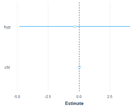
plot of the pooled coefficients of the "hyp" and "chl" coefficients, and their confidence intervals

On the other hand, taking a single one of the multiple imputed models and plotting its coefficients may lead to something wrong or misleading, as you suspected in the comments when you said "i'm worried because a single plot doesn't show the uncertainty". Pooled coefficients are very likely to be different from coefficients taken from any of the individual models generated during the multiple imputation workflow.

There is a simple example of this difference in the section "5.1.4 Repeated analyses" from Stef van Buuren's Flexible Imputation of Missing Data, where he notes that for the models fitted to the imputed datasets, "the estimates differ from each other because of the uncertainty created by the missing data". In this "repeated analyses" section, you can see for example than the two first imputed models have coefficients of 4.08 and 6.77 for the bmi variable, while the bmi's pooled coefficient is 4.99.

$\endgroup$

Your Answer

By clicking “Post Your Answer”, you agree to our terms of service and acknowledge you have read our privacy policy.

Not the answer you're looking for? Browse other questions tagged or ask your own question.