3
$\begingroup$

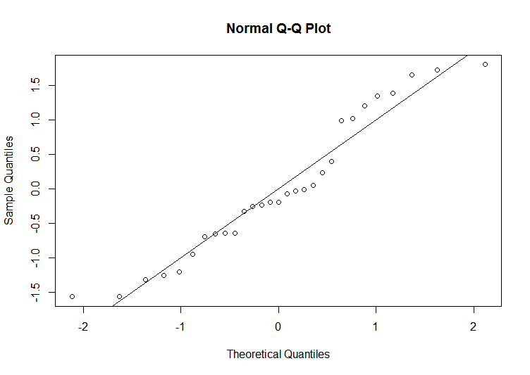
This is the Normal Probability Plot I've obtained for some data:

plot

As you can see the points seem to osciallate, as in a period, around the line of slope 1 and passing through the origin. I've obtained this plot by trying to fit a simple linear regression model. Can I deduce from this peculiar behaviour (just as an Anzat, or a guess, waiting for further tests) that this can indicate that there is a polynomial relationship? (for example the grade of the polynomial might be equal to the number of times the oscillation crosses the line)

Or otherwise, what does this suggest? That there is a trigonometric relationship?

Edit

Basically Ive fitted a linear model data.lm <- lm(y~x, data=data) , then Ive created the standardized residuals data.lm$sr <- rstandard(data.lm) and finally plotted the qqplot qqnorm(data.lm$sr) and I've added abline(0,1)

$\endgroup$
6
  • $\begingroup$ It may be random, or it may be a degree of clustering in your residuals. One possible cause could be some rounding in your original data $\endgroup$
    – Henry
    Commented Apr 12, 2017 at 20:42
  • 1
    $\begingroup$ I think you're reading way more into your small sample than you have evidence for; those little wiggles do happen with random data. You may have somewhat shorter tails but even that can happen sometimes. See here (where even in larger samples, plots g, i and u among others show such wiggles); also see here which gives advice on reading the plots $\endgroup$
    – Glen_b
    Commented Apr 13, 2017 at 1:44
  • $\begingroup$ @Henry Actually there is some rounding involved in the acquisition of data! $\endgroup$ Commented Apr 13, 2017 at 2:40
  • $\begingroup$ ... probably worth mentioning in the question. It looks like you have 3 pairs of duplicated values. $\endgroup$
    – Glen_b
    Commented Apr 13, 2017 at 2:54
  • $\begingroup$ @Glen_b where do you see that from? $\endgroup$ Commented Apr 13, 2017 at 8:42

1 Answer 1

3
$\begingroup$

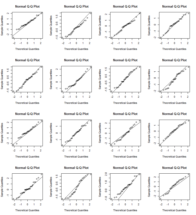
It is true that a qq plot from a multimodal distribution would look like this (with bumps), but assuming that none of the points in the picture are on top of each other, you only have 29 data points. The data could easily be normally distributed and yet have a qq plot that looks just like this. To check, you can simulate data sets of size 30 from a normal distribution and make qq plots of them.

Here are 16 which I made with the commands

for (i in 1L:16){x<-rnorm(30);qqnorm(x);abline(0,1)}

enter image description here

By coincidence, in this case the bottom left hand plot looks very much like yours!

$\endgroup$
1
  • 1
    $\begingroup$ +1 ... though I guess you mean "multimodal" in the first sentence? (you might enjoy the first answer I linked in comments above) $\endgroup$
    – Glen_b
    Commented Apr 13, 2017 at 1:45

Your Answer

By clicking “Post Your Answer”, you agree to our terms of service and acknowledge you have read our privacy policy.

Not the answer you're looking for? Browse other questions tagged or ask your own question.