In my paper I have a number of t-tests. I am thinking of representing some graphically. What is the best way of doing that in R?
-
2$\begingroup$ We need more information. What is the goal of doing the t-tests? Why did you do many of them? How much space do you want to devote to the graphics? $\endgroup$– Frank HarrellCommented May 20, 2017 at 12:27
-
$\begingroup$ @FrankHarrell To compare two set of values (marks of two group of students with pretest and posttest). Has got many comparisons (pretest, posttest for different groups). Its a research paper. So space is limited $\endgroup$– user2721Commented May 21, 2017 at 7:30
-
$\begingroup$ Several relevant threads already e.g. stats.stackexchange.com/questions/205629/… stats.stackexchange.com/questions/190223/… $\endgroup$– Nick CoxCommented May 21, 2017 at 10:51
2 Answers
The nice examples with violin plots etc. are for unpaired data. I have some examples for paired data in my Biostatistics for Biomedical Research notes - see the link at https://hbiostat.org/bbr. For unpaired data I am getting less impressed by violin and box plots and prefer to show the "whole" data using spike histograms along with selected quantiles and the mean. Examples are shown in https://hbiostat.org/R/Hmisc . You'll see that plotly interactive graphics in R extend what you can do. Click on areas in the legend to control what is displayed in the analysis of SGOT stratified by drug vs. placebo.
The point was well made that bar charts have a bad ink:information ratio. I have a similar comment for dynamite plots.
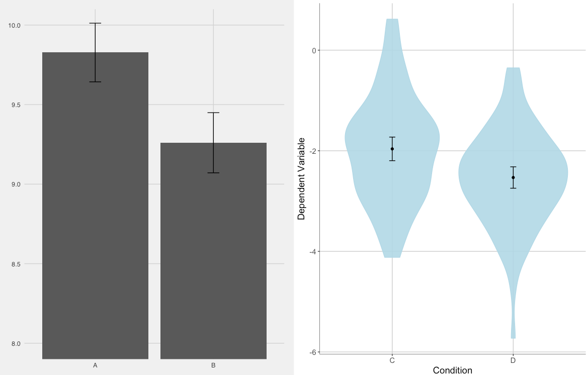
I like bar plots and violin plots the best. Bar plots are the classic thing that you generally see in papers. I always add 95% CI around the mean, since the means are what we are interested in when we do t-tests. Violin plots are nice, because they allow you to see the whole distrubition of your DV. It's like a histogram and bar plot combined. I use ggplot2 to create the graphs, and then some other packages like ggthemes, gridExtra, and Rmisc come in handy. I suggest reading about ggplot2. There are many, many, many guides and showcases (with code!) out there. There is SO much flexibility in R, but these are two that I really like. I generated some data, did some t-tests, and plotted them. You can copy-and-paste this right into R and mess with it how you want.
# setting seed for replication
set.seed(1839)

# creating data
d1 <- data.frame(y1 = c(rnorm(100,10,1), rnorm(100,9.25,1)),
                 x1 = factor(c(rep("A", 100), rep("B", 100))))
d2 <- data.frame(y2 = c(rnorm(80,-2.0,1), rnorm(80,-2.57,1)),
                 x2 = factor(c(rep("C", 80), rep("D", 80))))

# doing t-tests
d1t <- t.test(y1~x1, d1)
d2t <- t.test(y2~x2, d2)

# generating descrptive statistics for plots
library(Rmisc)
d1ss <- summarySE(d1, measure="y1", groupvars="x1")
d2ss <- summarySE(d2, measure="y2", groupvars="x2")

# making bar plot
library(ggplot2)
library(ggthemes)
p1 <- ggplot(d1ss, aes(x=x1, y=y1))+
  geom_bar(stat="identity")+
  theme_fivethirtyeight()+
  coord_cartesian(ylim=c(8, 10))+
  geom_errorbar(aes(ymax=y1+ci, ymin=y1-ci), width=.1)

# making violin plot
p2 <- ggplot(d2, aes(x=x2, y=y2))+
  geom_violin(fill="lightblue", alpha=.9, colour="lightblue")+
  labs(x = "Condition", y = "Dependent Variable")+
  theme(axis.line=element_line(size=.2),
        text=element_text(size=14),
        panel.background=element_rect(fill="white"),
        panel.grid.major = element_line(color = "grey80"),
        panel.grid.minor = element_blank())+
  geom_errorbar(data=d2ss,
                aes(ymax=y2+ci, ymin=y2-ci), width=.05)+
  geom_point(data=d2ss, stat="identity")

# putting plots in the same image
library(gridExtra)
grid.arrange(p1, p2, ncol=2)
-
1$\begingroup$ I like your recommendation of violins pots (and I like box plots) but bar charts contain so little information I think they are far worse than these alternatives. Another thing to consider is that in many cases, it is the difference between means that is of primary interest so confidence intervals (or standard errors) on these differences are more informative than on individual means. $\endgroup$ Commented May 20, 2017 at 15:38
-
$\begingroup$ Below each of these plots, I would annotate it with the Cohen's d and 95% CI to get at the difference between the means. $\endgroup$ Commented May 21, 2017 at 5:08
-
$\begingroup$ @ Mark White Good idea, especially if this information is incorporated within the graph itself (not graphically but with text) as Galileo probably would have done. The invention of the printing press led to the artificial separation of graphics and test. $\endgroup$ Commented May 21, 2017 at 13:07

