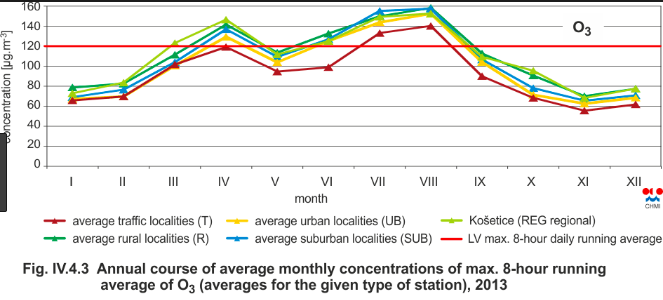
I provide a small demo in R from atmosphere science. Consider Ozone layer that varies due to reasons such as seasons (winter, summer, ...) and the tilt of the Earth axle. You can see here some monthly variations below
 (Source of the picture here.)
where you can see that there are some monthly functions in the layer. If you ask about the total trend (and not monthly figures), you are good to go with standard linear regression while hierarchial/mixed model helps you answer questions specific to months such that
> coef(fitML_)
(Intercept)       Month
  15.656673    3.677636
> coef(fitML_hierarchial)
$Month
  (Intercept)
5    25.52226
6    32.48859
7    57.14909
8    57.90293
9    32.40247

attr(,"class")
[1] "coef.mer"
where alas R's ozone data is only half year long.
Small working example
library(ggplot2)
library(lme4)
library(forecast)
library(lmerTest)
library(gridExtra)

data(airquality)
ggplot(data=airquality) + aes(y=Ozone, x=as.Date(as.character(paste("20180", airquality$Month, airquality$Day, sep="")), format="%Y%m%d") ) + geom_smooth()

fitML_ <- lm(data=airquality, Ozone ~ Month)
fitML_hierarchial <- lmerTest::lmer(data=airquality, Ozone ~ 1 + (1|Month))

predLM_            <- predict(fitML_)
predLM_hierarchial <- predict(fitML_hierarchial)
predDates_<-seq.Date(as.Date(as.character("20181001"), format="%Y%m%d"), by = 1, length.out = 116)

#LM
g1<-ggplot(data=airquality) + aes(y=Ozone, x=as.Date(as.character(paste("20180", airquality$Month, airquality$Day, sep="")), format="%Y%m%d") ) + geom_smooth() + geom_smooth(data=data.frame(predDates=predDates_, predML=predLM_), aes(x=predDates_, y=predLM_))
#LM hierarchial
g2<-ggplot(data=airquality) + aes(y=Ozone, x=as.Date(as.character(paste("20180", airquality$Month, airquality$Day, sep="")), format="%Y%m%d") ) + geom_smooth() + geom_smooth(data=data.frame(predDates=predDates_, predML=predLM_), aes(x=predDates_, y=predLM_hierarchial))

grid.arrange(g1, g2)

#ggplot(data=airquality) + aes(y=Ozone, x=as.Date(as.character(paste("20180", airquality$Month, airquality$Day, sep="")), format="%Y%m%d") ) + geom_smooth() + geom_point(aes(x=as.Date("20180701", format="%Y%m%d"), y=25), colour="red")

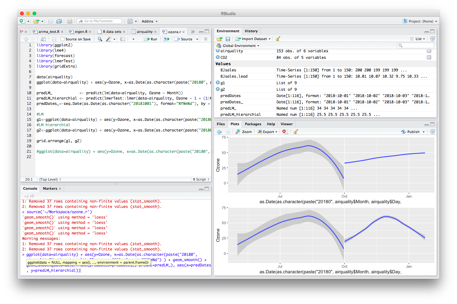
where you can see that the hierarchial model has tried to predict the monthly fluctuations while the linear regression just minimising the R2 over the whole data.
Alas with longer data you should get better predictions, here we have only one data point per month, hence the poor quality in predictions.


