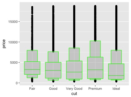
The key term is letter-value (box)plots and the key reference is now
Hofmann, Heike, Wickham, Hadley and Kafadar, Karen.
2017.
Letter-value plots: Boxplots for large Data.
Journal of Computational and Graphical Statistics 10.1080/10618600.2017.1305277
http://dx.doi.org/10.1080/10618600.2017.1305277
Earlier versions of this paper can easily be found on-line.
As I understand it the width of each box just indicates how a box is defined. The fattest box is between letter values that are (approximate) quartiles, the next fattest boxes stretch between (approximate) quartiles and the (approximate) octiles beyond in either tail, and so on. Positively, this is just an extension of the common box plot convention that each box indicates that it is the interval between quartiles and the width is otherwise just a conventional choice. (Only occasionally are boxes shown that indicate the number of values in each.)
A little more negatively, people have to learn that the width of the box is otherwise arbitrary. It's not, for example, a boxy version of a density plot.
But the interpretation is otherwise similar to that of box plots, e.g. the central half of a sample is within these limits; the central three-quarters within these limits; and so on. Are groups or variables similar or different in distribution?
For a survey of letter values with different emphasis, see
Cox, N. J.
2016.
Speaking Stata: Letter values as selected quantiles
Stata Journal 16(4): 1058-1071.
http://www.stata-journal.com/article.html?article=st0465
I have to worry, on behalf of those who advocate this plot, that naive users are all too likely to interpret it as a blocky version of a violin plot, just as histograms are discretised density plots. The ideal of showing more detail than a box plot is admirable, and the practice usually helps, but there are many other ways to do that. Naturally, advice to read how it is defined and constructed should always be followed.

