4
$\begingroup$

I'm fitting a mixed model with a nesting structure that produces a correlation in the random intercept. I'm having a difficult time understanding the correlation coefficient and obtaining the correlation matrix for each individual (which might not be possible in R but seems possible in SAS?).

Here is an example model:

    library(lme4)

    dat <- sleepstudy

    fit <- lmer(Reaction ~ Days + (1 + Days|Subject), data = dat)
    summary(fit)

The output produces the following:

Random effects:
 Groups   Name        Variance Std.Dev. Corr
 Subject  (Intercept) 612.09   24.740       
          Days         35.07    5.922   0.07
 Residual             654.94   25.592       
Number of obs: 180, groups:  Subject, 18

Fixed effects:
            Estimate Std. Error t value
(Intercept)  251.405      6.825   36.84
Days          10.467      1.546    6.77

Correlation of Fixed Effects:
     (Intr)
Days -0.138

There is a random effect correlation of 0.07 between Days and the Intercept (reaction time). What is the best way to interpret this? Because I have the subject nested in the day, does this mean that this is the "repeated measures correlation" as detailed by Roy? I'm not 100% certain that it can be interpreted in this fashion because in the attached article, the author is using the actual correlation matrices for each individual subject (in SAS), which I can't seem to reproduce in R. It seems like calling these individual correlation matrices is unique to SAS. The paper has an example of her code but I am not familiar with the the SAS language enough to decipher how to re-create it in R (if possible).

Has anyone worked with repeated measures correlation in this fashion using R?

$\endgroup$

1 Answer 1

11
$\begingroup$

It represents the relationship between the intercepts and coefficients. Since both are allowed to vary by group—they are "random" effects—each group has its own intercept and coefficient. That Corr = .07 means that there is a small, positive relationship between intercepts and slopes. Whether or not this is meaningful depends on the meaning of an intercept.

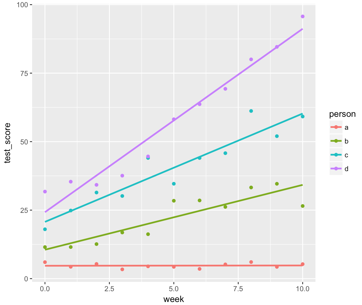
There are a few good examples that I find helpful. Imagine we are trying out a new 10-week class for learning multilevel modeling. People take a test on the material before they start (week 0) and then after each week 1 - 10. Imagine, for simplicity's sake, we only do it on four people. We do the study, and we find out something troubling: The class is successful in teaching people... but it is not a beginner's class! The only people that improve are the people that had good scores at the beginning (week = 0, making it the intercept). This would be a positive relationship between slope and intercept: As someone's score at week zero (the y-intercept) increases, their slope also increases. This could look like:

set.seed(1839)
x <- 0:10
y1 <- 5 + 0 * x + rnorm(11, 0, 1)
y2 <- 10 + 2 * x + rnorm(11, 0, 5)
y3 <- 20 + 4 * x + rnorm(11, 0, 5)
y4 <- 30 + 6 * x + rnorm(11, 0, 5)

dat <- data.frame(week = rep(x, 4), test_score = c(y1, y2, y3, y4),
           person = c(rep("a", 11), rep("b", 11), 
                     rep("c", 11), rep("d", 11)))

library(ggplot2)
ggplot(dat, aes(x = week, y = test_score, color = person)) +
  geom_point() +
  geom_smooth(method = "lm", se = FALSE)

enter image description here

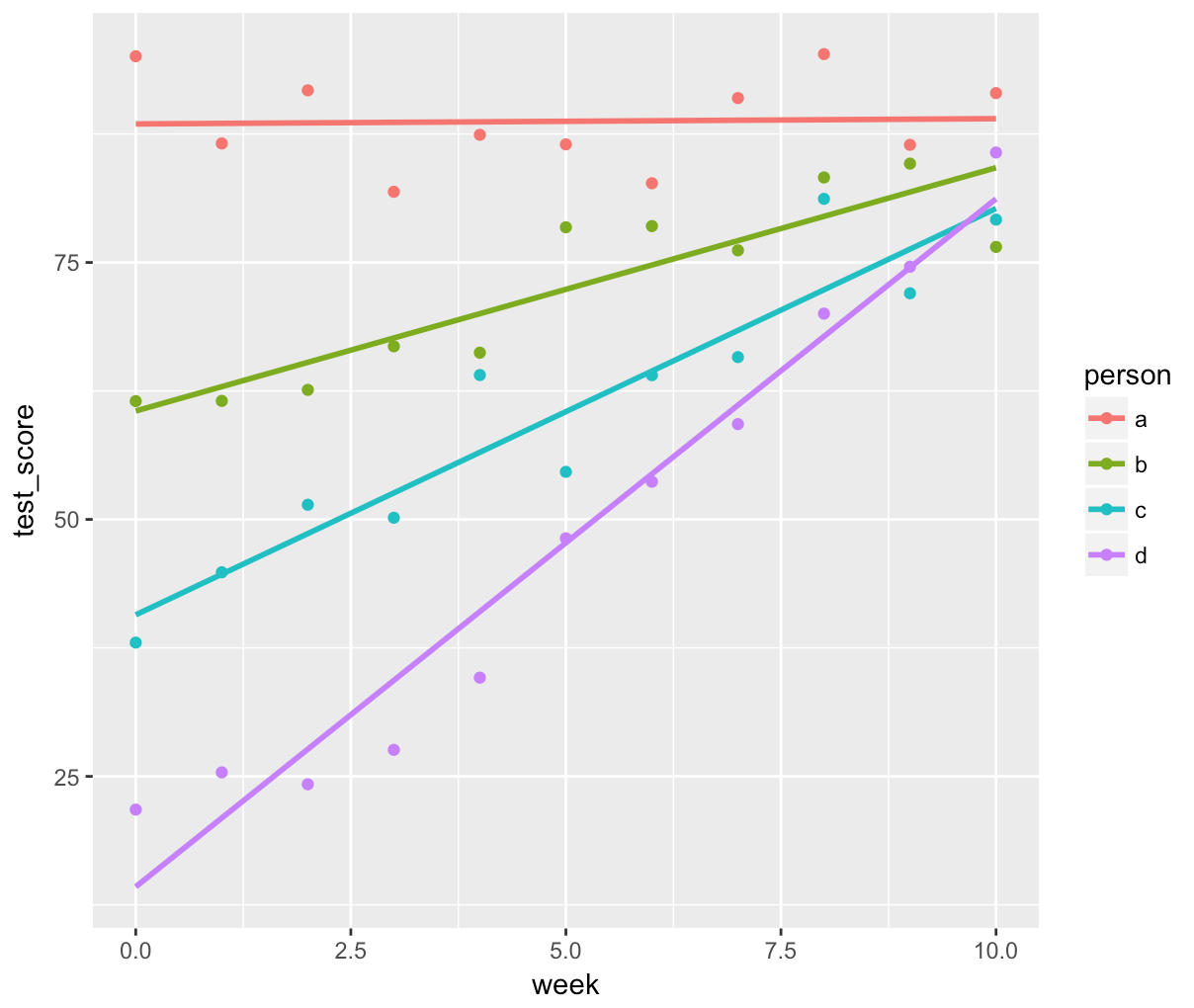
On the other hand, we could look at a negative relationship between the two. Let's say we do the same class, except this time it is too easy: People come into the class already with the highest scores possible. But people who came in not knowing much? They get brought up to speed to the people who already knew stuff. This means that as the scores at the beginning (week = 0, the y-intercept) get higher, the slopes get weaker. This could look like:

set.seed(1839)
x <- 0:10
y1 <- 90 - 0 * x + rnorm(11, 0, 5)
y2 <- 60 + 2 * x + rnorm(11, 0, 5)
y3 <- 40 + 4 * x + rnorm(11, 0, 5)
y4 <- 20 + 6 * x + rnorm(11, 0, 5)

dat <- data.frame(week = rep(x, 4), test_score = c(y1, y2, y3, y4),
           person = c(rep("a", 11), rep("b", 11), 
                     rep("c", 11), rep("d", 11)))

library(ggplot2)
ggplot(dat, aes(x = week, y = test_score, color = person)) +
  geom_point() +
  geom_smooth(method = "lm", se = FALSE)

enter image description here

It is important to remember that this effect is dependent on how you scale your variables. If you mean-center your predictor, the correlation between intercept and slope is the relationship between the two at the mean of the predictor (since mean-centering makes the y-intercept the mean). Similarly, if you measure people at 40 years-old, 50 years-old, and 60 years-old, then the y-intercept is essentially meaningless, since it is far outside the bounds of what you measured (0 years-old, being their birth).

If you want to test the significance of this relationship, you can compare models including and excluding that correlation. Removing the correlation can be done by including a || in the lmer random effects formula. More details here: http://rpsychologist.com/r-guide-longitudinal-lme-lmer#conditional-growth-model-dropping-intercept-slope-covariance

$\endgroup$
1
  • $\begingroup$ Mark, that's fantastic, thanks! I was reading Zuur's comments, in his book, about the random correlation coefficient and they echo your example. So this really doesn't tell me about the partial correlation of two variables, which is what I was getting at with the Roy article (the 'repeated measure' correlation coefficient). I can't seem to figure that out, then. If y is a continued variable and x is a continue variable and we model repeated measures with a mixed model (subject nested within "time") is there a way to understand the correlation between x and y? $\endgroup$ Commented Jan 2, 2018 at 2:34

Your Answer

By clicking “Post Your Answer”, you agree to our terms of service and acknowledge you have read our privacy policy.

Not the answer you're looking for? Browse other questions tagged or ask your own question.