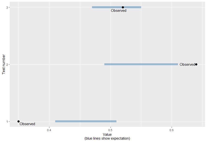
I have carried out some permutational sign tests, which give results in the following format:
                        Test1      Test2       Test3
Observed value           0.35       0.64        0.52
Expected range      0.41-0.51  0.49-0.61   0.47-0.55
I am happy with the results - tests 1 and 2 show observed values outside the expected range, while test 3 shows a non-significant difference.
I am struggling to think of an exciting way to display these results. Other people have suggested showing a histogram of the expected distributions, with arrows or lines showing that the observed results are outside (or inside) the range. However, I feel that the large histogram of expected values (which always shows a normal distribution) is essentially useless information - they are not "real" values, just results of randomisation.
I've been playing around with using a bar chart - with bars showing the observed values, and lines alongside showing the expected range. However, I'm having trouble making this look good in R - the lines always appear too separate or distant from the bars. And I'm not sure it will ever look that great.
Should I just give up and present the results as text? Or is there a better way to display such results? I don't see good visualisations of permutation tests very often.
Any ideas much appreciated!

