0
$\begingroup$

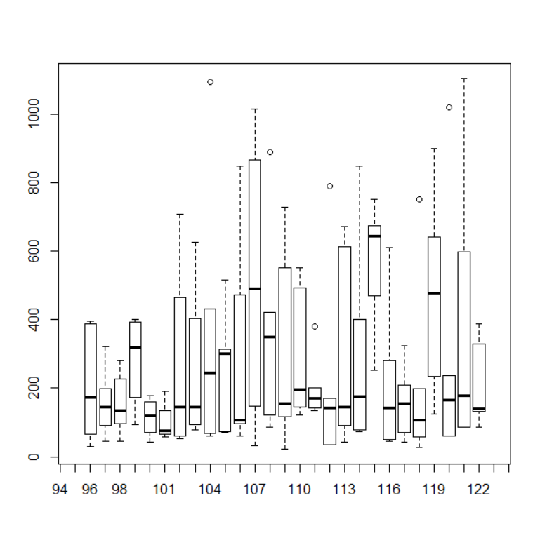
I'm examining how boldness of individuals change with time. My data consists of individuals repeatedly measured across trials for boldness scores. First, I plotted each individual to see its mean and variance from the following plot:

enter image description here

The x axis depicts individuals and y axis depicts boldness scores. As we can see, individuals differ from each other in their mean scores as well as variance.

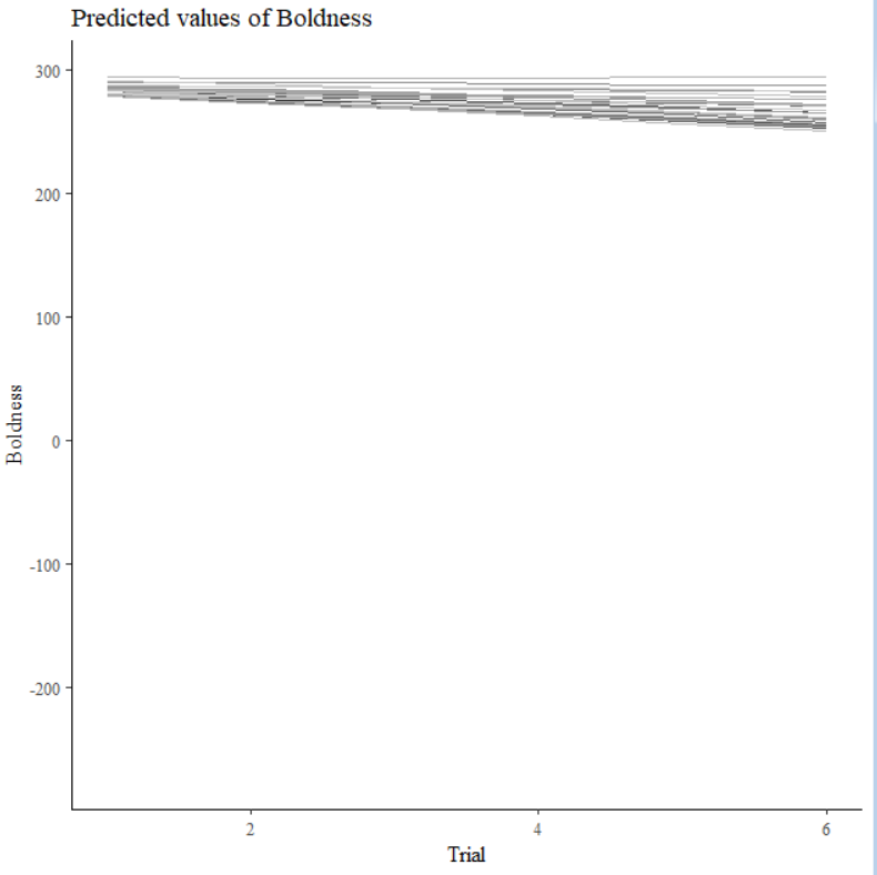
Next, I constructed a random slope random intercept plot, to see how boldness vary with time (trials). As lmer resulted in singular fitted model, I used the stan_lmer function from the rstanarm package in R (using the code stan_lmer(Boldness~Trial+(Trial|individualID,data=mydata)). From the model diagnostics, it appeared the model fit was reasonably well. Below is the random intercept random slope plot:

enter image description here

Here, each line represents an individual. From the plot, there appears to be very less variation between individuals in the intercept. Similarly, individual slopes are similar indicating similar variation in boldness across time (trials).

However, the boxplot of the raw data showed significant differences between individuals in their means and variances. These differences are very little in the random intercept random slope plot. I'm trying to figure why this is so? Individuals with greater mean values for boldness should have greater intercepts in the random slope plots. Similarly, individual showing greater variance in boldness should show greater variation in slopes. Is my model correct?

Any help is much appreciated. Thanks.

$\endgroup$
3
  • 1
    $\begingroup$ I'd suggest starting the $y$-axis at about 250 and letting it go to 300, so you can see the spread of the lines better. Also, you don't blot any confidence bands so how can you say anything about variance in the second graph? I think you probably is mostly due to graph scaling. $\endgroup$ Commented Dec 21, 2018 at 4:31
  • 1
    $\begingroup$ I don't really see a problem with the graph except that the y range is just wrong (negative values). If you limit the graph as suggest by the user above you should see better what is going on. $\endgroup$ Commented Dec 21, 2018 at 8:59
  • $\begingroup$ Thanks @StatsStudent. Correct me if I'm wrong, but doesn't slopes of lines say something about the variance? That is, I would except individuals with greater variation in the box plots to show greater magnitude in slopes. But this is not happening, which causes some concern. Thanks. $\endgroup$
    – BP86
    Commented Dec 21, 2018 at 15:30

1 Answer 1

2
$\begingroup$

This is a simple random intercepts and random slopes model. The fact that the model did not converge with lmer() may indicate that something went wrong in the way the data were fed into the function. In addition, the scale of the plot of the predicted values of boldness is different than the scale of the figure with the box-plots, i.e., in the box-plots some subjects have means below 200, whereas in the lines plot all of the seem to be above 250.

$\endgroup$
1
  • $\begingroup$ Thanks Prof. Dimitris Rizopoulos. I don't think something went wrong in feeding the data. Perhaps I have too few data for lmer to fit optimally. The fact that some subjects in the box plot have low means, and this not being reflected in the random intercepts causes my concern. Do you think something went wrong with the bayesian model? Would be grateful for any inputs. $\endgroup$
    – BP86
    Commented Dec 21, 2018 at 15:27

Your Answer

By clicking “Post Your Answer”, you agree to our terms of service and acknowledge you have read our privacy policy.

Not the answer you're looking for? Browse other questions tagged or ask your own question.