1
$\begingroup$

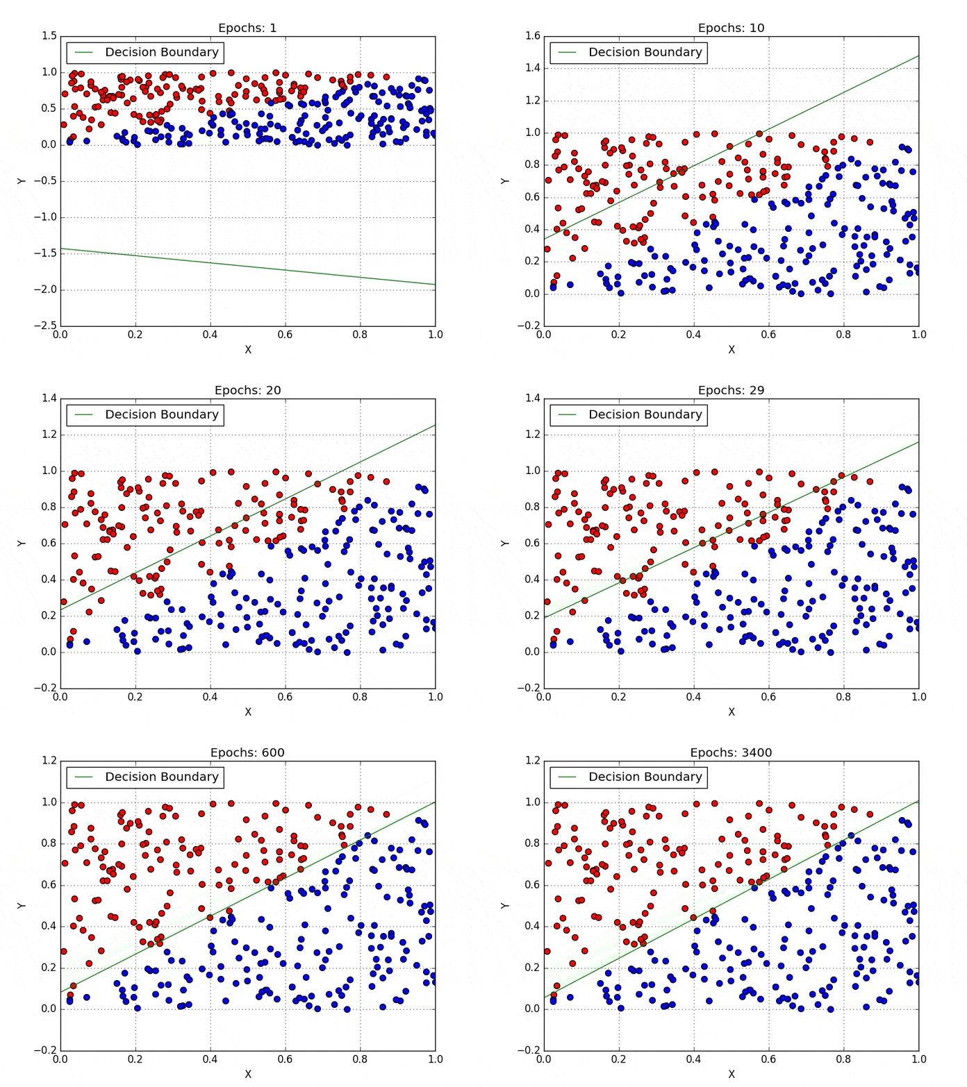
I was reading an article about logistic regression and I got confused by one of the pictures:

Optimized version of the animated gif

https://towardsdatascience.com/introduction-to-logistic-regression-66248243c148

First animated gif from Uni of Toronto. What is depicted there? What is y-axis and x-axis (from 0 to 1)? How is it related to logistic regression?

UPD: this post is not of the best quality - but I don't ask about the post, but about the picture. I've seen this picture multiple times and once I've seen a senior statistician laughing at this picture on twitter - however, no explanation followed why it is funny.

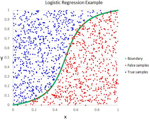
UPD1: here is another example of this plot:

enter image description here

https://www.datasciencecentral.com/profiles/blogs/why-logistic-regression-should-be-the-last-thing-you-learn-when-b

$\endgroup$

1 Answer 1

1
$\begingroup$

X and Y are different explanatory variables, while the output appears coded as blue / red dot. The decision boundary is what you should get after calibrating your model and selecting a threshold for classification, here it appears plotted trough the calibration process.

It is misleading for a least two reasons :

  • y is traditionaly used to denote the output. Axes should be $X_1$ and $X_2$, two explanatory variables, and the output, y, should appear in the legend (red : y = 1, blue y = 0).

  • The exemple does not really provide an explanation as to why logistic regression is better, or how the model is calibrated. Evolving boundaries would better illustrate the functionning of a SVM for exemple.

$\endgroup$
1
  • $\begingroup$ wow it was fast. Thank you! $\endgroup$ Commented Nov 14, 2019 at 14:58

Your Answer

By clicking “Post Your Answer”, you agree to our terms of service and acknowledge you have read our privacy policy.

Not the answer you're looking for? Browse other questions tagged or ask your own question.