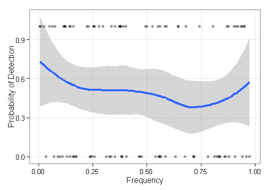
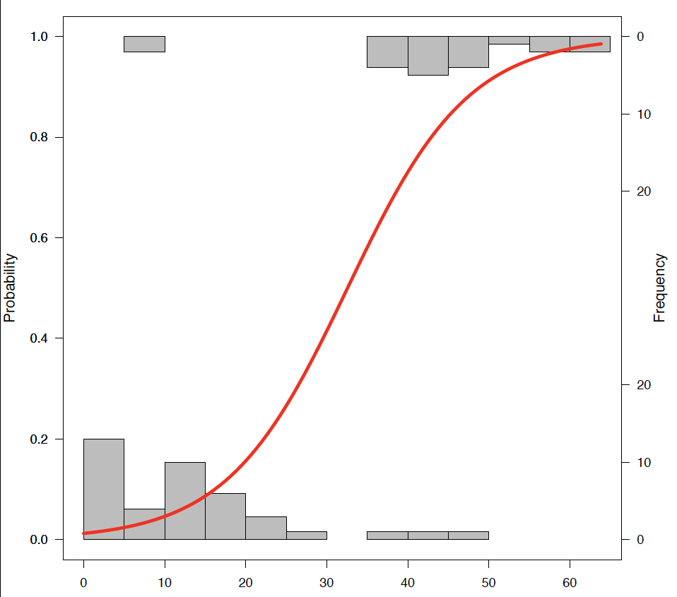
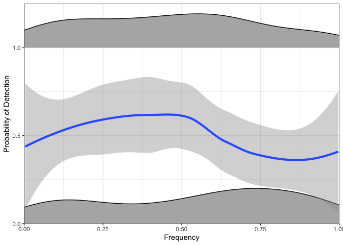
I have some data I need to visualize and am not sure how best to do so. I have some set of base items $Q = \{ q_1, \cdots, q_n \}$ with respective frequencies $F = \{f_1, \cdots, f_n \}$ and outcomes $O \in \{0,1\}^n$. Now I need to plot how well my method "finds" (i.e., a 1-outcome) the low frequency items. I initially just had an x-axis of frequency and a y axis of 0-1 with point-plots, but it looked horrible (especially when comparing data from two methods). That is, each item $q \in Q$ is has an outcome (0/1) and is ordered by its frequency.
Here is an example with a single method's results:

My next idea was to divide the data into intervals and compute a local sensitivity over the intervals, but the problem with that idea is the frequency distribution is not necessarily uniform. So how should I best pick the intervals?
Does anyone know of a better/more useful way to visualize these sort of data to portray the effectiveness of finding rare (i.e., very low-frequency) items?
EDIT: To be more concrete, I am showcasing the ability of some method to reconstruct biological sequences of a certain population. For validation using simulated data, I need to show the ability to reconstruct variants regardless of its abundance (frequency). So in this case I am visualizing the missed and found items, ordered by their frequency. This plot will not include reconstructed variants that are not in $Q$.


