4
$\begingroup$

I have a scatter plot where each point is at integer coordinates that may include 0 for both X and Y. The range of each coordinate is large, but most of the data is clustered around 0.

Ordinarily, I would do something like a log-log plot to show the decades of data. But since there is 0, it's not ideal (I could add a shift, but that makes interpretation of the data more difficult). Additionally, since the data are integers, it looks very banded in log-log plots. Again, relatively unattactive.

An example of the data:
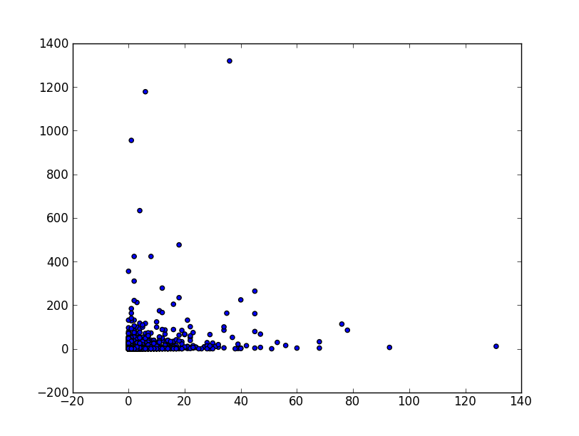
Original Data

An example of the log-log data where each axis has a shift by 1 before taking the log:
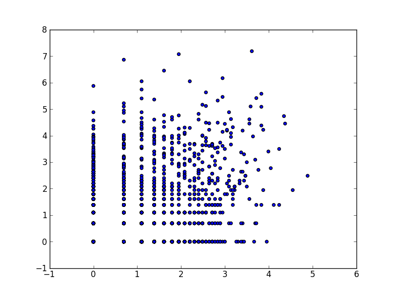
Log-Log Data

So, is there another type of transformation that would display the data more reasonably? It's important to see all scales of the data.

$\endgroup$
2
  • $\begingroup$ Who is the audience / what is the goal for the picture? $\endgroup$
    – MattBagg
    Commented Dec 10, 2012 at 1:22
  • $\begingroup$ @MattBagg This is actually data from physics.SE so let's assume it is people who understand data and can make sense of visualizations of data. The goal is to show interesting trends of the data across all decades. $\endgroup$
    – tpg2114
    Commented Dec 10, 2012 at 4:10

2 Answers 2

2
$\begingroup$

You could try one of the transformations to approximately constant variance for Poisson data such as $2\sqrt(Y+\frac{3}{8})$.

$\endgroup$
1
  • 1
    $\begingroup$ +1 The plots make it clear that some such transformation would help and that the logarithm is too strong. This one ought to work well as a point of departure. $\endgroup$
    – whuber
    Commented Jan 4, 2013 at 17:52
0
$\begingroup$

I would consider plotting some kind of aggregate function for each decade, say the sum of the value. or the count of instances (or both), if you want to continue using the scatterplot approach, try introducing transparency in the points, so the viewer can easily appreciate the increased density closer to the origin....

$\endgroup$
2
  • $\begingroup$ I'm definitely open to other ways of reducing/visualizing the data. Scatter plot was just the first "see what I'm dealing with" attempt, but I am curious how to manage data with a distribution like this on scatter plots. Transparency is a good idea. $\endgroup$
    – tpg2114
    Commented Dec 9, 2012 at 7:04
  • $\begingroup$ docs.ggplot2.org/current/geom_point.html take a look abt half way down the page... $\endgroup$
    – ADP
    Commented Dec 9, 2012 at 7:29

Your Answer

By clicking “Post Your Answer”, you agree to our terms of service and acknowledge you have read our privacy policy.

Not the answer you're looking for? Browse other questions tagged or ask your own question.