2
$\begingroup$

This is pretty close from what I would like to do.
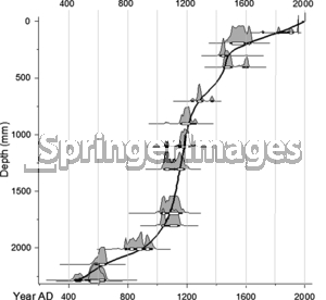
enter image description here

More precisely, I would like to represent graphically a sequence of inferences on time-indexed RVs $X_{t_i}$ by plotting at each time $t_i$ the density for $X_{t_i}$ (the horizontal axes representing the values taken by the $(X_{t_i})_i$ and all variables being homogeneous) at the vertical level $t_i$ (the vertical axis representing the time). I note that the inference relies on MCMC methods and thus my data are set of samples. I spent many times to find a solution on the web but did not manage to find it. If somebody knows how to do that and could help me, I will really enjoy it.

$\endgroup$
1

1 Answer 1

3
$\begingroup$

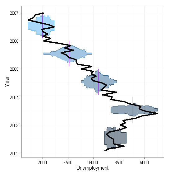
If you are willing to have your density estimates mirrored vertically (i.e., be violin plots), this is pretty straightforward with ggplot2 in R. As you didn't post any sample data, I will use data(economics) from ggplot2:

library(ggplot2)   # for plotting
library(lubridate) # for getting year from dates in dataset
library(plyr)      # for getting annual mean easily

data(economics)    # sample dataset

# calculate year to group by using lubridate's year function
economics$year <- year(economics$date)

# get a subset 
subgrp <- economics[economics$year>2001&economics$year<2007,]    

# get the mean of each year
subgrp <- ddply(subgrp, .(year), mutate, mean=mean(unemploy))

# plot
ggplot(subgrp, aes(x=date, y=unemploy))+ 
    geom_violin(aes(group=year, colour=year, fill=year), alpha=0.5, 
    kernel="rectangular")+    # passes to stat_density, makes violin rectangular 
    xlab("Year")+             # label one axis
    ylab("Unemployment")+     # label the other
    coord_flip()+             # flip the axes so violin plots are sideways
    theme_bw()+                      # make background white
    theme(legend.position="none")+   # suppress legend for year colors
    geom_line(aes(x=date, y=mean,    # add a line for the mean 
        group=year),colour="purple")+
    geom_line(size=1.5)              # make line for monthly data

enter image description here

$\endgroup$
4
  • $\begingroup$ Fantastic ! Thanks a lot. I have one more question. Is it possible to add vertical lines intersecting the mean number of unemployement for each groups (or any other values) in order to make the plot more verbose. Thanks again for your help. $\endgroup$
    – beuhbbb
    Commented Dec 11, 2012 at 9:59
  • $\begingroup$ I've added an example of how I would do that using ddply() from plyr package to determine the mean. $\endgroup$
    – MattBagg
    Commented Dec 11, 2012 at 22:28
  • $\begingroup$ thanks, your example enligths my understanding of ggplot2. I think I can now try by myself to build what I want precisely. $\endgroup$
    – beuhbbb
    Commented Dec 12, 2012 at 10:50
  • $\begingroup$ You're welcome (it's common practice to thank/recognize the best answer of a question by clicking the checkmark to accept it) $\endgroup$
    – MattBagg
    Commented Dec 12, 2012 at 16:42

Your Answer

By clicking “Post Your Answer”, you agree to our terms of service and acknowledge you have read our privacy policy.

Not the answer you're looking for? Browse other questions tagged or ask your own question.