1
$\begingroup$

I am having some issue understanding the behavior of such distributions when generating random numbers.
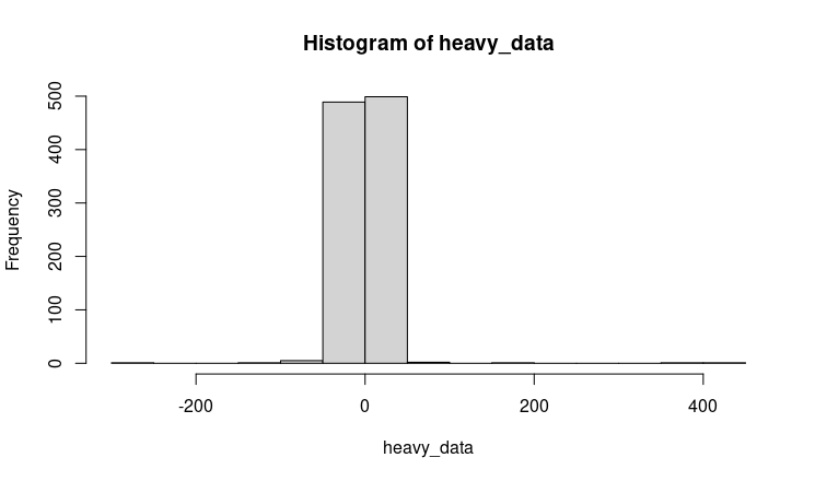
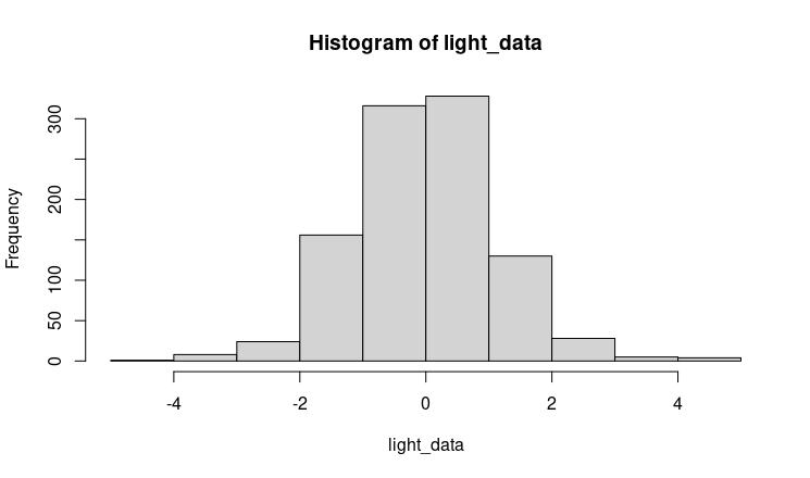
I was under the impression that heavy tailed distributions have "heavier" tails, so there is more probability to observe higher values, whereas lighter tailed distributions have values more concentrated in the body of the distribution. Is this correct? I tried to sample from a Cauchy distribution (heavy distribution) and from a t-distribution (light) and plot the histogram. I am confused because I expected exactly the opposite of what I get. Here some example in R (the same results can be replicated with any statistical software)

set.seed(999)

heavy_data <- rcauchy(1000)
light_data <- rt(1000, 10)

hist(heavy_data)
hist(light_data)

cauchy

t-student

It looks like that from the cauchy distributions, all the observations are in the body with almost anything in the tails, whereas for the t-distributions we have a wider spread of data, so in the body as well as in the tail.

Could anyone clarify this?

$\endgroup$
2
  • 1
    $\begingroup$ I wouldn't usually describe a t-distribution as light tailed; the Cauchy is one example of a t-distribution (and there are even heavier-tailed t-distributions than that). All t-distributions are heavier-tailed than the normal, for example, so if your cut-off between light and heavy is there, then all t-distributions would be heavy-tailed.. $\endgroup$
    – Glen_b
    Commented Jul 20, 2020 at 5:01
  • $\begingroup$ Notice the huge difference in your horizontal axes (actual values). $\endgroup$
    – desertnaut
    Commented Nov 14, 2020 at 14:12

3 Answers 3

0
$\begingroup$

Cauchy. The reason for the the strange histogram from Cauchy data is precisely because you are getting many extreme values in the tails--too sparse and too extreme to show well on your histogram. A data summary or boxplot might be more useful to visualize what's going on.

set.seed(999)
x = rcauchy(10000)
summary(x)
     Min.   1st Qu.    Median      Mean   3rd Qu.      Max. 
-5649.323    -0.970     0.021    -0.037     1.005  2944.847 
x.trnk = x[abs(x) < 200]  # omit a few extreme values for hist
length(x.trnk)
[1] 9971

par(mfrow=c(2,1))
dcauchy(0)
[1] 0.3183099   # Height needed for density plot in histogram
 hist(x.trnk, prob=T, br=100, ylim=c(0,.32), col="skyblue2")
  curve(dcauchy(x), add=T, col="red", n=10001)
 boxplot(x.trnk, horizontal=T, col="skyblue2", pch=20)
par(mfrow=c(1,1))
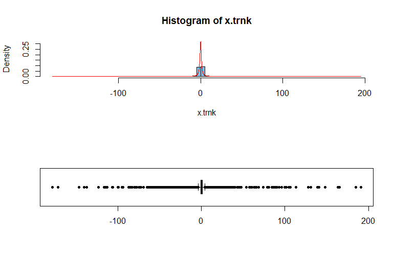
enter image description here

The standard Cauchy distribution (no parameters specified) is the same as Student's t distribution with DF = 1. The density function integrates to $1,$ as appropriate, but its tails are so heavy that the integral for its 'mean' diverges, so its mean doesn't exist. One speaks of its median as the center of the distribution.

Student's t, DF = 10. There is nothing particularly unusual about Student's t distribution with DF = 10. Its tails are somewhat heavier than for standard normal, but not so much heavier that it's hard to make a useful histogram (no truncation needed). And its mean is $\mu=0.$

y = rt(10000, 10)
summary(y)
     Min.   1st Qu.    Median      Mean   3rd Qu.      Max. 
-5.988219 -0.698855 -0.006711 -0.005902  0.685740  6.481538 
dt(0,10)
[1] 0.3891084
par(mfrow=c(2,1))
hist(y, prob=T, br=30, ylim=c(0,.4), col="skyblue2")
 curve(dt(x,10), add=T, col="red", n=10001)
boxplot(y, horizontal=T, col="skyblue2", pch=20)
par(mfrow=c(1,1))
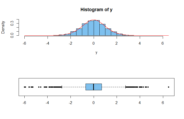
enter image description here

The distribution $\mathsf{T}(10)$ is sufficiently heavy-tailed that samples from it as large as $n=10\,000$ tend to show many boxplot outliers---as seen above. In a simulation of $100\,000$ samples of size $10\,000,$ almost every sample showed at least one outlier and the average number of outliers per sample was more than 180. [This simulation runs slowly because each sample of $10,000$ needs to be sorted in order to determine its outliers.]

set.seed(2020)
nr.out = replicate(10^5, length(boxplot.stats(rt(10000,10))$out))
mean(nr.out)
[1] 188.5043
mean(nr.out>0)
[1] 1
$\endgroup$
1
$\begingroup$

The direct answer to the question is, no, heavier tails does not necessarily mean "more probability in the tails." A sequence of distributions can have increasing tail weight, with simultaneously less probability, as long as the tails extend further and further.

See here for an example. https://math.stackexchange.com/a/2510884/472987

Part of the problem is that there are incorrect sources all over the web that show "fat tailed" distributions using histograms with a good chunk of probability in the tails. The problem is that, as the OP notes, the tails, while thicker than the normal distribution, are still very close to zero and hence hard to visualize in a histogram.

Thus, histograms are not appropriate for visualizing fat tails. The normal quantile-quantile plot should be used instead. As it turns out, there is a very direct mathematical connection between kurtosis (a measure of fat/heavy tails) and the q-q plot, see here: https://stats.stackexchange.com/a/354076/102879

$\endgroup$
4
  • $\begingroup$ Could you clarify what you mean by "tail weight" and how it might be related to the standard definition of a heavy tail? $\endgroup$
    – whuber
    Commented Jul 27, 2020 at 21:54
  • $\begingroup$ I am not referring to the "standard" definition, because I believe it is too limiting. Instead, I am referring (when I describe kurtosis as a measure of fat/heavy tails) to the leverage of the tail of the distribution of $X^4$ (assuming wlog that $X$ is standardized). See here for a detailed explanation of my logic. stats.stackexchange.com/a/378344/102879 $\endgroup$ Commented Jul 28, 2020 at 15:02
  • $\begingroup$ Thank you: in order for your answer to be understood as intended, then, it is essential that you edit it to explain the sense in which you are using the terminology. $\endgroup$
    – whuber
    Commented Jul 28, 2020 at 15:12
  • 1
    $\begingroup$ No, I think my answer is fine as it stands. Histograms are poor ways to visualize fat tails, in the various accepted ways of defining fat tails, exponential bounds, kurtosis, whatever. The essential point is that fat tails, while fat, are still close to zero in the tail (again, according to any reasonable definition.) Thus they are hard to see in a histogram, but easy to see in a q-q plot. Further, kurtosis is indeed a measure of fat/heavy tails, as I stated. $\endgroup$ Commented Jul 28, 2020 at 18:00
0
$\begingroup$

Your intuition is correct but your pictures are inaccurate. hist by default generates the limits of the x-axis based on the range of your data. Your Cauchy data ranges from about -400 to 400, whereas your t_10 data ranges from about -5 to 5. So you need to specify a common x-axis to compare. A related problem is the bin size. The bins of the Cauchy data are big, driven by the range of the data. A simple way to make them more comparable is to increase the number of bins:

hist(heavy_data, xlim = range(heavy_data), breaks = 600)
hist(light_data, xlim = range(heavy_data), breaks = 200)
$\endgroup$

Your Answer

By clicking “Post Your Answer”, you agree to our terms of service and acknowledge you have read our privacy policy.

Not the answer you're looking for? Browse other questions tagged or ask your own question.