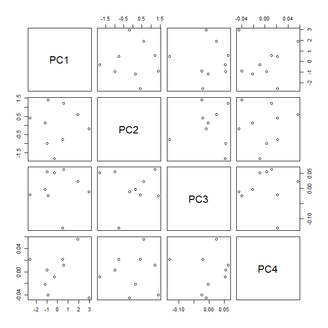
What you have is a (labeled) scatterplot. To a first approximation, what you can learn from this is what you can learn from any scatterplot.
Probably what would help is to think about what PCA does. The text below is copied from my answer here:
Put simply, PCA (as most typically run) creates a new coordinate system by:
- shifting the origin to the centroid of your data,
- squeezes and/or stretches the axes to make them equal in length, and
- rotates your axes into a new orientation.
(For more details, see this excellent CV thread: Making sense of principal component analysis, eigenvectors & eigenvalues.)
Let's take a look at your data and see if we can make sense of what is in your plot. (I don't know what "Fr" and "Ang" are, so I will interpret them as French and Anglish, which are humanities classes in literature and foreign language depending on whether you live in France or the land of the Angles.) Below, I read in your data, compute the correlation matrix and make the scatterplot matrix. Then I compute the PCA and make the scatterplot matrix of the data rerepresented in the new coordinate system.
d = read.table(text="name   Math Phys   Fr  Ang
                     Benny   6.0  6.0  5.0  5.5
                     ...
                     Coby   14.5 14.5 15.5 15.0
                     ...
                     Emily  11.0 10.0  5.5  7.0
                     Judy    5.5  7.0 14.0 11.5
                     ...",                       header=T)
rownames(d) = d$name
d = d[,2:5]
round(cor(d), digits=2)
#      Math Phys   Fr  Ang
# Math 1.00 0.98 0.23 0.51
# Phys 0.98 1.00 0.40 0.65
# Fr   0.23 0.40 1.00 0.95
# Ang  0.51 0.65 0.95 1.00
windows()
  pairs(d)

pca.d = prcomp(d, scale=TRUE);  pca.d
# Standard deviations (1, .., p=4):
# [1] 1.69578500 1.05815281 0.05981296 0.03237707
#
# Rotation (n x k) = (4 x 4):
#            PC1        PC2        PC3        PC4
# Math 0.4784540  0.5519489 -0.2025732 -0.6522256
# Phys 0.5319172  0.4068018  0.4412026  0.5974251
# Fr   0.4439304 -0.6212336  0.5324079 -0.3654264
# Ang  0.5395106 -0.3793856 -0.6934308  0.2900837
windows()
  pairs(pca.d$x)


In the scatterplot matrix of the raw data that the STEM classes are highly correlated, as are the humanities classes, but that the culture of STEM classes and humanities classes have become split are are largely unrelated to each other. Of necessity, the data are uncorrelated in the space of the principal components. The first two principal components account for 99.9% of the variability in the dataset. It isn't uncommon for the vast bulk of the variability to be in the first couple PCs, and it's reasonable to just make the first scatterplot (note that it appears you did not scale your data, whereas I did).
At this point, what you can see in your scatterplot is where each person falls on these two constructed dimensions. That could be of interest. The other thing your plot may help you with is interpreting the new variables (PCs). It is convenient that there is a person who is near the top / bottom of each axis, but near 0 on the other axis. This lets you look at the data and see what that corresponds to (bear in mind that the positive and negative signs are largely meaningless—you can flip the plot and it will contain the same information). We see that Colby has the lowest score on PC1 and that Colby earned high marks in every class. This leads me to suspect that Colby is very smart overall. Likewise, Benny has the highest score on PC1 and got poor grades in every class. That leads me to believe Benny is not a good student. As a result, I interpret PC1 to measure something like intelligence or studiousness (albeit in a backwards fashion). On the other hand, Emily got good scores in math and physics, but poor scores in French and Anglish, whereas Judy did very well in the humanities, but not as well in science. From these I infer that the second PC indicates whether a person's intelligence is balanced or skewed towards one kind of subject. Note that this information can also be gleaned from the rotation matrix, although that may be harder to see.


