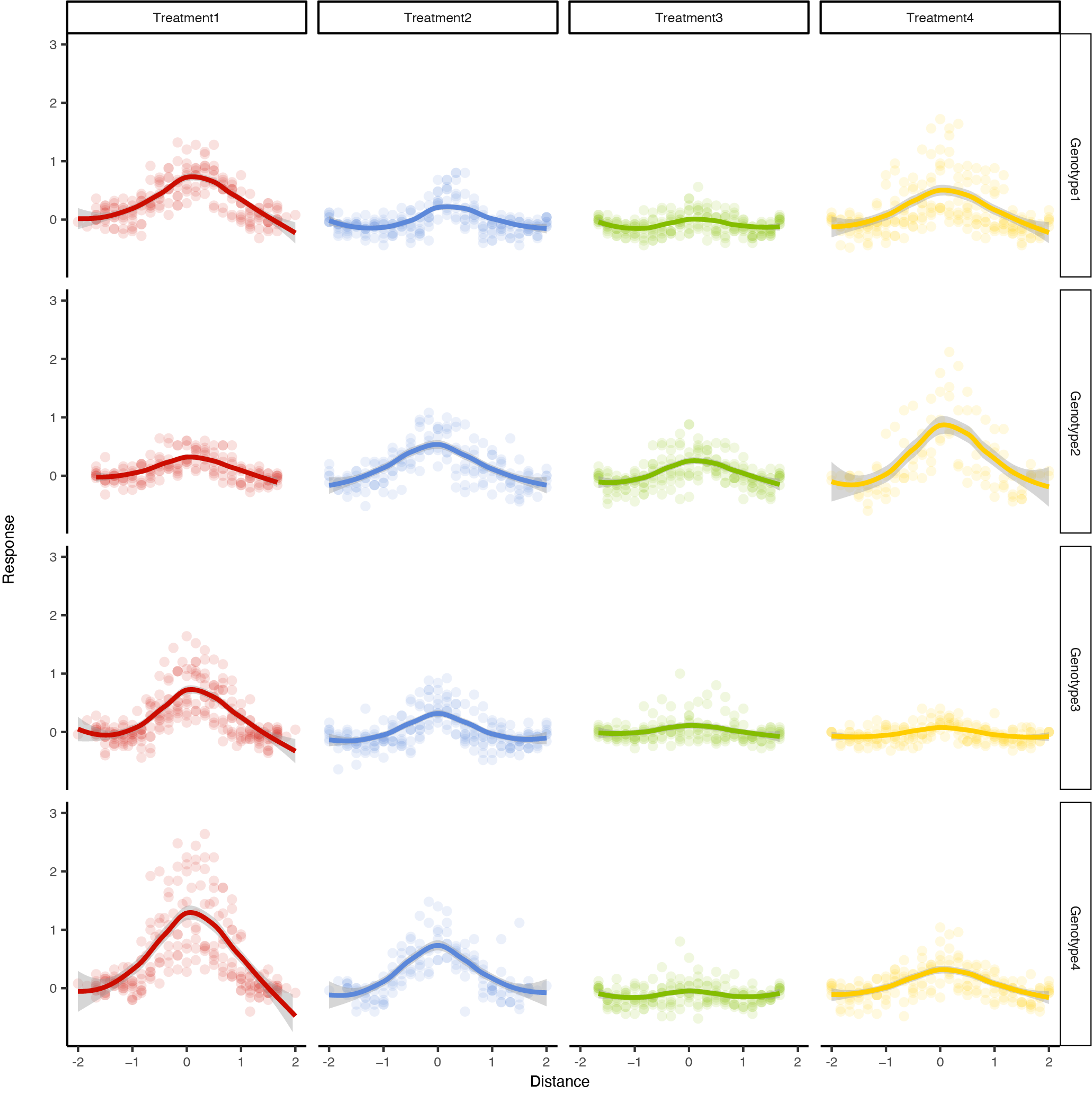
Your data suggest all responses may have a common functional form, they are symmetric with distance, and that they differ only in magnitude.
They also exhibit noticeable scatter around the fitted values. This scatter is (a) roughly symmetric, (b) proportional to the fitted value, yet with (c) some irreducible level of "noise."
We may express this mathematically. Let $f:[0,\infty)\to[0,\infty)$ be the common functional form of the responses. I will assume its scale with distance is unknown and has to be estimated, so let $1/\rho$ be that common scale. For a given combination of treatment $t$ and genotype $g,$ let $\beta_{gt}$ be the amplitude of the response. To model the scatter I will suppose its variance is a linear function of the (true underlying) response. Thus, for an observation of genotype $g,$ treatment $t,$ and distance $x$ the response $Y$ is a random variable with
$$E[Y; x,g,t] = \beta_{gt} f(\rho\, |x|)$$
and
$$\operatorname{Var}[Y; x,g,t] = \sigma^2 + E[Y; x,g,t]\tau^2.$$
This model has $4\times 4 + 3 = 19$ parameters to fit and all may be of some interest, although ultimately you will want to test hypotheses about the $\beta_{gt}.$
There are various ways to fit such a model. A maximum likelihood estimator that assumes the $Y$ have (independent) Normal distributions will behave very much like an adaptively weighted Least Squares estimator, which may represent a good compromise between robustness and simplicity.
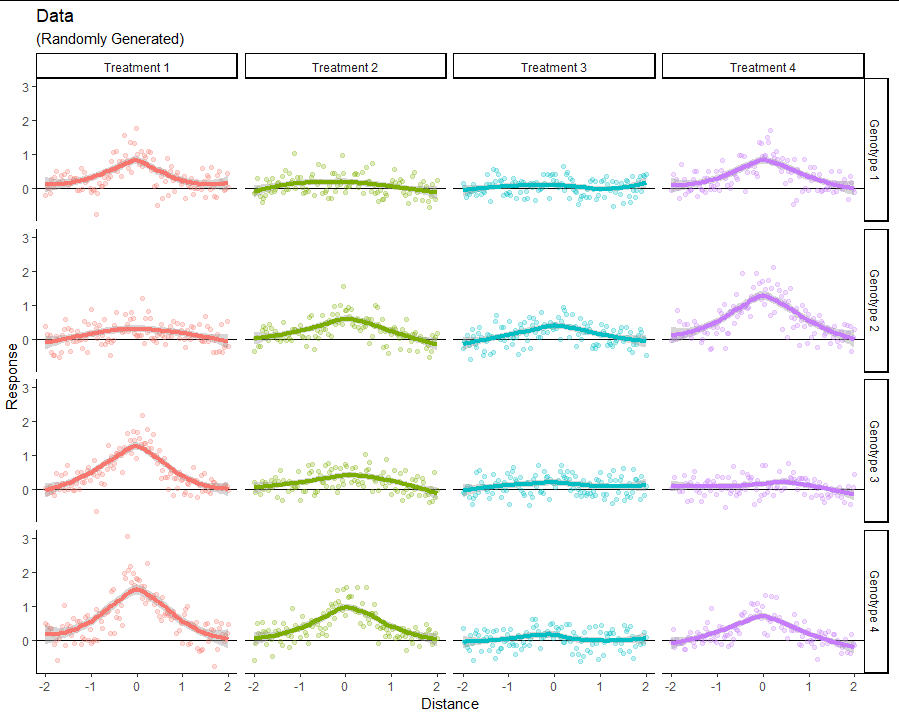
As an example, let's take $f$ to be what physical theory suggests for the attenuation of radiation through a homogeneous medium: a decaying exponential. Here is a dataset of $120\times 4\times 4$ data generated according to such a model. (You can see its parameters near the end of this post.)

The fits are the default Loess smooths offered by ggplot2. I hope you agree this dataset looks qualitatively like yours in all important respects.
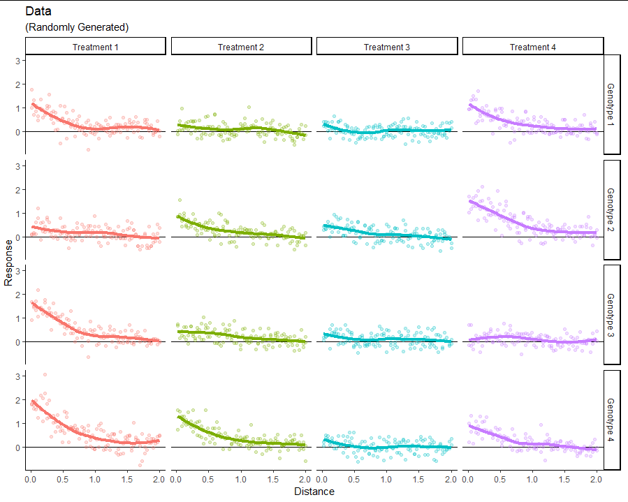
One problem with this graphic is that the Loess smooth (and practically any smooth, for that matter) is going to flatten the peaks at a distance of $0.$ It is better to plot the response against the absolute distance:

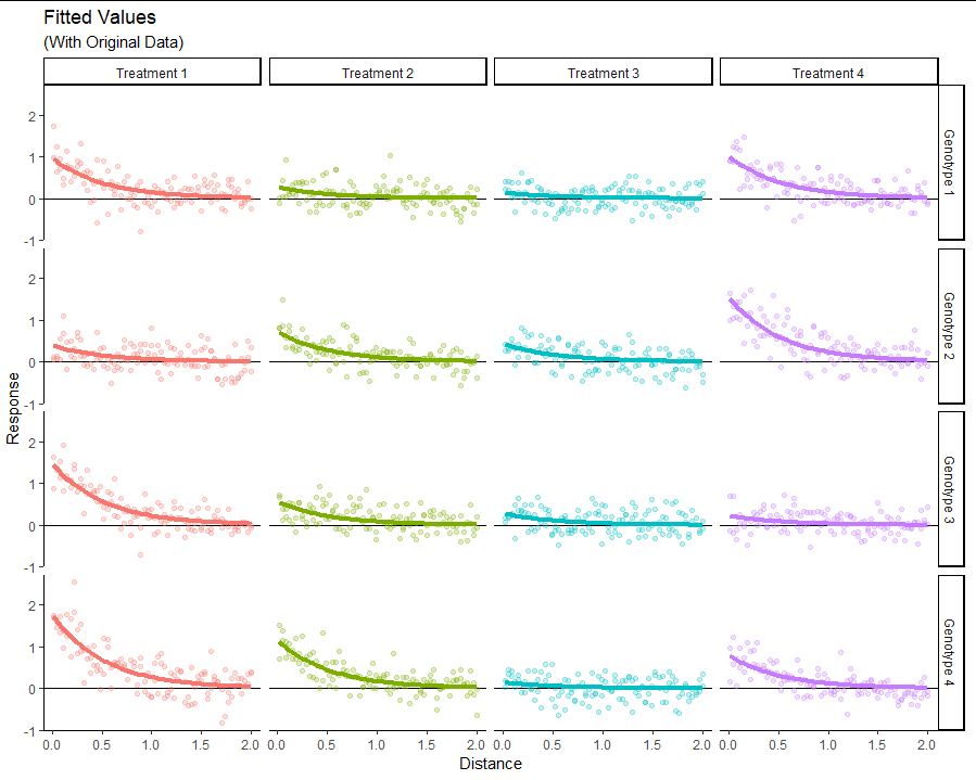
I fit this model using the "nonlinear minimizer" nlm offered in R. Here is its solution:

As usual with Maximum Likelihood estimation, the negative reciprocal of the Hessian of the likelihood at its maximum estimates the covariance matrix of these 19 parameter estimates. The following table reports the square roots of its diagonal as the standard errors (SE) and uses them to compute $t$ statistics for the comparison of the estimates to the known true values. None differ significantly: that is, the fitting procedure works when the data are generated by the assumed model.
                       Actual   Fit     SE        t
Genotype 1 Treatment 1  1.000 0.981 0.0862 -0.22168
Genotype 2 Treatment 1  0.500 0.395 0.1820 -1.29861
Genotype 3 Treatment 1  1.500 1.500 0.0660  0.00131
Genotype 4 Treatment 1  2.000 1.793 0.0590 -1.85298
Genotype 1 Treatment 2  0.250 0.272 0.2540  0.33021
Genotype 2 Treatment 2  0.750 0.728 0.1085 -0.27759
Genotype 3 Treatment 2  0.500 0.566 0.1367  0.90650
Genotype 4 Treatment 2  1.250 1.160 0.0776 -0.95882
Genotype 1 Treatment 3  0.125 0.143 0.4454  0.29498
Genotype 2 Treatment 3  0.500 0.440 0.1647 -0.77498
Genotype 3 Treatment 3  0.250 0.287 0.2414  0.56512
Genotype 4 Treatment 3  0.250 0.147 0.4336 -1.22782
Genotype 1 Treatment 4  1.000 1.034 0.0837  0.39558
Genotype 2 Treatment 4  1.750 1.577 0.0641 -1.62926
Genotype 3 Treatment 4  0.250 0.232 0.2973 -0.24787
Genotype 4 Treatment 4  0.750 0.804 0.1010  0.68505
tau                     0.250 0.272 0.0982  0.87706
sigma                   0.250 0.249 0.0236 -0.16593
rate                    2.000 1.895 0.0424 -1.26810
The covariance matrix furnishes the information needed for comparing the $\beta_{gt}$ to each other using the usual t-tests and F-tests. Provided the sample sizes for each combination of genotype and treatment are comparable, we can expect the correlations among the estimates of these parameters to be very small. (Because there is a clear tradeoff between $\tau$ and $\sigma$ in this model, their estimates will be strongly negatively correlated). This lack of correlation simplifies the direct comparison of any two estimates. For instance, to test whether Genotypes 3 and 4 differ on Treatment 1, we compare the difference in estimates to the root sum of squares of their variances:
$$\frac{1.500 - 1.793}{\sqrt{0.0660^2 + 0.0590^2}} = -3.31.$$
Because a standardized Normal variable has a very small chance of exceeding $|-3.31|$ in magnitude (less than one in a thousand), you would likely conclude there really is a difference. (As the table shows, the actual difference is $1.500 - 2.000 = -0.500$ and so, in this case, that conclusion is correct.)
This model is readily modified to accommodate different function forms for its response vs. distance and its the variance vs. distance components. For instance, $f$ could be replaced by a spline. You could even contemplate using different rates (or scale factors) for each of the genotypes, each of the treatments, or even for each unique combination.
If possible, select those functional forms based on theoretical considerations. If that's not possible, hold out a confirmation dataset and select among likely functional forms by exploring or through cross validation.
Further details can be found in the R code that generated this example.
#
# Specify the parameters.
#
beta <- rbind("Genotype 1" = c(1, 1/4, 1/8, 1),
              "Genotype 2" = c(1/2, 3/4, 1/2, 7/4),
              "Genotype 3" = c(3/2, 1/2, 1/4, 1/4),
              "Genotype 4" = c(2, 5/4, 1/4, 3/4))
colnames(beta) <- paste("Treatment", 1:4)
sigma <- 1/4
tau <- 1/4
rate <- 2
#
# Simulate.
#
ff <- function(x) exp(-abs(x))
# ff <- function(x) (1 + x^2)^(-1)
rf <- function(x, beta, tau, sigma, rate) {
  y <- beta * ff(rate * x)
  rnorm(length(y), y, sqrt(sigma^2 + y * tau^2))
}

n.per.group <- 120*2
set.seed(17)
x <- seq(-2, 2, length.out=n.per.group)
X <- expand.grid(Distance = x,
                 Genotype = rownames(beta),
                 Treatment = colnames(beta))
X$Response <- c(sapply(c(beta), function(b) rf(x, b, tau, sigma, rate)))
#
# Plot.
#
library(ggplot2)
ggplot(X, aes(abs(Distance), Response, color = Treatment)) +
  geom_hline(yintercept=0) +
  geom_point(alpha = 1/4, show.legend = FALSE) +
  stat_smooth(method = "loess", formula = "y ~ x", size=1.5,
              show.legend = FALSE, se=FALSE) +
  labs(x = "Distance", y = "Response") +
  theme_classic () +
  facet_grid(Genotype ~ Treatment) +
  ggtitle("Data", "(Randomly Generated)")

ggplot(X, aes(Distance, Response, color = Treatment)) +
  geom_hline(yintercept=0) +
  geom_point(alpha = 1/4, show.legend = FALSE) +
  stat_smooth(method = "loess", formula = "y ~ x", size=1.5, show.legend = FALSE) +
  labs(x = "Distance", y = "Response") +
  theme_classic () +
  facet_grid(Genotype ~ Treatment) +
  ggtitle("Data", "(Randomly Generated)")
#
#
# Fit.
#
f <- function(theta) {
  beta <- matrix(exp(theta[1:16]), 4,
                 dimnames=list(paste("Genotype", 1:4),
                               paste("Treatment", 1:4)))
  tau <- exp(theta[17])
  sigma <- exp(theta[18])
  rate <- exp(theta[19])

  y <- beta[cbind(X$Genotype, X$Treatment)] * ff(X$Distance * rate)
  -sum(dnorm(X$Response, y, sqrt(sigma^2 + y * tau^2), log = TRUE))
}

theta <- rep(0, 19)
fit <- nlm(f, theta, hessian=TRUE)

theta.hat <- fit$estimate
beta.hat <- matrix(exp(theta.hat[1:16]), 4,
           dimnames=list(paste("Genotype", 1:4),
                         paste("Treatment", 1:4)))
tau.hat <- exp(theta.hat[17])
sigma.hat <- exp(theta.hat[18])
rate.hat <- exp(theta.hat[19])
#
# Plot.
#
X$Prediction <- c(beta.hat[cbind(X$Genotype, X$Treatment)] * ff(X$Distance * rate.hat))
ggplot(X, aes(Prediction, Response)) +
  geom_point(alpha=1/2) +
  geom_abline(intercept=0, slope=1, size=1.5, color="#d01010") +
  ggtitle("Model Fit")

ggplot(X, aes(abs(Distance), Prediction, color = Treatment))  +
  geom_hline(yintercept=0) +
  geom_point(aes(y=Response), alpha=1/4, show.legend=FALSE) +
  geom_line(size=1.5, show.legend=FALSE) +
  labs(x = "Distance", y = "Response") +
  theme_classic () +
  facet_grid(Genotype ~ Treatment) +
  ggtitle("Fitted Values", "(With Original Data)")
#
# Extract the covariance matrix.
#
V <- solve(fit$hessian)
s <- rbind(Actual = c(beta, tau, sigma, rate),
       Fit = exp(fit$estimate),
           SE = sqrt(diag(V)),
           t = (fit$estimate - log(c(beta, tau, sigma, rate))) / sqrt(diag(V)))
colnames(s) <- c(c(outer(rownames(beta), colnames(beta), paste)), "tau", "sigma", "rate")
print(t(s), digits=3)

colnames(V) <- rownames(V) <- colnames(s)
#
# Check the correlation among the estimates.
#
Sigma <- t(V/sqrt(diag(V))) / sqrt(diag(V))
# Shows little correlation among the betas; negative correlation between tau and sigma
image(seq_along(colnames(Sigma)), seq_along(rownames(Sigma)), Sigma,
      main="Variance-Covariance Matrix of Estimates")

Sigma <- pmin(1, pmax(-1, Sigma))
h <- hclust(as.dist(matrix(acos(Sigma), nrow(V))), method="median")
plot(h)
