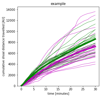
Nice study! Some finer details for your cumulative plot seem to be missing:
Do you only have 2 groups of fish represented in that plot and are you interested in comparing the "average group trajectory" across these two groups?
What do you actually mean by "individual replicate" in this plot? Does "individual replicate" correspond to an individual fish or to a pair of individual fish? It is important to clarify what entity is implied by "individual replicate, as this entity will need to be represented in your modelling.
Assuming you are indeed interested in comparing the "average group trajectory" across 2 groups, one way of going about this is to use a so-called hierarchical generalized additive mixed effects model (HGAM). See https://peerj.com/articles/6876/ for the article Hierarchical generalized additive models in ecology: an introduction with mgcv by Pedersen et al. which will show you how to pull this off.
In this type of model, you will treat the entity of interest (e.g., individual fish if that is what you mean by "individual replicate") as a random grouping factor. Each entity will have repeated response measurements associated with it, corresponding to the cumulative distance travelled over time. When plotted over time for a specific entity, these measurements will form an observed trajectory specific to that entity.
The model will allow you to capture the underlying shape of each entity's trajectory (for all entities represented by the one included in your study) and hence the underlying shape of the average trajectory in each of your 2 groups of entities. (Again, the average trajectory of a group refers to all entities represented by the ones included in your study for that particular group.) Once you are able to recover the average group trajectories, you can compare them across the entire time span and identify whether they differ across the entire span or perhaps over just specific portions of it.
When you specify your HGAM model, you'll need to consider how the entities specific to a group vary about the average trajectory in that group. For example, the simplest scenario would be that the individual entities in each group have individual trajectories that are shifted up or down from the average trajectory of each group by a random amount. More complicated scenarios would allow for the individual trajectories to be "stretched" and "shifted" versions of the average trajectory of the group. Each of these scenarios would come with its specific model specification, as explained in the above paper.
The HGAM models provide great flexibility because they only assume that the individual (and group) trajectories are smooth and possibly nonlinear. In this sense, these models imply a nonparametric shape for these curves.
Another option for your setting would be to consider that the possibly shape of the individual (and group) trajectories can be captured via a small number of parameters (e.g., via polynomial regression). This approach is popular in growth curve analysis.
Other articles that might come in handy if you decide to pursue these types of approaches include:
How to analyze linguistic change using mixed models, Growth Curve Analysis and Generalized Additive Modeling by Winter et al. (https://academic.oup.com/jole/article/1/1/7/2281883)
GENERALISED ADDITIVE MIXED MODELS FOR DYNAMIC ANALYSIS IN LINGUISTICS: A PRACTICAL INTRODUCTION by Márton Sóskuthy (https://eprints.whiterose.ac.uk/113858/2/1703_05339v1.pdf)
Growth Curve Analysis and Visualization Using R by Daniel Mirman (https://www.routledge.com/Growth-Curve-Analysis-and-Visualization-Using-R/Mirman/p/book/9781466584327 and https://www.danmirman.org/gca);
Overview GAMM analysis of time series data by Jacolien van Rij (https://jacolienvanrij.com/Tutorials/GAMM.html);
Noam Ross' Resources for Learning About and Using GAMs in R (https://github.com/noamross/gam-resources) and free course on GAMs in R
(https://noamross.github.io/gams-in-r-course/).


