Here are a few of my thoughts about your data. I hope some of them will be useful.
To a good approximation, your data can be summarized as frequencies f and discrete
values v, corresponding to your six intervals, as shown below. Values are midpoints of the intervals, with arbitrary value
$2.5$ for the last (open-ended) interval)
v = c(-3:1, 2.5); f = c(9,32,109,180,132,38)
v
[1] -3.0 -2.0 -1.0  0.0  1.0  2.5
f
[1]   9  32 109 180 132  38
Then the sample size is $n = 500,$ and the approximate mean a and standard
deviation
s as shown below:
 n = sum(f); n
 [1] 500
 a = sum(f*v)/n; a
 [1] 0.054
 s = sqrt(sum(f*(v-a)^2)/(n-1)); s
 [1] 1.172533
I have simulated a sample that might have come from the
same population, by spreading values uniformly in each of the middle four
intervals and using beta distributions that put relatively fewer
points at the extremes than uniform. Your final interval is split
into two intervals of length $1.$
x = c(-3.5+rbeta(9,2,1), runif(32,-2.5,-1.5),
      runif(104,-1.5,-.5), runif(180,-.5,.5),
      runif(132,.5,1.5), 1.5+2*rbeta(38,1,2))
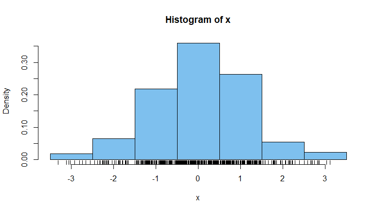
The histogram below shows the
results for intervals, the rug along the horizontal axis
shows locations of the 500 simulated points, and output
for a 'non-plotted' histogram shows bin frequencies.
(Notice that the count $38$ in your open-ended interval
has been split over two bins $27+11.)$
cutp = seq(-3.5, 3.5, 1)
hist(x, prob=T, br = cutp, col="skyblue2")
 rug(x)
hist(x, br = cutp, plot=F)$counts
[1]   9  32 104 180 132  27  11

The histogram seems to have a vaguely normal shape and
the normal curve with appropriate mean and standard deviation is
a reasonably good fit.
(See the dotted density curve in the figure below.)
A = mean(x);  S = sd(x);  A;  S
[1] 0.03776537
[1] 1.152983
curve(dnorm(x, A, S), add=T, lwd=3, lty="dotted", col="darkgreen")
Finally, I used the kernel density estimation (KDE) procedure density in R to see a possible
continuous distribution corresponding to the simulated data. The default kernel
type in R is gaussian. Roughly speaking, this KDE is a mixture of normal distributions over various
intervals (unrelated to the histogram). The length of these intervals is called
the bandwidth of the KDE; to get a smoother KDE, I have used a slightly wider bandwidth than
the default in R, with adj=1.2. (See the brown density curve in
the figure below.) In R, the KDE is represented by 512 $(x,y)$ pairs, which may
be displayed using $-notation density(x,adj=1.5)$x and density(x,adj1.5)$y
(not shown).
lines(density(x,adj=1.5), col="brown")

Note: Bear in mind that a different seed at the beginning, might have
'reconstructed' the data in a slightly different way, leading to a slightly
different KDE. You can try several runs, omitting the set.seed statement.


