I want to make a simulation experiment on the sensitivity of Pearson correlation coefficient to the distribution types of variables. In other words, I want to demonstrate "when the distributions of variables are not Gaussian, the Pearson correlation coefficient of samples is expected to be not a good estimator of that for the population."
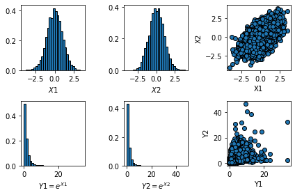
With support of Python, I firstly sampled 10000 examples from a bivariate normal distribution with a arbitrarily defined mean vector and covariance matrix, i.e., $\mu=[0; 0]$, $\Sigma=[1, 0.6; 0.6, 1]$. The two variables are termed here as $X_1$ and $X_2$. Then I constructed a multivariate log-normal distribution by performing 'exponential' transformation on $X_1$ and $X_2$, i.e., $Y_1=e^{X_1}$, $Y_2=e^{X_2}$. After that, I calculated the Pearson correlation coefficient of $\rho(X_1$, $X_2)$, and $\rho(Y_1$,$Y_2)$.
If there is a large difference between $\rho(Y_1$,$Y_2)$ and $\rho(X_1$, $X_2)$, can I believe that my proposition is validated?
My viewpoint: I think this experiment is questionable, because we do not know the theoretical correlation for the log-normal variables $Y_1$ and $Y_2$, or the correlation of $X_1$ and $X_2$ is not equivalent to that for $Y_1$ and $Y_2$. However, how can we simulate two log-normal samples with a known correlation coefficient?
The following is my code and the result:
import matplotlib.pyplot as plt
import numpy as np

# Simulate correlated variables x and y
rho = 0.6
mu = [0, 0]
C = [[1, rho], [rho, 1]]
N = 10000
X1, X2 = np.random.multivariate_normal(mu, C, N).T

# test = np.corrcoef(X1, X2)
fig = plt.figure()
plt.subplot(2, 3, 1)
plt.hist(X1, bins = 30, density = True, edgecolor = 'k')
plt.xlabel(r'$X1$')
plt.subplot(2, 3, 2)
plt.hist(X2, bins = 30, density = True, edgecolor = 'k')
plt.xlabel(r'$X2$')
plt.subplot(2, 3, 3)
plt.scatter(X1, X2, marker = 'o', edgecolors = 'k')
plt.xlabel('X1')
plt.ylabel('X2')

# Construct the log-normal distributions
Y1 = np.exp(X1)
Y2 = np.exp(X2)

plt.subplot(2, 3, 4)
plt.hist(Y1, bins = 30, density = True, edgecolor = 'k')
plt.xlabel(r'$Y1=e^{X1}$')
plt.subplot(2, 3, 5)
plt.hist(Y2, bins = 30, density = True, edgecolor = 'k')
plt.xlabel(r'$Y2=e^{X2}$')
plt.subplot(2, 3, 6)
plt.scatter(Y1, Y2, marker = 'o', edgecolors = 'k')
plt.xlabel('Y1')
plt.ylabel('Y2')

plt.tight_layout()

