2
$\begingroup$

It's been a while I fitted GAMs, but I always find interpreting smooth terms to be somewhat confusing because there is no positive or negative sign for co-efficients. The plot does not always show a clear upward or downward trend. I always double check GAM output by fitting the same model using GLM or another non-linear model. For instance, I fit the following model in R

mod1 <- gam(severity ~  s(mean_rh, k = 8) + s(mean_temp, k = 10) + s(mean_ws, k =7) + s(avg_daily_rain, k = 7), family = betar(),  data = dat_seasonal)

summary(mod1)

Here is the output:

Formula:
disease_severity ~ s(mean_rh, k = 8) + s(mean_temp, k = 10) + 
    s(mean_ws, k = 7) + s(avg_daily_rain, k = 7)

Parametric coefficients:
            Estimate Std. Error z value Pr(>|z|)
(Intercept)  -0.1687     0.1374  -1.228    0.219

Approximate significance of smooth terms:
                    edf Ref.df Chi.sq  p-value    
s(mean_rh)        1.000  1.000   2.76 0.096633 .  
s(mean_temp)      4.231  4.598  74.22  < 2e-16 ***
s(mean_ws)        2.461  2.673  17.53 0.000669 ***
s(avg_daily_rain) 1.000  1.000  49.89  < 2e-16 ***
---
Signif. codes:  0 ‘***’ 0.001 ‘**’ 0.01 ‘*’ 0.05 ‘.’ 0.1 ‘ ’ 1

R-sq.(adj) =  0.847   Deviance explained = 91.8%
-REML = -29.205  Scale est. = 1         n = 37

The model output suggests that mean_temp, mean_ws and avg_daily_rain are significant, but there is no information on whether the effect is negative or positive.

Here is the plot:

plot(mod1, pages = 1, all.terms = TRUE, rug = TRUE, residuals = TRUE, pch = 1, cex = 1, shade = TRUE, seWithMean = TRUE, shift = coef(mod1)[1])

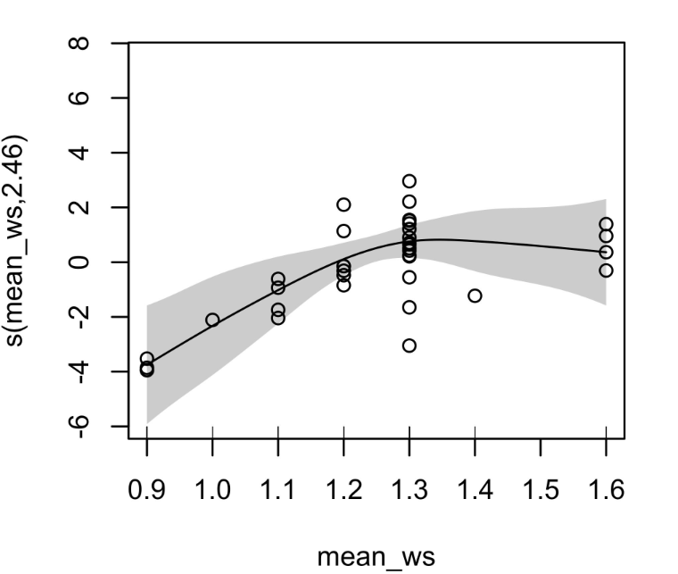
From the plot it's clear that mean_temp and avg_daily_rain have a significant positive effect. But what about mean_ws? The curve is going up from wind speed up to a wind value of 1.3, and then the curve is almost flat from 1.3 to 1.6. I can only guess that the effect is negative. DHARMa residuals are fine and the gam.check() output is also okay. Thank you!

$\endgroup$

1 Answer 1

6
$\begingroup$

Coefficients in GAMs

First off, the coefficients definitely can be negative. I think you are confusing the coefficients with the edf terms. As an example, I have fit this model with the mcycle data from the MASS package to show you.

library(mgcv)

fit <- gam(accel ~ s(times),
           data = MASS::mcycle,
           method = "REML")

coef(fit)

Shown below:

(Intercept)  s(times).1  s(times).2  s(times).3  s(times).4  s(times).5 
 -25.545865  -63.799013   41.202002 -109.827071  -23.305431   35.132376 
 s(times).6  s(times).7  s(times).8  s(times).9 
  90.759312   -8.721425 -106.596311   17.592814 

You can see that in fact many of the coefficients are positive and many are negative.

Model Summary and Plots

However, I don't find this information is super useful for your purpose. The rest of the information you usually get from mgcv summary and plots is far more useful if you are looking for a meaningful interpretation.

The edf part of the summary is your expressive degrees of freedom and indicates how curvilinear your predictor is. This alone doesn't say much about the direction of the relationship, only how straight the line should be. You can see this with the two edfs of 1. While they have the same curvilinearity, their plots show one has a positive relationship and the other has a negative relationship. Here so far your interpretation is correct.

However, what you said about mean_ws is wrong. I show it here by itself so its more clear:

enter image description here

It is not negative, or rather it is not at least strictly negative (it does slightly taper off but not dramatically). Without knowing how wind speed normally works, I can see that it begins to have a positive relationship, and then has a plateau effect. Something may be theoretically influencing the relationship once it gets to 1.3, and then the relationship between the two variables has a flattening effect. Saying it is negative implies that this relationship continuously decreases your DV.

However, there are two caveats here, and I have circled what I mean in the plot.

enter image description here

First, the point where the data plateaus seems to have a high level of clustering of points there, so I would look into why that is happening. Second, the far right has far less data compared to the cluster on the left, so I would see why this is, as it may signify why the relationship looks this way. Consider if you have 100 data points at the left cluster and 1 data point on the right cluster that has a much lower value, this would cause an artificial bend in your GAM curve. This is actually why the standard error shading is larger at the end, because this part of your regression becomes less accurate with less data. So while this isn't a problem for your regression per se, it may be worth looking into why this relationship exists.

$\endgroup$
0

Your Answer

By clicking “Post Your Answer”, you agree to our terms of service and acknowledge you have read our privacy policy.

Not the answer you're looking for? Browse other questions tagged or ask your own question.