2
$\begingroup$

I am doing a statistical test (program used is SPSS). On the basis of distribution and sample size, I have to chose the correct variable analysis. I also have to justify every decision. I have two independent groups with a sample size of $n=43$ and $n=12$. My first step is to decide whether the data in groups is normally distributed.

As per instructions:

  • When deciding if data is normally distributed, I should take into consideration the use of a histogram or QQ plot along with a Kolgomorov-Smirnov or Shapiro-Wilk test. I should also consider mean and median difference, skewness, and kurtosis values .

  • If $n>30$, I should consider data being normally distributed if the deviation is not greater than moderate.

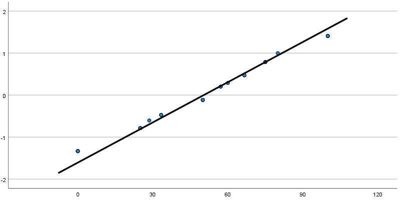
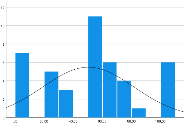
Now regarding Group 1, there exists a non-existent mean/median difference and kurtosis/standard error and skewness/standard error point to normality, but Kolgomorov-Smirnov and Shapiro-Wilk test values are less than $0.05$. The QQ plot shows values gathered in a line. The data in the histogram seems to have close to symmetric distribution, but how do extreme values at 0% and 100% affect my decision if data is normally distributed? Is the data normally distributed?

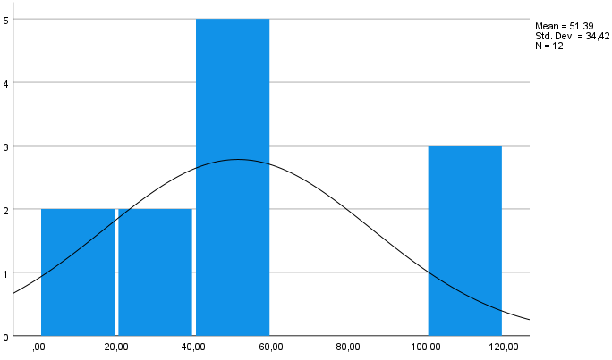
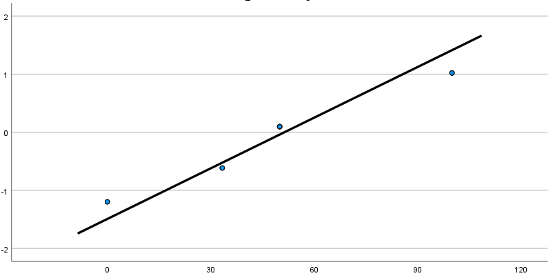
Regarding Group 2, I am pretty much lost. Mean/median difference, kurtosis/standard error, skewness/standard error and the SW-test does not seem point to deviation, but the KS test has a value of 0.019. In the histogram, there is also an extreme value at 100% that I don't know how to relate to. How does it affect normality? A small sample size of $12$ ($n<30$) doesn't allow one to consider a normal distribution (if the deviation is not greater than moderate). Does this data have a normal distribution?

When considering the normality of a distribution, is there a "grade" regarding histograms, QQ plots, skewness/kurtosis, Kolgomorov-Smirnov and Shapiro-Wilk tests, etc.?

If one group has a normal distribution but the other does not, and considering small sample in Group 2, should I continue with a non-parametric test? Also, how do I decide if the deviation is moderate?

Group 1 Descriptives:

  • Mean=50.4
  • Median=50
  • Standard Deviation = 31
  • Kolgomorov-Smirnov = 0.021
  • Shapiro-Wilk = 0.012
  • Kurtosis/standard error = -0,162
  • Skewness/standard error = -0,024

Group 1 Histogram

Group 1 Histogram

Group 1 QQ plot

Group 1 QQ plot

Group 2 Histogram

  • Mean = 51.5
  • Median = 50
  • Standard Deviation = 34.4
  • Kolgomorov-Smirnov = 0.019
  • Shapiro-Wilk = 0.060
  • Kurtosis/standard error = -0,057
  • Skewness/standard error = 0,017

Group 2 Histogram

Group 2 QQ plot

Group 2 QQ plot

Part 2 (In reference to posted answer)

Regarding the equality of variance assumption. I assumed equality of variance is examined by doing Levene's test for equality of variances. I proceeded to test the data for equality of variance and got the following results. The sig. value was 0.955. That's pretty good value, right? I suppose that the assumption of homogeneity of variance has been met?

enter image description here

Now regarding the sample sizes of my groups not being equal. It was some time ago and I can't find direct quote but basically, the author said that the larger the difference between sizes of sample groups, the larger the Sig. of Levene's test should be in order to use Independent T-test. Is this correct? If so, is sig. value of 0.955 enough?

You also noted the gaps between bars in the histogram. I was wondering the same thing. I went through all variable values and found that some values (that were very close) in the histogram for group 1 have been lumped together, although not for group 2. I asked a teacher about this but he said that histograms looked ok and I should use them as they are. Now I should note that the initial sample size for the whole variable was 1000 but I had to filter it for different parameters.

If assumptions are met, I would like to stick to the independent t-test as a first choice because we haven't discussed Welch's in this course. Even the course literature refers to "t-test with corrected degrees of freedom" not being discussed. Now I'm translating directly but I assume it's referring to Welch's or something similar. I believe as long as my line of reasoning is logical and I account for weaknesses when I'm justifying my choice, I think I'm good. Feel free to let me know if my interpretations are wrong in any way.

$\endgroup$
2
  • $\begingroup$ What test are you trying to conduct? An independent samples t-test? $\endgroup$ Commented May 26, 2023 at 1:05
  • $\begingroup$ Well, as a part of the assignment, if I can conclude that variables have normal distribution and propperly justify my decision on normality of variables, then yes, I guess that independent samples T-test would be appropriate. $\endgroup$
    – Chester
    Commented May 26, 2023 at 1:28

2 Answers 2

3
$\begingroup$

I asked in the comments, but based off the wording of your question, I assume this is for an independent samples t-test, where you compare the means of two independent groups and test their statistical significance.

First off, despite what some textbooks may say, there is no real golden rule when it comes to which sample size will get you a normal distribution. I would consider $n=30$ to be pretty low in many cases for achieving normality. I previously did an analysis with around $5,000$ observations and it still had a heavily right-skewed inverse Gaussian distribution. Sample size only minimizes the threat of imprecise tests and potentially makes a distribution more normal. Normality is generally approximate, so it is more up to you to perform detailed detective work to decide whether or not you should use one thing or another with inferential statistics.

With that point in mind, I personally prefer visualization over statistical tests of normality. First off, it is well known that Shapiro-Wilk and Kolgomorov-Smirnov can be easily flagged with large sample sizes even when the data is normally distributed. I have recent experience with this where I had an almost straight line for a QQ plot of thousands of observations, but the tails were slightly curved at the ends of the QQ line and flagged the test for no reason other than slight fluctuation from normality. Plots will generally give you a more detailed look at what is actually going on.

To that point, your data doesn't seem that bad. Your QQ plots are pretty linear, so the theoretical quantiles (where your data is supposed to be distributed) and your empirical quantiles (where the data is actually located) line up the way they should. It is clear from the histogram that there are some gaps between your bars (I discuss this a bit more below), but this isn't incredibly damning either. The kernel density (shown by the black line) seems to still be approximately normal.

The only potential problems with your data are the following:

  • The equality of variance assumption does not hold for your groups. They clearly have very different distributions which will affect a parametric t-test. In this case, a Student t-test is not helpful because the results will be biased based off the pooled variance.
  • The sample sizes for your groups are not equal, so conducting a t-test on these groups should come with cautious interpretation given sample size can greatly affect the outcome of a test. Consider if you compare the heights of $1,000$ people in one group versus the heights of $10$ in another. While there may be a difference, your perspective on that can be fairly limited.
  • While it isn't an issue per se, I'm curious why there are gaps between your bars in the histogram. While this isn't a nail in the coffin of your test, it is important to investigate. For example, if your data isn't independent (e.g. you measure the same person multiple times), it can sometimes exhibit this sort of clustered behavior in histograms.

In any case, with the assumption this is for an independent samples t-test, you should almost always use a Welch t-test by default. The two common assumptions not met for the Student t-test, homogeneity of variance and normality, are generally not a problem for the Welch t-test. Given your data doesn't have any other apparently massive flaws, you can run this just fine. For more details, see the citation below, which involves simulations of Student and Welch t-tests under different distributional properties. It is fairly readable for somebody even without math background.

Citation

Delacre, M., Lakens, D., & Leys, C. (2017). Why psychologists should by default use Welch’s t-test instead of Student’s t-test. International Review of Social Psychology, 30(1), 92. https://doi.org/10.5334/irsp.82

Edit

Since you have updated the question, I will update my thoughts. The TLDR is that you can probably go ahead and use your Student t-test with caveats, but it's generally safer to use Welch and there are some important points you made that warrant discussion. First among them...

You also noted the gaps between bars in the histogram. I was wondering the same thing. I went through all variable values and found that some values (that were very close) in the histogram for group 1 have been lumped together. Although not for group 2. I asked a teacher about this but he said that histograms looked ok and I should use them as they are. Now I should note that the initial sample size for the whole variable was 1000 but I had to filter it for different parameters.

A couple things. First, there is a lot of missing information here that seems to be omitted from your previous question. Why was the sample filtered so? That seems to be a giant change in the sample size. Since this is for homework, you don't really have to justify what you did, but I'm curious why there is such a steep drop in participants. Surely this will change the distributional properties of your data, especially at very small sample sizes.

Second, you can of course use your data as-is regardless of the histogram bins. My question was more to get you to understand your data better. Why is it doing this? For example, it is common with discrete data with limited values (like Likert scale data) to stack up into each bin, which contributes to non-normality in Likert scale samples. It is important to know this about your own data. If somebody asks you these things in the future (like journal reviewers, etc.), you need to have a good explanation as to why.

Third, about your comment for Levene's test:

It was some time ago and I can't find direct quote but basically, the author said that the larger the difference between sizes of sample groups, the larger the Sig. of Levene's test should be in order to use Independent T-test. Is this correct?

I don't know if I buy that argument about Levene's test because 1) that definition doesn't make sense since the value of $p$ isn't based on magnitude and 2) it suffers from some of the same issues as the other normality tests I mentioned. As an extreme example, we can take one sample of $n = 10,000$ and another of $n = 10$ with the same mean and standard deviation and still end up with a significant Levene test, as shown below with simulated data in R.

#### Load Libraries ####
library(tidyverse)
library(rstatix)

#### Set Random Seed for Reproducibility ####
set.seed(123)

#### Simulate Groups (Same Mean/SD) ####
group.1 <- rnorm(n=10000,
                 mean=50,
                 sd=1)

group.2 <- rnorm(n=10,
                 mean=50,
                 sd=1)

#### Turn into Long Format ####
df <- data.frame(group.1,
                 group.2) %>% 
  as_tibble() %>% 
  gather(key = "group") %>% 
  mutate(group = factor(group))

#### Conduct Levene Test ####
df %>% 
  levene_test(value ~ group)

Which shows a significant $p$ despite being normally distributed with identical mean/sd:

# A tibble: 1 × 4
    df1   df2 statistic        p
  <int> <int>     <dbl>    <dbl>
1     1 19998      108. 3.55e-25

However, looking at the group standard deviations again and your Levene's test, you are probably safer with the equality of variance assumption than I speculated, but the sample size differences still offers problematic theoretical speculation. I refer back to my heights example, which should be clear why you should interpret with caution. Regardless if the t-statistic is "right", what we can deduce from such a test is limited because it doesn't really make sense to do. Your case isn't so dramatic, but it still warrants discussion.

As a final note, you can probably get away with using your Student t-test, but just keep in mind that you are still going to have to explain its limitations given your data. The biggest issue is that your Group 1 is four times as large as Group 2. I don't know if you feel confident about differences between those two groups, but I wouldn't be. I would at minimum note it as a limitation in your homework.

$\endgroup$
0
3
$\begingroup$

I am going to make so many general and specific comments that they are better presented as an answer, intended to complement the very helpful and detailed answer from @Shawn Hemelstrand.

I am also broadening the discussion so that is directed not just at a particular assignment but also at more general questions of how to analyse similar data.

What are the data?

Although it can be argued that the correct analysis does not depend on what the data (supposedly) are measuring, that information can still be interesting and also helpful. In science, although not so often in an assignment, any researcher should use their judgement based on knowing how certain kinds of measurement usually behave. That is, the researcher should know in particular what larger samples would often be like, either from direct experience or by looking at literature on the variables concerned.

The data need more careful discussion

Any really thorough answer depends on seeing not just the descriptive statistics and graphs you posted -- which were helpful -- but also the raw data. The datasets here are so tiny that if they are available they should be posted in full to allow really thorough discussion.

To flag a point touched on but not developed fully, it seems that the data are bounded by 0 and 100%. I will come back to that.

I note from the quantile plots 11 distinct points for the group with sample size 43 and 4 distinct points for the group with sample size 12. What's more, most if not all of the values appear to be multiples of 5.

If that means the data were binned before SPSS drew the graphs, or that SPSS binned the data in drawing the graphs, that is not good practice and at least needs to be flagged. If the raw data come with such spikes of duplicated values, that at least needs to be flagged and discussed.

The graphs could be improved

I am happy to blame SPSS defaults as dopey if they are, but the choices of 0 30 60 90 120 as labelled points for the quantile plots and 0.00 20.00 40.00 60.00 80.00 and 100.00 for the histograms are not just inconsistent, but also poor choices for a major and a minor reason. The major reason is from previous discussion we should be seeing say 0(20)100 on the quantile plots. Extra labels or at least axis ticks at 10(20)90 would do no harm. The minor reason is that those .00 are not even cosmetic, but silly, given the apparent resolution of the data.

I would prefer a dotplot or even stem-and-leaf plot to a histogram for this kind of data. I know that histograms allow superimposed normals but they aren't to me easier to interpret than quantile normal plots.

Normality is frustrated if the data are bounded

It's an elementary point (meaning here fundamental as well as introductory) that normal distributions are unbounded. We often treat that lightly, as when a fit of a normal distribution to human heights can look good and we happily ignore the very tiny probability predicted for negative heights. But when both bounds, here 0 and 100%, occur in the sample we should be more cautious.

Be more circumspect with wording

Wording such as (1) "Is my distribution normal?" is always over-simplified. Unfortunately, a careful discussion obliges more long-winded wording such as (2) "Is my distribution close enough to normal to make it defensible to use procedures for which marginal normal distributions are an ideal?". If it is argued that people (should) know that (1) is shorthand for (2), well, good, but reading that kind of wording (1) always makes me feel uncomfortable.

Using multiple criteria is awkward

You have been given multiple criteria that you could use (different plots; different tests; skewness and kurtosis) but (it seems) little guidance on how to weigh them comparatively if they don't agree. Juggling several criteria seems common practice in some fields but nevertheless is rather muddled. Learners are given a raw deal if expected to understand not just individual guidelines but what to do if they conflict. As already brought out in discussion to some degree, these criteria find varying favour among statistically-minded people. A personal view -- but one nevertheless not unique to me as it is quite often aired on CV -- is that normal quantile plots are by far the best guide in this issue. Tests for normality are often unhelpful for differing reasons. While I will often look at skewness and kurtosis as descriptive statistics, they are a weak reed to decide on closeness to normality. The chicken-and-egg learning and decision problems are that you need to have experience with normal quantile plots before you can interpret them carefully; nevertheless even experienced people might still disagree about interpretation. The problem is a fetish of objectivity in the guise of trying to automate decisions and downplaying not just the need for, but the value of, judgement based on experience.

A distinct but related issue is assessing closeness to normality can be easier if there are alternatives to consider, as when the fit of a normal is compared with the fit of a gamma or a lognormal. Here the most obvious brand-name distribution as an alternative is some kind of beta distribution to match the boundedness, but I guess that is a little esoteric at the level of this assignment.

Why go back to the early 1970s?

Your assignment is your assignment, but the challenge given is in my view about 50 years behind the state of the art. If the main focus is the difference between means, I would want to see a bootstrapped confidence interval for that difference. Also possible in practice (possible in principle 50 years ago, but often not easy in software available) would be a permutation test. I mention without enthusiasm what has been mentioned already, a Wilcoxon-Mann-Whitney test (which goes back to the 1940s). Although it goes way beyond the assignment, using a generalized linear model would have allowed some experimentation to see how the results are robust depending on choice of link or family.

(Naturally I am having a little wicked fun here: being an old idea doesn't invalidate anything, or else we would stop using means as having long roots. The point is why use old ideas when long since we have better ones.)

$\endgroup$
1
  • 1
    $\begingroup$ You make some solid points here. I had also considered commenting on the plot labels because I agree they are a bit wonky. The boundedness of the data you mention is especially important for later statistical topics OP will likely learn down the road. $\endgroup$ Commented May 27, 2023 at 22:30

Your Answer

By clicking “Post Your Answer”, you agree to our terms of service and acknowledge you have read our privacy policy.

Not the answer you're looking for? Browse other questions tagged or ask your own question.