2
$\begingroup$

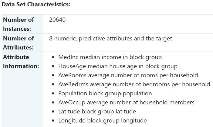
so i am using the fetch_california_housing() dataset from scikit-learn and did some simple linear regression with this. Here is a screenshot of the dataset characteristics. enter image description here
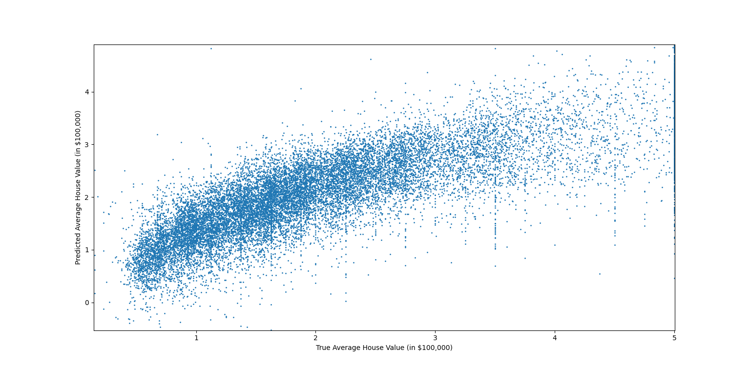
I plotted the predicted values over the true values, as you can see in the following screenshot, and found a mean square error of 4.638.

enter image description here

What i find strange is that the plot does not look linear, but rather like x^(some power less than 1) or like log(x). I know we can do some transformation onto our feature vector x and do linear regression with this transformed value. When i try to raise the first 5 different x values (since these must be positive) to some power less than 1, and plug it into the normal equations, I however get a much higher MSE (e.g. 656.1).

Is what I am doing here making sense? When i see this plot and see it is not linear, is it sensible to try to transform X in some way such that the plot looks linear? I know I am plotting over target values and not input values, so maybe it does not make sense to expect the plot to look linear (even though the inputs might affect the target linearly)? My thought process is basically that I am doing linear regression (in the weights and inputs) so the plot should look linear too, or otherwise there exists some transformation which achieves a smaller MSE and therewith a a linear plot, or maybe not? I do not have much experience with regression so if someone could tell me a bit more about how to think about this and when it makes sense to transform the data and how?

Very much appreciate any feedback and inputs!

$\endgroup$
2
  • $\begingroup$ Why would you expect the data to be linear??? You can linearly regress any family of functions (specifically, finite dimensional vector space of functions), eg logarithms or exponentials or whatever. All you're doing with linear regression is finding the function in the family that most "closely" matches your data in the sense of linear algebra (via the projection operator) $\endgroup$ Commented Sep 25, 2023 at 23:00
  • $\begingroup$ Hi Brevan, so yeah I shouldn't generally expect the data to be linear. My main question is then, when looking at a (true vs. predicted) plot, and seeing a nonlinear behavior, should i transform the input variables into the type of function which resembles the plot? I tried that with the examples I mentioned but got much much higher error. I am essentially trying to find ways to do better than standard linear (in weights and inputs) regression $\endgroup$
    – Ivan
    Commented Sep 25, 2023 at 23:05

4 Answers 4

6
$\begingroup$

Fitting a generalized additive model (GAM) with smoothing splines using R package mgcv will allow for capturing non-linear effects, without requiring you to try out non-linear transformations of the predictors manually. Instead of regressing the response variable linearly on the predictors, the response variable can be regressed on a smoothing spline function of the predictors. E.g.:

library("mgcv")
my_mod <- gam(y ~ s(x1) + s(x2) + s(3), data = my_data)
summary(my_mod)
plot(my_mod)
$\endgroup$
4
$\begingroup$

To expand a bit on the answer from Marjolein Fokkema (+1), your simple linear modeling of the association between continuous predictor values and outcome isn't adequate. It looks like the simple linear modeling systematically underestimates the values of higher-valued properties. It also seems to overestimate values at actual values near 0.

The generalized additive model (GAM) approach with the particular type of smooths recommended in that answer is one well-accepted way to deal with such problems. A GAM might provide a better way to handle the spatial data (latidute/longitude). If you are including such data, you might look at questions on the site with the spatial tag.

There are other approaches to modeling nonlinear associations between continuous predictors and outcome, outlined on this page.

If I understand your model correctly, it implicitly assumes that the association of each predictor variable with outcome is independent of the values of the other predictor variables. That's often not the case. Your model might be improved by including interaction terms between predictor variables whose associations with outcome might be expected to depend on each other's values.

As you are starting to understand, the simplicity of implementing a linear regression model in modern software can hide the difficulty in properly formulating the model to start with. I'd recommend that you study Frank Harrell's Regression Modeling Strategies, a comprehensive guide to formulating regression models.

Also, there are several types of plots that are more useful for diagnosing problems with models than the simple predicted versus observed plot that you show. See this page and its links for the plots provided in R. I suppose that similar plots can be obtained in Python, but I don't use Python for this type of modeling.

$\endgroup$
2
$\begingroup$

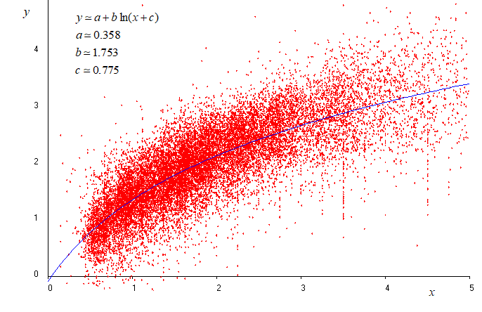
Try nonlinear regression with several function models. For example with a function of logarithmic kind (figure below, blue curve). Finally chose the equation model giving the smaller MSE.

enter image description here

Note : if you want that the origin $(0,\,0)$ be exactly on the blue curve the function becomes $y=B\,\ln(1+\frac{x}{C})$. But the MSE will be slightly higher after nonlinear fitting for $B$ and $C$.

Note : The MSE found above $(\simeq 0.51)$ cannot be compared with the MSE that you might find with your original data. This is because the data used above for my answer is far to be the original data not given in the question. The data used for my answer comes from scanning the pixels of the figure joint to the question and computing the coordinates of each pixel. This gives 64061 points which is certainly very different from the number of original points. Nethertheless MSE$\simeq 0.51$ can be compared with MSE$\simeq 0.529$ obtained with linear regression (Both with the same data).

$\endgroup$
1
$\begingroup$

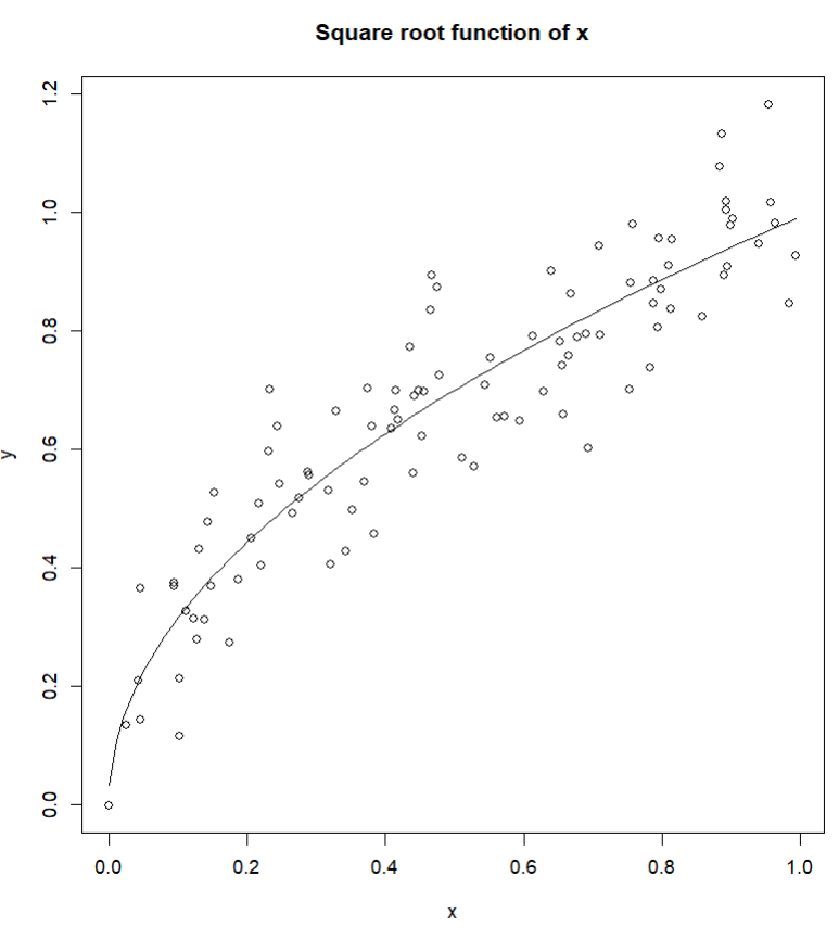
The other answers here suggesting the spline and GAM fits are immediately the first thing I would have considered. Another nonlinear option, which is probably less popular these days (for reasons that include overfitting and difficulty with complex curves) is simply modeling either a polynomial (growth curve) or square root function (decay curve) of the data. Because your data is positive, increases rapidly in the beginning of the distribution, and then slowly decays, a square root regression would approximate such a model fairly simply.

To emulate your data and the fit required, here is an example using R:

#### Simulate Data ####
set.seed(123)
fx <- function(x){
  sqrt(x)
}

x <- runif(100)
y <- fx(x) + rnorm(100,sd=.1)
plot(x,y,main="Square root function of x")

#### Run Regression ####
fit <- lm(y ~ x + I(sqrt(x)))
summary(fit)

#### Fit Line ####
x.new <- seq(
  min(x),max(x),length.out=100
)

new <- data.frame(x = x.new)
pred <- predict(fit, newdata = new)
lines(x.new,pred)

Which gives an $R^2$ around $84.4$% and fits the data quite accurately.

enter image description here

As noted by another answer here, a log fit to the data would probably approximate the curve in similar ways, so that could be another option. The GAM models in my opinion are a better option simply because they penalize overfitting and are far more flexible with fitting, especially with the inclusion of multiple variables and interactions. In a more complex case where scale and location are concerns, a GAMLSS fit may be even better.

$\endgroup$

Your Answer

By clicking “Post Your Answer”, you agree to our terms of service and acknowledge you have read our privacy policy.