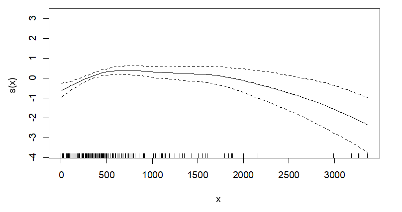
This question seems to be two lumped into one. Your primary questions seem to be:
- What does this partial effects plot actually show?
- What does the plot say about my own data?
I answer both below, starting with the first point:
Point 1: I'm guessing based off the formula and the plot that you are plotting a Gaussian curve using the default predicted values. This will naturally give you positive and negative values because this provides you with the partial effect of $x$, which is conditional upon whatever you add into the model. This will usually not look like the original scale of your response variable unless you transform them since this uses the partial residuals, which can often be positive or negative, even if the original scale is strictly non-negative.
Below I simulate data that conceptually looks similar to yours. The code may look convoluted, but all I am doing is estimating piecewise function, adding a positive constant to it (so that the raw values are not negative), and then saving that into an object called data.
#### Sim Data ####
library(tidyverse)
library(mgcv)
set.seed(123)
x <- seq(0, 3500, length.out = 1000)
y <- numeric(length(x))

#### Define Piecewise Function ####
data <- tibble(x = x) %>%
  mutate(
    ly = case_when(
      x <= 500 ~ 0.01 * x + rnorm(n(), sd = 5),  # Gradual positive association
      x > 500 & x <= 1500 ~ 10 + rnorm(n(), sd = 5),  # No change
      x > 1500 ~ 10 - 0.005 * (x - 1500) + rnorm(n(), sd = 5)  # Gradual decrease
    ),
    y = ly + 10 # add positive constant after piecewise fx
  ) %>%
  select(-ly) # remove original variable

#### Plot Original Data ####
plot(data)
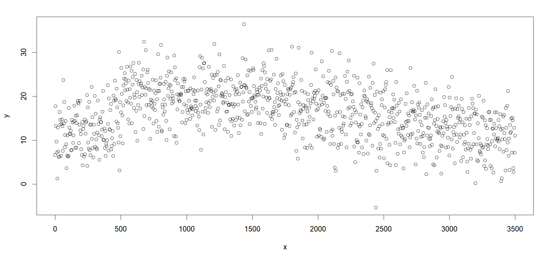
Which on their raw scale look like this:

We see that the range of values for $x$ match yours and the $y$ values are strictly positive. We can fit the model you specify but also add the residuals to that plot, then resize them to be big enough to see with cex = 2:
#### Fit GAM ####
fit <- gam(y ~ s(x), data = data, method = "REML")

#### Plot Model Alone ####
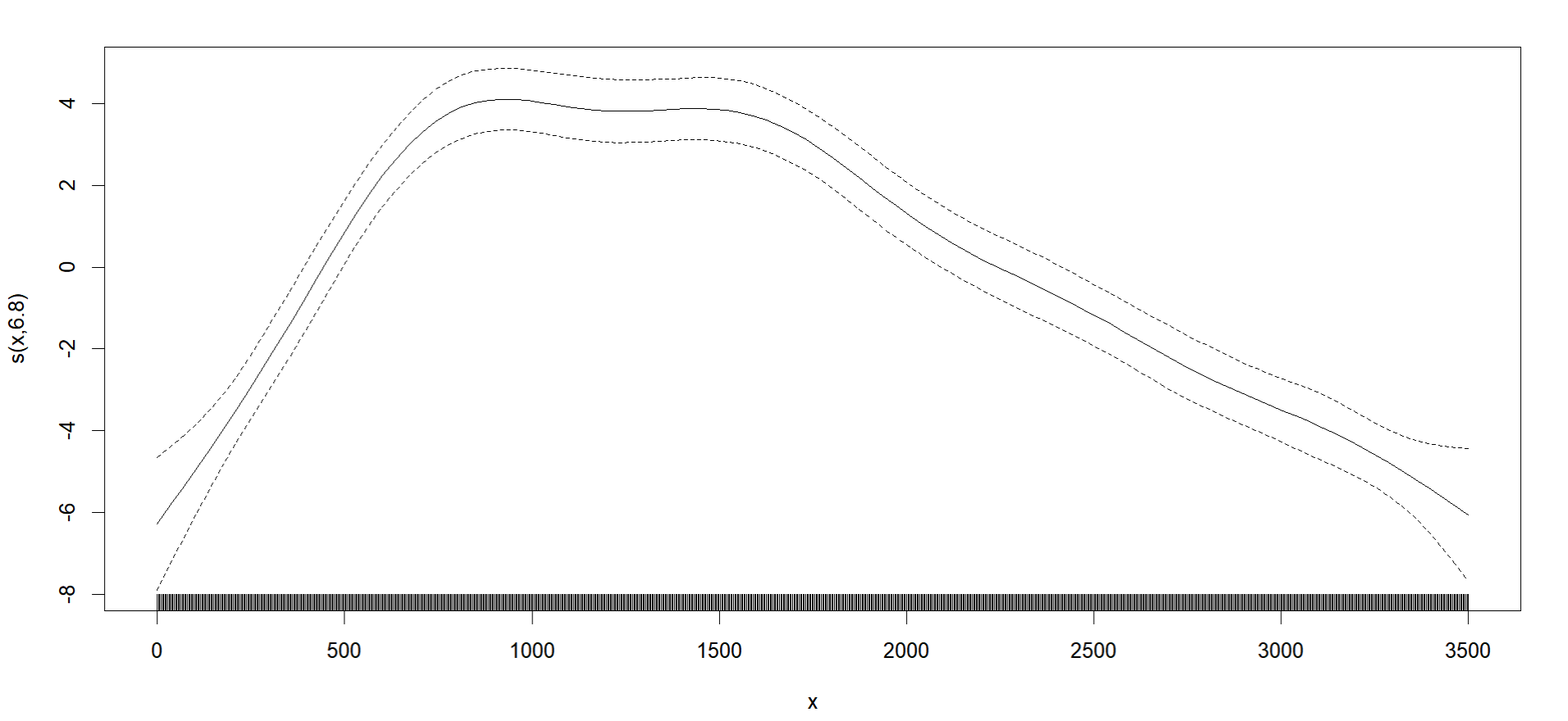
plot(fit)

#### Plot Model w/ Residuals ####
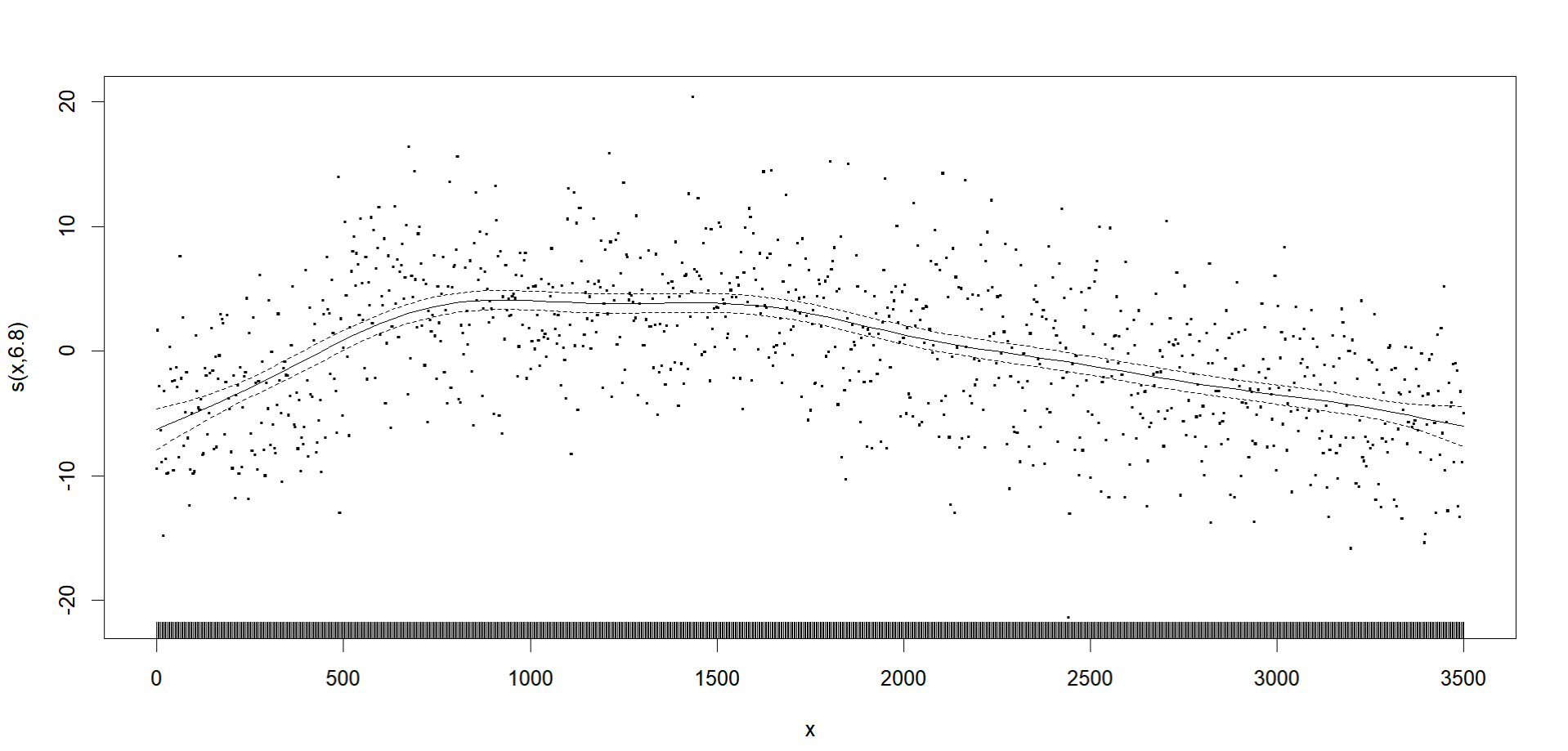
plot(fit, residuals = T, cex = 2)
The first plot looks similar to yours, though the slopes are a bit more dramatic on both ends (seems my simulation skills are still not amazing, but its good enough I suppose):

The second plot shows us where the residuals are:

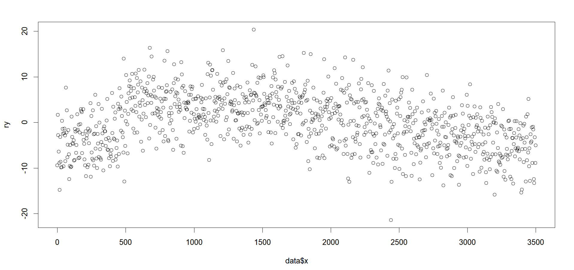
Now the y-axis fluctuates around $-20$ and $+20$. The non-residual plot has a different $y$ axis from this one, but that is just because it is showing the constructed regression line's range whereas the residual plot shows the range of the residuals too (which stray pretty far from the regression line here). This is because the partial residuals from a curvy line like this will naturally fluctuate to above the mean residual value ($0$, where the error from a prediction is essentially none) and below or above it (approximately plus or minus $2$, representing large errors) with every fluctuation of the curve. With more terms added to the model, these become partial residuals on the y-axis, which are just residuals from fitting the model after omitting the predictor in question with relation to the others in the model. For a simple case like yours, this would simply look like this since there is only one predictor to omit:
#### Get Residuals from Reduced Model ####
fit.reduce <- gam(y ~ 1, data = data)
ry <- resid(fit.reduce)

#### Plot X Against Partial Residuals ####
plot(data$x, ry)
Which gives us this plot on the same scale as our plot.gam() version:

Point 2: So now that we have established all of that, what does our plot actually mean here? In terms of the pattern from the curve, as $x$ increases from $0$ to $500$, the $y$ also increases, then flatlines, and then curves down, as you noted. So it seems your predictor has an initial positive association with $y$, then ceases to have any association, then has a negative one at the highest values. The plot just shows this in terms of residuals because as you add in more predictors, you have to account for the influence of $x$ independent of the other predictors instead. The positive and negative values just indicate whether or not the residuals are above or below their mean value, but the interpretation is similar to what they would be on their raw scale.

