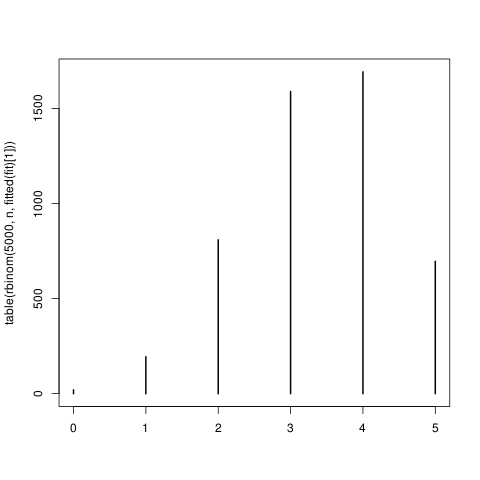
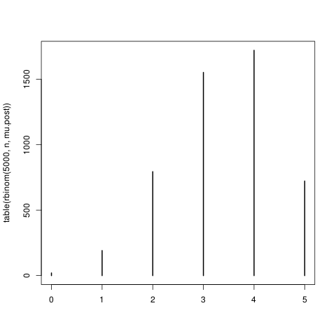
Either my intuition is misleading me or my code is wrong. In a nutshell, I have a simple logistic-regression model, and when I look at the posterior distribution of μ, a given unit's probability of succeeding on each trial, I see substantial uncertainty (i.e., variability in the posterior distribution), but when I look at the posterior predictive distribution for a sum of these trials, it looks the same as the binomial distribution implied by a point estimate of μ. Where did the variability go?
Here are the details, in R. I generate the data:
ilogit = function(x) 1 / (1 + exp(-x))

set.seed(10)
N = 20
n = 5
dat =
    transform(f = n - y,
    transform(y = rbinom(N, n, mu),
    transform(mu = ilogit(1 + x1 + x2),
    data.frame(x1 = rnorm(N), x2 = rnorm(N)))))
and fit the model:
fit = glm(data = dat, family = binomial(link = "logit"),
    cbind(y, f) ~ x1 + x2)
We'll look at inferences for the first subject (the first row of dat). To get a predictive distribution for y using only a point estimate of mu (namely, fitted(fit)[1]), we can do this:
plot(table(rbinom(5000, n, fitted(fit)[1])))

This procedure doesn't account for uncertainty about mu. To do that in a Bayesian fashion, we can use sim from the arm package.
library(arm)
sims = sim(fit, 5000)@coef
mu.post = ilogit(
    sims[,"(Intercept)"] +
    sims[,"x1"] * dat$x1[1] +
    sims[,"x2"] * dat$x2[1])
Here's a 95% credible interval for this subject's mu, showing substantial uncertainty.
> quantile(mu.post, c(.025, .975))
     2.5%     97.5%
0.5528186 0.7749029
We can now plot the real posterior predictive distribution by drawing one point from a binomial distribution per sample of the posterior of mu.
plot(table(rbinom(5000, n, mu.post)))

Which looks the same as the first plot! What's going on?
Now, if you set N to something small, like 5, these figures will no longer match. It makes sense to me that they should indeed match for large N, large enough for mu.post to be tightly concentrated at a single point. But N = 20 isn't that large, going by quantile(mu.post, c(.025, .975)).
