2
$\begingroup$

I had trouble coming up with a title, so hopefully I can explain it better here.

I'm working on a classification problem and I'm doing some pre-analysis of variables. I'm looking for some nice ways to visualise the distribution of the target variable within each independent variable.

As an example for categorical variables I can look at a plot like this, The one on the left gives an idea of the distribution of the different categories, whereas the one on the right shows that B has a much higher proportion of the target variable.

Categorical Variables

If I want to do the same for a numeric variable I have to bin the variable and get something like below. Here's an example of some numerical data, the same data with different bin sizes.
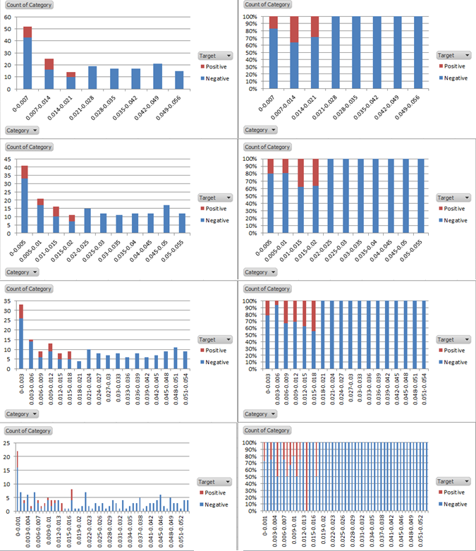
enter image description here

This is not as good... it isn't as clear since the binning is pretty arbitrary and each column isn't exactly a different category. Different bin sizes seem to tell different stories.

Are there any good ways to visualise numeric variables to get a similar overview without having to bin?

$\endgroup$
1
  • 1
    $\begingroup$ Following the comments on Nick's answer: Maybe you want something like mutual information? $\endgroup$
    – ziggystar
    Commented Jan 28, 2014 at 11:16

2 Answers 2

2
$\begingroup$

Your question has two main parts.

  • A better measure of impurity? Better for what purpose? There are many measures of impurity (heterogeneity, diversity, fragmentation, many other names). Suppose that a calculation gives you proportions $p_i, i = 1, \cdots, I$ of the observations in each of $I$ categories. Then most of the simpler measures are members of a family $$C(j,k) = \sum_{i=1}^I p_i^j \ [\ln(1/p_i)]^k.$$ Checking this out, $j = 2, k = 0$ gives you $\sum_{i=1}^I p_i^2$, $j = 0, k = 0$ gives you the number of categories present and $j = k = 1$ gives you entropy. So, you choose your weighting through $j, k$ according to what you want emphasised. (More complicated and/or more general families are popular, but I think this one deserves to be well known. I owe the generalisation to Good, I.J. 1953. The population frequencies of species and the estimation of population parameters. Biometrika 40: 237-264.) But (all that said) when looking at measured variables people tend to use standard deviation, interquartile range, etc., as is covered in almost any introduction to statistics.

  • Plotting continuous distributions without binning? Surely. Search for quantile plots, cumulative distribution plots, density estimation. See e.g. this article for an introduction to quantile plots.

A meta-answer is what, if anything, are you reading? You seem to be diving in straight at the machine learning end without having learned any basic statistics.

$\endgroup$
6
  • $\begingroup$ Thanks for the response. I have a reasonable background in Statistics and I realise the question may be a basic one. I may not have been clear in my question... My question isn't with plotting continuous variables it's with highlighting, as you say there are many methods, but I want to include in the plot the class of the variable (Positive/Negative). Possibly something along the lines of a stacked density graph with two colours (i.sstatic.net/quzkI.png). Was just wondering if there's any good methods I'm not familiar with. $\endgroup$
    – Ger
    Commented Jan 28, 2014 at 10:38
  • $\begingroup$ Quantile plots and cumulative distribution plots show zero as a point on a magnitude scale whenever positive and negative values are present. I don't know quite what is being shown on that graph, but it looks odd. Nothing stops you superimposing different quantile functions or their inverses if the problem is comparing continuous measurements according to the categories of another variable. Your question seems to be morphing into something else: better to edit the main question than change it in comments. $\endgroup$
    – Nick Cox
    Commented Jan 28, 2014 at 10:49
  • $\begingroup$ Regarding the Impurity measure, I haven't much experience with this so I realise now my question doesn't really make sense. I was looking to measure the Information Gain based on a split as opposed to the overall impurity. I gather now that this is only possible if you're actually splitting into distinct groups (i.e. binning continuous variables). $\endgroup$
    – Ger
    Commented Jan 28, 2014 at 10:51
  • $\begingroup$ The jargon "impurity" seems to arise mostly within classification and regression trees (CART) literature. As I indicated earlier, these measures appear in many other contexts. $\endgroup$
    – Nick Cox
    Commented Jan 28, 2014 at 10:53
  • $\begingroup$ I think I am trying to force my thinking about it with respect to decision trees as opposed to 'general statistics'. I'm trying to compare on a variable by variable basis how well a variable can be used to explain a target variable. If one variable has a high proportion of target variable when the target is low this is a more explanatory variable than if the target is randomly distributed around all values. I'm wondering what measure I could use to compare these variables (possibly a single variable logistic regression and compare the p-values?) $\endgroup$
    – Ger
    Commented Jan 28, 2014 at 11:09
2
$\begingroup$

This may seem like you're answering your own question because all of the following sketches were mentioned by you in the comment to another answer.

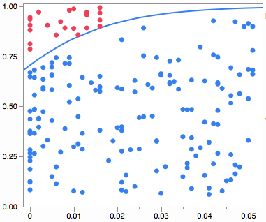
Logistical Regression seems to be the most analytical. It works well here, but may not do so with the other (non-logistic) patterns. Here's the visual my software gives and the p-value is <0.0001. Dots have random Y positions within their regions.

enter image description here

For less regular patterns a decision tree is better. Here's one partitioning. Dots have random X and Y positions within their regions (I think because there are usually multiple X variables).

enter image description here

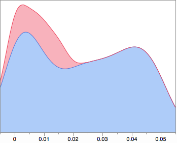
Composing smoothed densities:

enter image description here

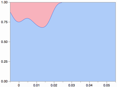
Composing smoothed proportions:

enter image description here

$\endgroup$
2
  • $\begingroup$ I really like these, they seem very clear representations. The smoothed densities and proportions might be the simplest solution, but I really like the idea of randomizing the Y axis so the data isn't just along one line. Could you explain a little how you randomize and how the blue line is generated in your first plot? What software did you use to generate these? Also for feature selection and it seems regression is a commonly used method, there's a scikit function scikit-learn.org/stable/auto_examples/… with anova_filter.get_support() to get confidence. $\endgroup$
    – Ger
    Commented Jan 29, 2014 at 9:20
  • $\begingroup$ @Ger The line in the first plot is the logistic curve that best fits the data. The randomization is supposed to give you a sense of having equal density of data in each region (if the fit is good). After posting, I was thinking it might be good to overlay the composition of proportions with the logistic curve as a better indication of how the densities compare. Of course, the smooth densities are subject to a tuning parameter, like the binning in your originals. The examples are from JMP, a commercial product that I work on. $\endgroup$
    – xan
    Commented Jan 29, 2014 at 13:35

Your Answer

By clicking “Post Your Answer”, you agree to our terms of service and acknowledge you have read our privacy policy.

Not the answer you're looking for? Browse other questions tagged or ask your own question.