3
$\begingroup$

enter image description here

Here I have shown the first two lines of my data frame. It goes on for a number of lines.

I am wanting to make plots to show what is happening over time . e.g a plot showing the sequence of grip changes over time and who is making the changes P1 or P2 .

I am using R, so things I can implement in R would be relevant - and guidance on how to do so would be especially useful.

I have tried using code such as plot(mydata$Start,mydata$Name) and stripchart(mydata$Name) but I have not been successful. In some cases I get an error such as

Error in stripchart.default(mydata$Name) : invalid first argument

I am unsure how to approach this. Should it not be a data frame maybe ?

$\endgroup$
3
  • $\begingroup$ What are the types of the variables? What types are the plot commands you call expecting? $\endgroup$
    – Glen_b
    Commented Jul 17, 2014 at 10:19
  • $\begingroup$ @Glen_b, the variables are all coming as "factor" when I cheek their class type. I thought R would interpret text as a string and numbers as integers or ideally time int his case . My assumption was wrong though. $\endgroup$
    – B.Miller
    Commented Jul 17, 2014 at 10:24
  • $\begingroup$ I've edited the question to come closer to what I was trying to suggest in chat; I suspect I didn't convey it clearly. Feel free to change it, of course. $\endgroup$
    – Glen_b
    Commented Jul 17, 2014 at 15:58

2 Answers 2

2
$\begingroup$

There are several issues here.

The problem is not that it's a data frame, it's that you're not giving it numbers where it needs numbers. It's not even a problem that the variables (other than time) are factors.

You should be able to convert time to numbers okay, but even if your text was all strings, that wouldn't help.

Note that when you do stripchart(mydata$Name) you're passing it names when it expects numbers.

$\endgroup$
7
  • $\begingroup$ ahh right . Thanks. I had thought I'd be able to plot a strip chart of Name's and R would just plot them in the sequence they occur in my data frame. Looks like I have ALOT of reading to do. $\endgroup$
    – B.Miller
    Commented Jul 17, 2014 at 10:33
  • $\begingroup$ It sounds like you think a stripchart does something other than what it actually does. It's not for ordered sequences of data at all. $\endgroup$
    – Glen_b
    Commented Jul 17, 2014 at 10:39
  • $\begingroup$ hmmm maybe I have misunderstood what the strip chart does. I had thought it'd place time along the x axis and then there wouldnt be a Y axis as such rather (based on the x axis showing time) it'd show me at what time a certain variable of my choosing occurred. e.g. it show me time along x axis and at what the corresponding Name value was at that time. Thankls for you input and help it is appreciated. $\endgroup$
    – B.Miller
    Commented Jul 17, 2014 at 10:41
  • $\begingroup$ Nope. You could maybe fiddle with it to do something like that, but I think there are better ways. How many different events are there? $\endgroup$
    – Glen_b
    Commented Jul 17, 2014 at 10:42
  • $\begingroup$ I am only using 18 in total with this set (it is a learning set for me before I tackle bigger sets) $\endgroup$
    – B.Miller
    Commented Jul 17, 2014 at 10:43
2
$\begingroup$

I attempted to create a dummy data frame similar to your data using the following code:

data <- data.frame(Grip.Type=rep(c('RH','LH'),times=100),
                   Start=seq(from=0.5,to=2,length.out=200),
                   Name=ifelse(rnorm(n=200,mean=1,sd=2)>0,'P1','P2'),
                   Position=c('RH : L/Knee','LH : R/Elbow'))

(Please let me know if this is the way your data looks like)

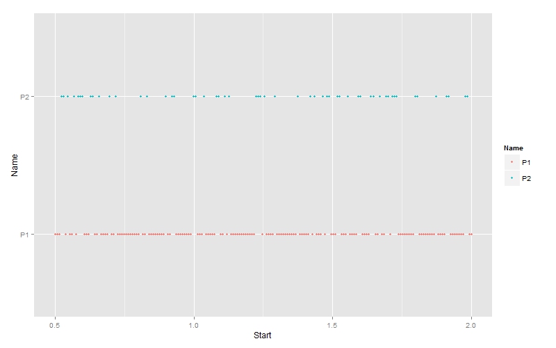
From this data frame I have attempted to create the following plot using the ggplot2 library:

Plot 01:

p1 = ggplot(data)+
    geom_point(aes(x=Start,y=Name,col=Name),size=1.5)+
    ggtitle('Plot 1')
p1

Sequence of grip changes

Does this look like what you are looking for?

$\endgroup$
10
  • $\begingroup$ This is definitely headed down the path I am ultimately aiming to go down. My original data is from a CSV file that I have exported from another program. $\endgroup$
    – B.Miller
    Commented Jul 17, 2014 at 21:39
  • $\begingroup$ Jittering the points would be much more informative here. $\endgroup$
    – Andy W
    Commented Jul 17, 2014 at 21:49
  • $\begingroup$ It would have, had there been more numerical parameters to represent the data in a distributed format on both the axes.But, as it is right now, only the time axis is numerical and other variables are categorical, so the y axis would never make sense in this case as each categorical level must be shown at the same value on y-axis. $\endgroup$
    – anakin
    Commented Jul 17, 2014 at 21:53
  • $\begingroup$ This is definitely headed down the path I am ultimately aiming to go down. My original data is from a CSV file that I have exported from another program. One of my goals is to have it similar to the plot above but to have each point indicate what the position change was. Ultimately it becomes slightly more complex as there are apporixmately 15 different positions that happen and in same cases the reoccur throughout the time. $\endgroup$
    – B.Miller
    Commented Jul 17, 2014 at 21:58
  • $\begingroup$ One question we are wanting to answer is are there any sequences/patterns of grip change that reoccur and then we would go and investigate why these are happening and what is leading to them. $\endgroup$
    – B.Miller
    Commented Jul 17, 2014 at 22:02

Your Answer

By clicking “Post Your Answer”, you agree to our terms of service and acknowledge you have read our privacy policy.

Not the answer you're looking for? Browse other questions tagged or ask your own question.