4
$\begingroup$

I have time series data that represent dates/times of trades taken in a financial market.

I would like to assign a score to this data that represents whether the trades are mostly clustered around particular time values or if they are mostly spread out evenly. I am going to have about 1000+ results per dataset.

Example situation one (High degree of "clustering" ):

1. 01/01/01 : 13:00 
2. 01/01/01 : 13:10
3. 01/01/01 : 13:15
4. 01/01/01 : 13:25
5. 03/05/01 : 17:20
6. 03/05/01 : 17:35
7. 03/05/01 : 17:40
8. 03/05/01 : 17:45

Example situation two( Low degree of "clustering)"

1. 01/01/01 : 13:00
2. 01/05/01 : 02:30
4. 02/12/01 : 06:40
5. 02/25/01 : 02:30
6. 03/30/01 : 21:10
7. 04/12/01 : 02:20
8. 05/02/01 : 03:25

I can of course convert all the timestamps to posix time or whatnot so doing calculation with the time values won't be a problem.

I was thinking possibly standard error?

(For those who want more background info: I am using backtest results to modulate the size of my entry position in a complex manner. If the results contain trades that are clustered together, then they don't really count as 1 trade each (more like one big trade). This means that such results are untrustworthy and I should not act on them.) Thanks!

$\endgroup$

2 Answers 2

1
$\begingroup$

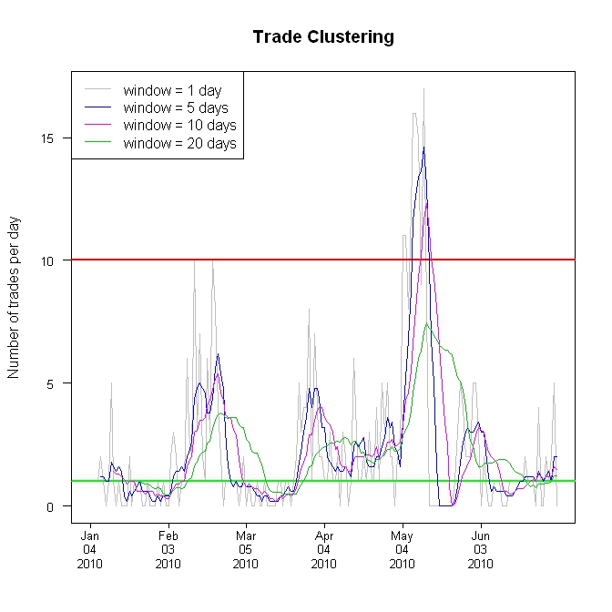
I would simply calculate a rolling window of the number of trades (or dollar volume) per hour, day, week, or whatever time frame that makes sense. For example, you might use 1 day as the rolling window. If 1 trade per day is a low degree of clustering then 10 trades per day might be a high degree of clustering. If so, then a linear "y" scale for a "clustering plot" is probably reasonable.

Here's an example:

Edit 2 ===========================================

Below is the updated version of the plot. Just like the previous plots, the gray line is from a "window" of 1 day where the "cluster number" is the number of trades for the previous day. The new blue line is from a "window" of 5 days where the "cluster number" is the sum of the trades for the previous 5 days divided by 5 (the divide by 5 is to scale the result so it can be directly compared to a 1 day "window"). The new purple line is from a "window" that sums the trades for 10 days and then divides by 10, and the new green line is from a "window" for 20 days, divided by 20.

The last day in the plot (far right hand side) is for the day 2010-07-02 where the values are:

1 day window = 0

5 day window = 2

10 day window = 1.5

20 day window = 1.25

If you had chosen a "window" of 5 days, then before you trade on 2010-07-03 (assuming that's the next trading day), your "cluster number" would be 2 (averaging 2 trades per day for the previous 5 days).

Just like any moving average, the longer the "window", the smoother the plot. However, this smoothing delays the peaks and valleys. Compare the gray peak in early April with the blue peak, then the purple peak, and then the green peak. This may not be a big issue for the current use, but I thought it was a good idea to point it out.

The bottom line is, you'll have to play around with different "windows" to zero-in on your desired smoothness and timeliness.

enter image description here

$\endgroup$
9
  • $\begingroup$ @bill, Good idea- but how do I then assign 1 number to the whole graph you posted? (I need to do this). $\endgroup$ Commented May 23, 2011 at 19:44
  • $\begingroup$ @Mike: The "clustering number" would simply be the number of trades per day. I updated the above graph. "Low clustering" might be a value of 1 trade or less per day (the green line or below). "High clustering" might be a value of 10 or more trades per day (the red line or above). "Normal clustering" might be anything in between the red and green lines. You can have as many "degrees of clustering" (horizontal lines) as you like. So, you can spot any degree of "clustering" simply by looking at the rolling "trades per day" number. $\endgroup$
    – bill_080
    Commented May 23, 2011 at 20:06
  • $\begingroup$ @Mike: Each day has a "cluster number". If you need one number for the whole graph, then the "rolling window" is the whole graph. $\endgroup$
    – bill_080
    Commented May 23, 2011 at 20:08
  • $\begingroup$ @bill I need to create 1 number for the whole graph because I intend to automatically react to this number by entering or not entering another (unrelated) trade. I can take the average of every clustering number within the graph and I guess that would do it, but it seems like an imperfect method. I may have to take the standard deviation between these clustering numbers.... perhaps that is the way. $\endgroup$ Commented May 23, 2011 at 20:20
  • 1
    $\begingroup$ @Mike: You need to concentrate the idea of "the window". In the above case, "the window" is 1 day. And for trading purposes, you would react each day to the previous day. The full graph above is 180 days. However, if you want to use 180 days as "the window" then the total number of trades in the previous 180 days would be your "cluster number" (in this case, there were a total of 404 trades in those 180 days, giving you a cluster number of 404). This 180-day window would advance each day, dropping off the trades that are 181 days ago and picking up the latest trades. $\endgroup$
    – bill_080
    Commented May 23, 2011 at 20:37
0
$\begingroup$

Maybe use an adaptation of J-Charts and/or Market Profile charts, but instead of plotting price (y-axis) vs volume (x-axis) you could plot time of trade (y-axis) vs no. of trades (x-axis) and use colours to delineate different trading days or averages of no. of trades at these times for different look back periods.

$\endgroup$

Your Answer

By clicking “Post Your Answer”, you agree to our terms of service and acknowledge you have read our privacy policy.

Not the answer you're looking for? Browse other questions tagged or ask your own question.