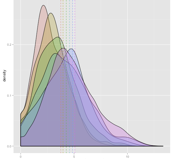
I am trying to understand a density plot. It has narrow peaks and means are far away from the peaks. What would be the reason for such behavior? Should I be doing a different plot to understand this data other than a density plot?
Description of data: It's user performance and different colors represent different groups. You can think performance as step count and I have logged the performance.
ggplot(dt, aes(x=log(step_count), fill=groups)) + geom_density(alpha=.3) +
  geom_vline(data=mean.steps, aes(xintercept=mean.val, color=groups), linetype="dashed", size=.5)

