For illustration I will take a less complex regression model $Y = \beta_1 + \beta_2 X_2 + \beta_3 X_3 + \epsilon$ where the predictor variables $X_2$ and $X_3$ may be correlated. Let's say the slopes $\beta_2$ and $\beta_3$ are both positive so we can say that (i) $Y$ increases as $X_2$ increases, if $X_3$ is held constant, since $\beta_2$ is positive; (ii) $Y$ increases as $X_3$ increases, if $X_2$ is held constant, since $\beta_3$ is positive.
Note that it's important to interpret multiple regression coefficients by considering what happens when the other variables are held constant ("ceteris paribus"). Suppose I just regressed $Y$ against $X_2$ with a model $Y = \beta_1' + \beta_2' X_2 + \epsilon'$. My estimate for the slope coefficient $\beta_2'$, which measures the effect on $Y$ of a one unit increase in $X_2$ without holding $X_3$ constant, may be different from my estimate of $\beta_2$ from the multiple regression - that also measures the effect on $Y$ of a one unit increase in $X_2$, but it does hold $X_3$ constant. The problem with my estimate $\hat{\beta_2'}$ is that it suffers from omitted-variable bias if $X_2$ and $X_3$ are correlated.
To understand why, imagine $X_2$ and $X_3$ are negatively correlated. Now when I increase $X_2$ by one unit, I know the mean value of $Y$ should increase since $\beta_2 > 0$. But as $X_2$ increases, if we don't hold $X_3$ constant then $X_3$ tends to decrease, and since $\beta_3 > 0$ this will tend to reduce the mean value of $Y$. So the overall effect of a one unit increase in $X_2$ will appear lower if I allow $X_3$ to vary also, hence $\beta_2' < \beta_2$. Things get worse the more strongly $X_2$ and $X_3$ are correlated, and the larger the effect of $X_3$ through $\beta_3$ - in a really severe case we may even find $\beta_2' < 0$ even though we know that, ceteris paribus, $X_2$ has a positive influence on $Y$!
Hopefully you can now see why drawing a graph of $Y$ against $X_2$ would be a poor way to visualise the relationship between $Y$ and $X_2$ in your model. In my example, your eye would be drawn to a line of best fit with slope $\hat{\beta_2'}$ that doesn't reflect the $\hat{\beta_2}$ from your regression model. In the worst case, your model may predict that $Y$ increases as $X_2$ increases (with other variables held constant) and yet the points on the graph suggest $Y$ decreases as $X_2$ increases.
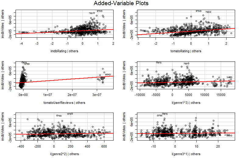
The problem is that in the simple graph of $Y$ against $X_2$, the other variables aren't held constant. This is the crucial insight into the benefit of an added variable plot (also called a partial regression plot) - it uses the Frisch-Waugh-Lovell theorem to "partial out" the effect of other predictors. The horizontal and vertical axes on the plot are perhaps most easily understood* as "$X_2$ after other predictors are accounted for" and "$Y$ after other predictors are accounted for". You can now look at the relationship between $Y$ and $X_2$ once all other predictors have been accounted for. So for example, the slope you can see in each plot now reflects the partial regression coefficients from your original multiple regression model.
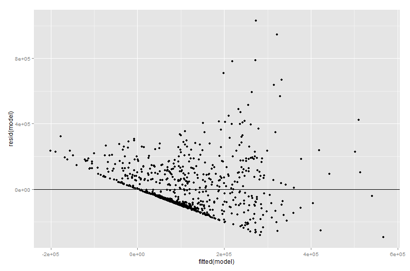
A lot of the value of an added variable plot comes at the regression diagnostic stage, especially since the residuals in the added variable plot are precisely the residuals from the original multiple regression. This means outliers and heteroskedasticity can be identified in a similar way to when looking at the plot of a simple rather than multiple regression model. Influential points can also be seen - this is useful in multiple regression since some influential points are not obvious in the original data before you take the other variables into account. In my example, a moderately large $X_2$ value may not look out of place in the table of data, but if the $X_3$ value is large as well despite $X_2$ and $X_3$ being negatively correlated then the combination is rare. "Accounting for other predictors", that $X_2$ value is unusually large and will stick out more prominently on your added variable plot.
$*$ More technically they would be the residuals from running two other multiple regressions: the residuals from regressing $Y$ against all predictors other than $X_2$ go on the vertical axis, while the residuals from regression $X_2$ against all other predictors go on the horizontal axis. This is really what the legends of "$Y$ given others" and "$X_2$ given others" are telling you. Since the mean residual from both of these regressions is zero, the mean point of ($X_2$ given others, $Y$ given others) will just be (0, 0) which explains why the regression line in the added variable plot always goes through the origin. But I often find that mentioning the axes are just residuals from other regressions confuses people (unsurprising perhaps since we now are talking about four different regressions!) so I have tried not to dwell on the matter. Comprehend them as "$X_2$ given others" and "$Y$ given others" and you should be fine.


avPlots? $\endgroup$