1
$\begingroup$

I have used permutation tests to analyse some data (specifically, the perm.test() function in R's exactRankTests package). I understand that permutation tests are effectively repeated iterations on parametric tests. However, I have used permutation tests because my data are not normally distributed.

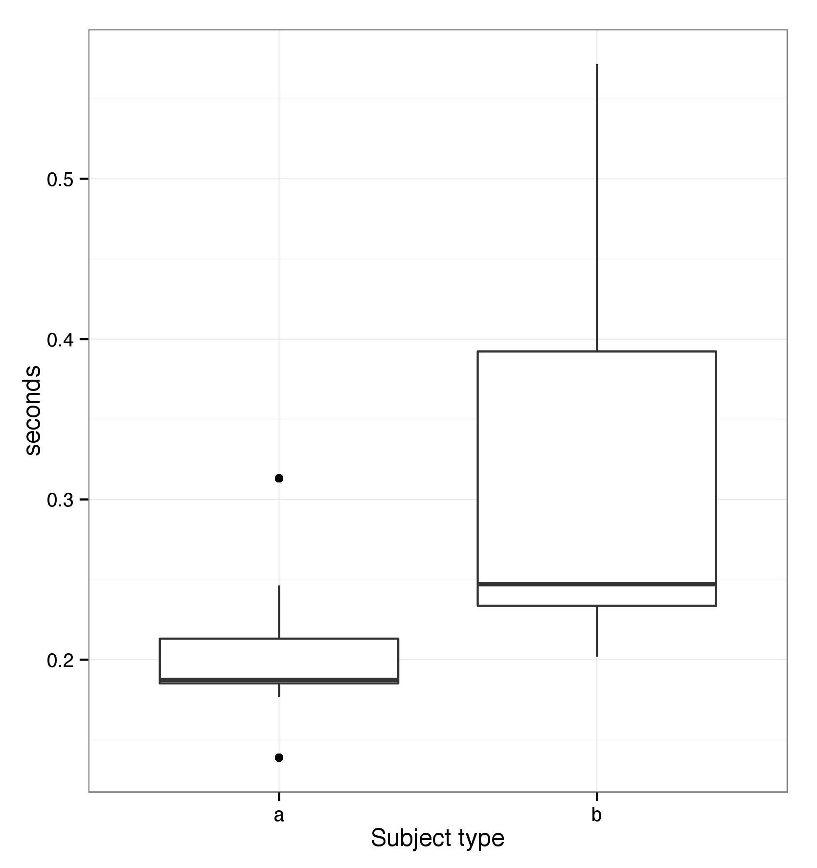
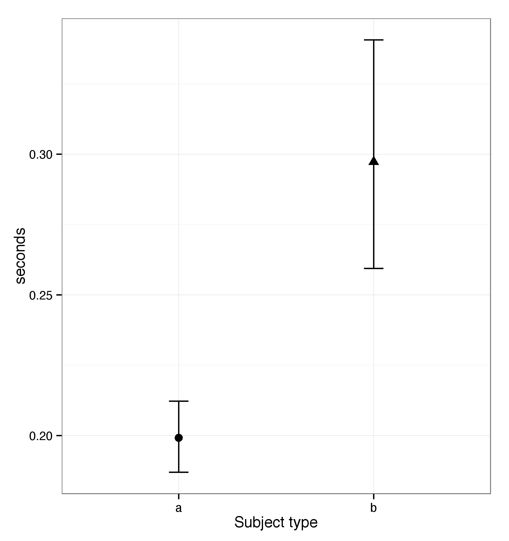
I believe that showing my raw data using median-based box and whisker plots (in a scientific publication) would be more informative. However, since I've used permutation t-tests, would it be more 'correct' to report mean / standard error and the corresponding plots? Or, is it entirely up to me how I display the data?

Example of box and whisker plot: enter image description here
The same data, shown as means and standard error: enter image description here
$\endgroup$
3
  • $\begingroup$ What kind of variable is it you have? What's being measured? $\endgroup$
    – Glen_b
    Commented Feb 20, 2015 at 14:43
  • $\begingroup$ I'm measuring human response times - specifically, the time taken to notice something has happened, and respond by moving the eyes. Such data are typically positively skewed. $\endgroup$ Commented Feb 20, 2015 at 14:47
  • $\begingroup$ 1. I'd be inclined model times either on the log-scale or as speeds (inverse times). Usually one of those tends to reduce both skewness and heteroskedasticity. Or I'd use a GLM, either a Gamma or inverse Gaussian model. 2. Your means-and-standard-error display has the mean not in the middle of the interval around it, which doesn't seem right to me. $\endgroup$
    – Glen_b
    Commented Feb 20, 2015 at 17:10

1 Answer 1

1
$\begingroup$

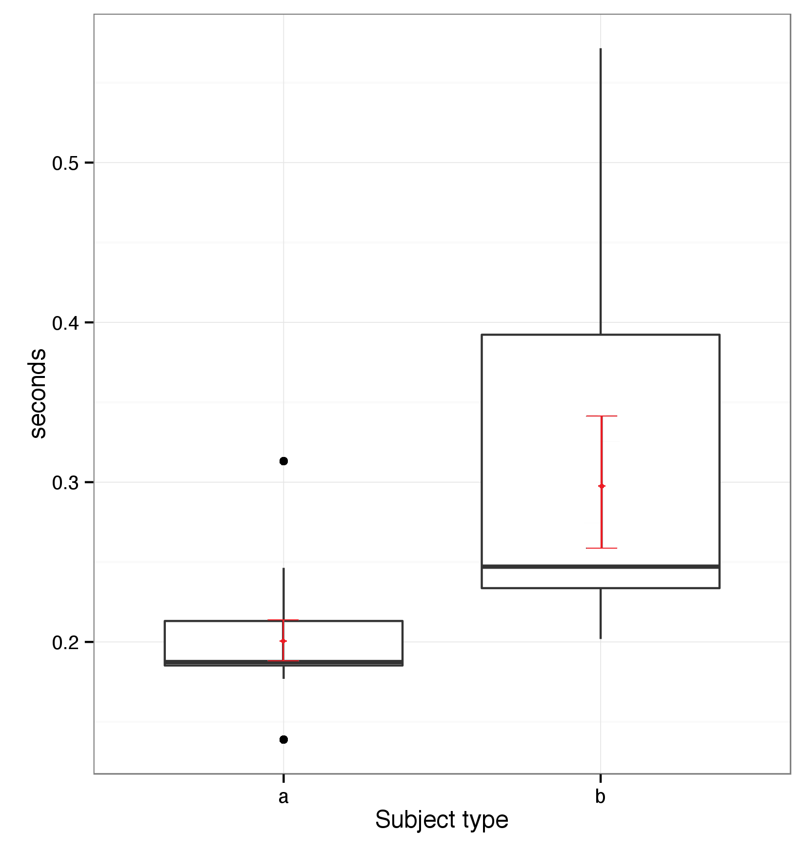
If you used a mean-based permutation test it would seem that you regard the mean as informative - an important and relevant feature of the distribution.

On the other hand, if you think the quantiles, such as the median are informative about the distribution, why not base the test on those?

That said, there's nothing really stopping you testing one and showing the other ... but if they're both informative for your purposes, you could actually show both pieces of information on a plot; there;s a variety of ways to do that. Here's one:

enter image description here

$\endgroup$

Your Answer

By clicking “Post Your Answer”, you agree to our terms of service and acknowledge you have read our privacy policy.

Not the answer you're looking for? Browse other questions tagged or ask your own question.