17
$\begingroup$

I'm asked to write an introduction to statistics and I'm struggling how to graphically show the way p-value and power relate. I've come up with this graph:
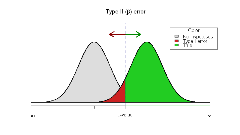
Two Gauss curves interacting

My question: Is there a better way of displaying this?

Here is my R code

x <- seq(-4, 4, length=1000)
hx <- dnorm(x, mean=0, sd=1)

plot(x, hx, type="n", xlim=c(-4, 8), ylim=c(0, 0.5), 
ylab = "",
xlab = "",
main= expression(paste("Type II (", beta, ") error")), axes=FALSE)
axis(1, at = c(-qnorm(.025), 0, -4), 
     labels = expression("p-value", 0, -infinity ))

shift = qnorm(1-0.025, mean=0, sd=1)*1.7
xfit2 <- x + shift
yfit2 <- dnorm(xfit2, mean=shift, sd=1)

# Print null hypothesis area
col_null = "#DDDDDD"
polygon(c(min(x), x,max(x)), c(0,hx,0), col=col_null)
lines(x, hx, lwd=2)

# The alternative hypothesis area

## The red - underpowered area
lb <- min(xfit2)
ub <- round(qnorm(.975),2)
col1 = "#CC2222"

i <- xfit2 >= lb & xfit2 <= ub
polygon(c(lb,xfit2[i],ub), c(0,yfit2[i],0), col=col1)

## The green area where the power is
col2 = "#22CC22"
i <- xfit2 >= ub
polygon(c(ub,xfit2[i],max(xfit2)), c(0,yfit2[i],0), col=col2)

# Outline the alternative hypothesis
lines(xfit2, yfit2, lwd=2)

axis(1, at = (c(ub, max(xfit2))), labels=c("", expression(infinity)), 
    col=col2, lwd=1, lwd.tick=FALSE)


legend("topright", inset=.05, title="Color",
   c("Null hypoteses","Type II error", "True"), fill=c(col_null, col1, col2), horiz=FALSE)

abline(v=ub, lwd=2, col="#000088", lty="dashed")

arrows(ub, 0.45, ub+1, 0.45, lwd=3, col="#008800")
arrows(ub, 0.45, ub-1, 0.45, lwd=3, col="#880000")

Update


Thank you for the terrific answers. I've changed some of the code:

# Print null hypothesis area
col_null = "#AAAAAA"
polygon(c(min(x), x,max(x)), c(0,hx,0), col=col_null, lwd=2, density=c(10, 40), angle=-45, border=0)
lines(x, hx, lwd=2, lty="dashed", col=col_null)

...
legend("topright", inset=.015, title="Color",
   c("Null hypoteses","Type II error", "True"), fill=c(col_null, col1, col2), 
       angle=-45,
       density=c(20, 1000, 1000), horiz=FALSE)

I like the dashed, slightly vague picture of the null hypothesis because it signals that it's not truly there. I've thought about the transparency and adding the alfa but I worry about getting too much information into one picture and have therefore chosen not to.
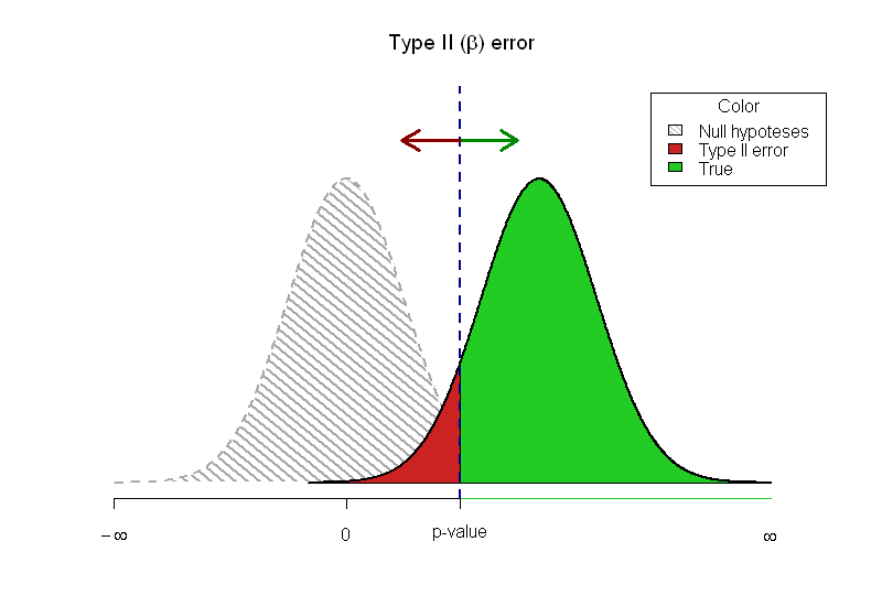
enter image description here

The limitations of printed articles doesn't allow me to do let the readers experiment. I've chosen the @Greg Snow's reply with TeachingDemos as my answer since I love the idea with the two errors not overlapping.

$\endgroup$
7
  • 4
    $\begingroup$ You could enhance your graph slightly by using pseudo-transparency. Something like in this answer. $\endgroup$
    – caracal
    Commented Aug 11, 2011 at 9:23
  • $\begingroup$ @caracal (+1) I should have add a dashing pattern (like you) for the area showing power. $\endgroup$
    – chl
    Commented Aug 11, 2011 at 10:13
  • $\begingroup$ This is nice, I've seen similar plots elsewhere. But this doesn't show the actual values of multiple p values and the power at those p values. You could calculate power for different p values and sample sizes and then put several lines on one graph $\endgroup$
    – Peter Flom
    Commented Aug 11, 2011 at 10:13
  • 1
    $\begingroup$ Maybe checking out how the types of plots the G*Power 3 software generates would be good for ideas of what to plot. Although from memory they seem very similar to what chl and caracal have already presented (and wouldn't help you any how to do that in R). $\endgroup$
    – Andy W
    Commented Aug 11, 2011 at 12:26
  • $\begingroup$ @Andy G*Power-inspired power vs. effect size plots or power vs. alpha plots would be a nice addition indeed. For the first case, a start could be this answer, which should be easily adaptable to the 2nd case. $\endgroup$
    – caracal
    Commented Aug 11, 2011 at 14:35

3 Answers 3

10
$\begingroup$

I have played around with similar plots and found that it works better when the 2 curves don't block each other, but are rather vertically offset (but still on the same x-axis). This makes it clear that one of the curves represents the null hypothesis and the other represents a given value for the mean under the alternative hypothesis. The power.examp function in the TeachingDemos package for R will create these plots and the run.power.examp function (same package) allows you to interactively change the arguments and update the plot.

$\endgroup$
1
  • $\begingroup$ +1, a more complete illustration than mine. (In fact, I knew there was something in the TeachingDemos package but was too lazy to search for it.) $\endgroup$
    – chl
    Commented Aug 11, 2011 at 18:58
15
$\begingroup$

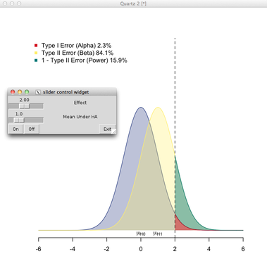
A few thoughts: (a) Use transparency, and (b) Allow for some interactivity.

Here is my take, largely inspired by a Java applet on Type I and Type II Errors - Making Mistakes in the Justice System. As this is rather pure drawing code, I pasted it as gist #1139310.

Here is how it looks:

enter image description here

It relies on the aplpack package (slider and push button). So, basically, you can vary the deviation from the mean under $H_0$ (fixed at 0) and the location of the distribution under the alternative. Please note that there's no consideration of sample size.

$\endgroup$
2
  • $\begingroup$ That is truly awesome, I'd never seen aplpack before. $\endgroup$ Commented Aug 11, 2011 at 16:33
  • 1
    $\begingroup$ @Ken Thanks. The aplpack package has also some good add-ons for data viz. However, the rpanel, which also relies on tcl/tk, is probably a better option for more complex stuff. Now, with RStudio and the manipulate package, it's also easy to enhance basic plot in R. $\endgroup$
    – chl
    Commented Aug 11, 2011 at 19:04
9
$\begingroup$

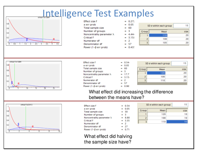
G Power 3, free software available on Mac and Windows, has some very nice graphing features for power analysis. The main graph is broadly consistent with your graph and that shown by @chl. It uses a simple straight line to indicate null hypothesis and alternate hypothesis test statistic distributions, and colours in beta and alpha in separate colours.

A nice feature of G Power 3 is that it supports a large number of common power analysis scenarios and the GUI makes it simple for students and applied researchers to explore.

Here is an a screen shot of a slide (taken from a presentation I gave on descriptive statistics with a section on power analysis) with multiple such graphs shown on the left. If you chose a one-tail t-test version then it would look more like your example.

g power 3 graphs

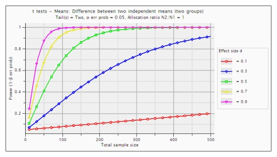
It's also possible to produce graphs that show the functional relationship between factors relevant to statistical power and hypothesis testing (e.g., alpha, effect size, sample size, power, etc.). I present a few examples of such graphs here. Here's one example of such a graph:

enter image description here

$\endgroup$
1
  • $\begingroup$ Interesting package, I'll look into it in the future. The graphs seem a little complicated though for someone new to the field. My audience is MD's without any mathematical or statistical background knowledge. Thanks! $\endgroup$
    – Max Gordon
    Commented Aug 12, 2011 at 14:47

Your Answer

By clicking “Post Your Answer”, you agree to our terms of service and acknowledge you have read our privacy policy.

Not the answer you're looking for? Browse other questions tagged or ask your own question.