25
$\begingroup$

I have 17 years (1995 to 2011) of death certificate data related to suicide deaths for a state in the U.S. There is a lot of mythology out there about suicides and the months/seasons, much of it contradictory, and of the literature I've reviewed, I do not get a clear sense of methods used or confidence in results.

So I've set out to see if I can determine whether suicides are more or less likely to occur in any given month within my data set. All of my analyses are done in R.

The total number of suicides in the data is 13,909.

If you look at the year with the fewest suicides, they occur on 309/365 days (85%). If you look at the year with the most suicides, they occur on 339/365 days (93%).

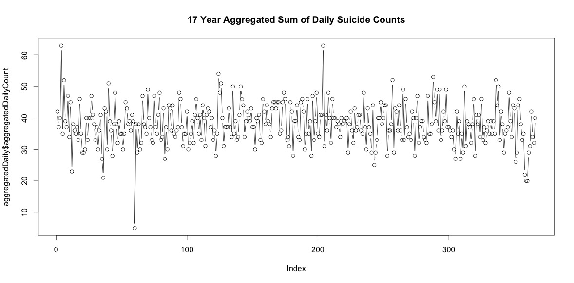
So there are a fair number of days each year without suicides. However, when aggregated across all 17 years, there are suicides on every day of the year, including February 29 (although only 5 when the average is 38).
enter image description here

Simply adding up the number of suicides on each day of the year doesn't indicate a clear seasonality (to my eye).

Aggregated at the monthly level, average suicides per month range from:

(m=65, sd=7.4, to m=72, sd=11.1)

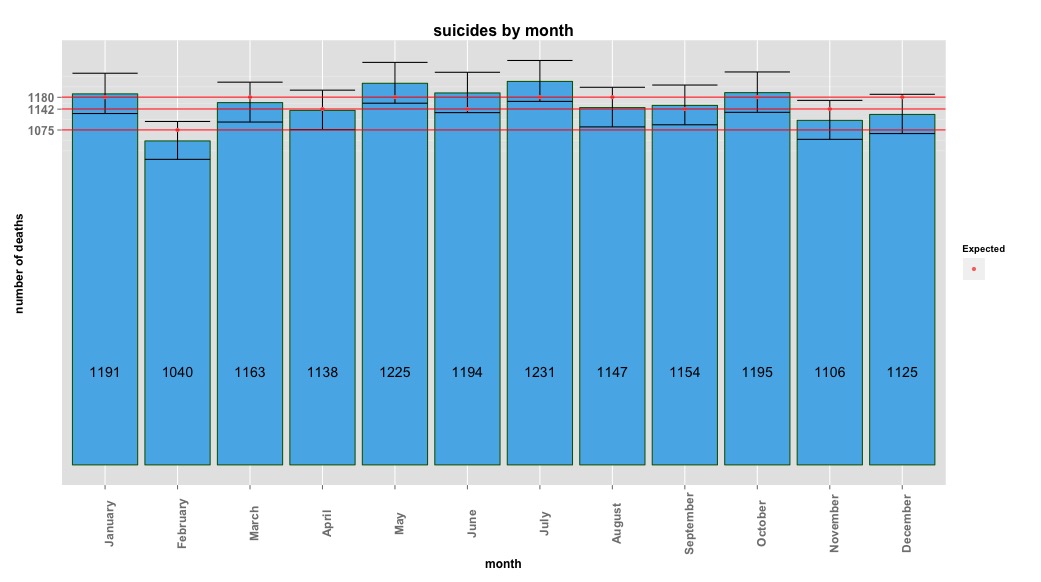
My first approach was to aggregate the data set by month for all years and do a chi-square test after computing the expected probabilities for the null hypothesis, that there was no systematic variance in suicide counts by month. I computed the probabilities for each month taking into account the number of days (and adjusting February for leap years).

The chi-square results indicated no significant variation by month:

# So does the sample match  expected values?
chisq.test(monthDat$suicideCounts, p=monthlyProb)
# Yes, X-squared = 12.7048, df = 11, p-value = 0.3131

The image below indicates total counts per month. The horizontal red lines are positioned at the expected values for February, 30 day months, and 31 day months respectively. Consistent with the chi-square test, no month is outside the 95% confidence interval for expected counts. enter image description here
I thought I was done until I started to investigate time series data. As I imagine many people do, I started with the non-parametric seasonal decomposition method using the stl function in the stats package.

To create the time series data, I started with the aggregated monthly data:

suicideByMonthTs <- ts(suicideByMonth$monthlySuicideCount, start=c(1995, 1), end=c(2011, 12), frequency=12) 

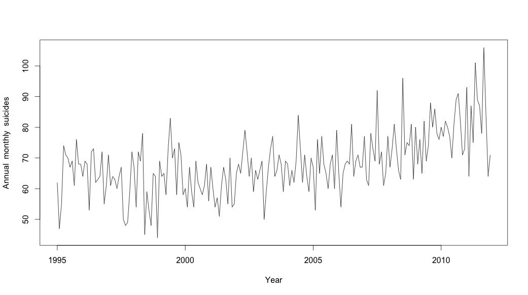
# Plot the monthly suicide count, note the trend, but seasonality?
plot(suicideByMonthTs, xlab="Year",
  ylab="Annual  monthly  suicides")
enter image description here

     Jan Feb Mar Apr May Jun Jul Aug Sep Oct Nov Dec
1995  62  47  55  74  71  70  67  69  61  76  68  68
1996  64  69  68  53  72  73  62  63  64  72  55  61
1997  71  61  64  63  60  64  67  50  48  49  59  72
1998  67  54  72  69  78  45  59  53  48  65  64  44
1999  69  64  65  58  73  83  70  73  58  75  71  58
2000  60  54  67  59  54  69  62  60  58  61  68  56
2001  67  60  54  57  51  61  67  63  55  70  54  55
2002  65  68  65  72  79  72  64  70  59  66  63  66
2003  69  50  59  67  73  77  64  66  71  68  59  69
2004  68  61  66  62  69  84  73  62  71  64  59  70
2005  67  53  76  65  77  68  65  60  68  71  60  79
2006  65  54  65  68  69  68  81  64  69  71  67  67
2007  77  63  61  78  73  69  92  68  72  61  65  77
2008  67  73  81  73  66  63  96  71  75  74  81  63
2009  80  68  76  65  82  69  74  88  80  86  78  76
2010  80  77  82  80  77  70  81  89  91  82  71  73
2011  93  64  87  75 101  89  87  78 106  84  64  71

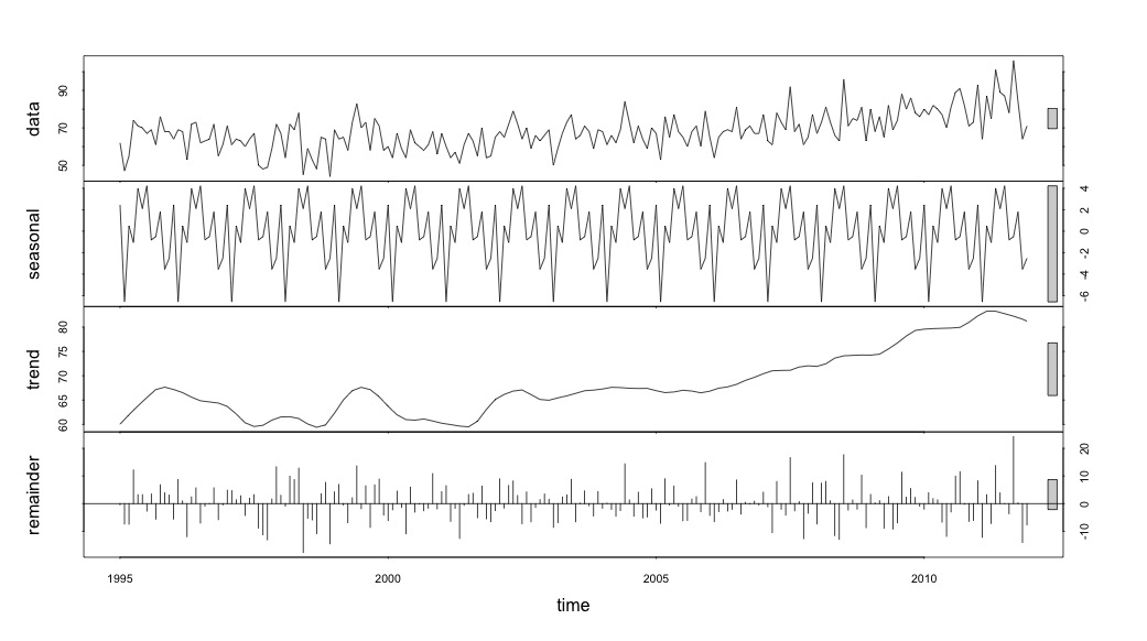
And then performed the stl() decomposition

# Seasonal decomposition
suicideByMonthFit <- stl(suicideByMonthTs, s.window="periodic")
plot(suicideByMonthFit)
enter image description here

At this point I became concerned because it appears to me that there is both a seasonal component and a trend. After much internet research I decided to follow the instructions of Rob Hyndman and George Athana­sopou­los as laid out in their on-line text "Forecasting: principles and practice", specifically to apply a seasonal ARIMA model.

I used adf.test() and kpss.test() to assess for stationarity and got conflicting results. They both rejected the null hypothesis (noting that they test the opposite hypothesis).

adfResults <- adf.test(suicideByMonthTs, alternative = "stationary") # The p < .05 value 
adfResults

    Augmented Dickey-Fuller Test

data:  suicideByMonthTs
Dickey-Fuller = -4.5033, Lag order = 5, p-value = 0.01
alternative hypothesis: stationary

kpssResults <- kpss.test(suicideByMonthTs)
kpssResults

    KPSS Test for Level Stationarity

data:  suicideByMonthTs
KPSS Level = 2.9954, Truncation lag parameter = 3, p-value = 0.01

I then used the algorithm in the book to see if I could determine the amount of differencing that needed to be done for both the trend and season. I ended with nd = 1, ns = 0.

I then ran auto.arima, which chose a model that had both a trend and a seasonal component along with a "drift" type constant.

# Extract the best model, it takes time as I've turned off the shortcuts (results differ with it on)
bestFit <- auto.arima(suicideByMonthTs, stepwise=FALSE, approximation=FALSE)
plot(theForecast <- forecast(bestFit, h=12))
theForecast
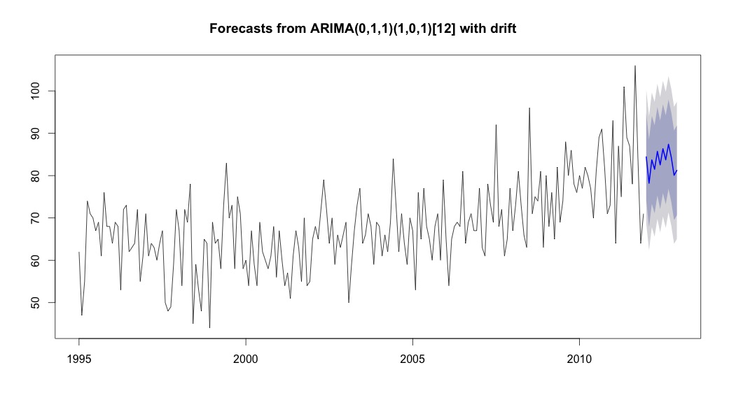
enter image description here

> summary(bestFit)
Series: suicideByMonthFromMonthTs 
ARIMA(0,1,1)(1,0,1)[12] with drift         

Coefficients:
          ma1    sar1     sma1   drift
      -0.9299  0.8930  -0.7728  0.0921
s.e.   0.0278  0.1123   0.1621  0.0700

sigma^2 estimated as 64.95:  log likelihood=-709.55
AIC=1429.1   AICc=1429.4   BIC=1445.67

Training set error measures:
                    ME    RMSE     MAE       MPE     MAPE     MASE       ACF1
Training set 0.2753657 8.01942 6.32144 -1.045278 9.512259 0.707026 0.03813434

Finally, I looked at the residuals from the fit and if I understand this correctly, since all values are within the threshold limits, they are behaving like white noise and thus the model is fairly reasonable. I ran a portmanteau test as described in the text, which had a p value well above 0.05, but I'm not sure that I have the parameters correct.

Acf(residuals(bestFit))
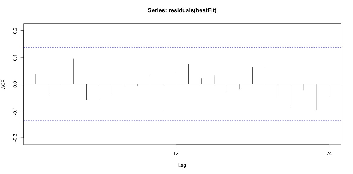
enter image description here

Box.test(residuals(bestFit), lag=12, fitdf=4, type="Ljung")

    Box-Ljung test

data:  residuals(bestFit)
X-squared = 7.5201, df = 8, p-value = 0.4817

Having gone back and read the chapter on arima modeling again, I realize now that auto.arima did choose to model trend and season. And I'm also realizing that forecasting is not specifically the analysis I should probably be doing. I want to know if a specific month (or more generally time of year) should be flagged as a high risk month. It seems that the tools in the forecasting literature are highly pertinent, but perhaps not the best for my question. Any and all input is much appreciated.

I'm posting a link to a csv file that contains the daily counts. The file looks like this:

head(suicideByDay)

        date year month day_of_month t count
1 1995-01-01 1995    01           01 1     2
2 1995-01-03 1995    01           03 2     1
3 1995-01-04 1995    01           04 3     3
4 1995-01-05 1995    01           05 4     2
5 1995-01-06 1995    01           06 5     3
6 1995-01-07 1995    01           07 6     2

daily_suicide_data.csv

Count is the number of suicides that happened on that day. "t" is a numeric sequence from 1 to the total number of days in the table (5533).

I've taken note of comments below and thought about two things related to modeling suicide and seasons. First, with respect to my question, months are simply proxies for marking change of season, I am not interested in wether or not a particular month is different from others (that of course is an interesting question, but it's not what I set out to investigate). Hence, I think it makes sense to equalize the months by simply using the first 28 days of all months. When you do this, you get a slightly worse fit, which I am interpreting as more evidence towards a lack of seasonality. In the output below, the first fit is a reproduction from an answer below using months with their true number of days, followed by a data set suicideByShortMonth in which suicide counts were computed from the first 28 days of all months. I'm interested in what people think about wether or not this adjustment is a good idea, not necessary, or harmful?

> summary(seasonFit)

Call:
glm(formula = count ~ t + days_in_month + cos(2 * pi * t/12) + 
    sin(2 * pi * t/12), family = "poisson", data = suicideByMonth)

Deviance Residuals: 
    Min       1Q   Median       3Q      Max  
-2.4782  -0.7095  -0.0544   0.6471   3.2236  

Coefficients:
                     Estimate Std. Error z value Pr(>|z|)    
(Intercept)         2.8662459  0.3382020   8.475  < 2e-16 ***
t                   0.0013711  0.0001444   9.493  < 2e-16 ***
days_in_month       0.0397990  0.0110877   3.589 0.000331 ***
cos(2 * pi * t/12) -0.0299170  0.0120295  -2.487 0.012884 *  
sin(2 * pi * t/12)  0.0026999  0.0123930   0.218 0.827541    
---
Signif. codes:  0 ‘***’ 0.001 ‘**’ 0.01 ‘*’ 0.05 ‘.’ 0.1 ‘ ’ 1

(Dispersion parameter for poisson family taken to be 1)

    Null deviance: 302.67  on 203  degrees of freedom
Residual deviance: 190.37  on 199  degrees of freedom
AIC: 1434.9

Number of Fisher Scoring iterations: 4

> summary(shortSeasonFit)

Call:
glm(formula = shortMonthCount ~ t + cos(2 * pi * t/12) + sin(2 * 
    pi * t/12), family = "poisson", data = suicideByShortMonth)

Deviance Residuals: 
    Min       1Q   Median       3Q      Max  
-3.2414  -0.7588  -0.0710   0.7170   3.3074  

Coefficients:
                     Estimate Std. Error z value Pr(>|z|)    
(Intercept)         4.0022084  0.0182211 219.647   <2e-16 ***
t                   0.0013738  0.0001501   9.153   <2e-16 ***
cos(2 * pi * t/12) -0.0281767  0.0124693  -2.260   0.0238 *  
sin(2 * pi * t/12)  0.0143912  0.0124712   1.154   0.2485    
---
Signif. codes:  0 ‘***’ 0.001 ‘**’ 0.01 ‘*’ 0.05 ‘.’ 0.1 ‘ ’ 1

(Dispersion parameter for poisson family taken to be 1)

    Null deviance: 295.41  on 203  degrees of freedom
Residual deviance: 205.30  on 200  degrees of freedom
AIC: 1432

Number of Fisher Scoring iterations: 4

The second thing I've looked into more is the issue of using month as a proxy for season. Perhaps a better indicator of season is the number of daylight hours an area receives. This data comes from a northern state that has substantial variation in daylight. Below is a graph of the daylight from the year 2002.
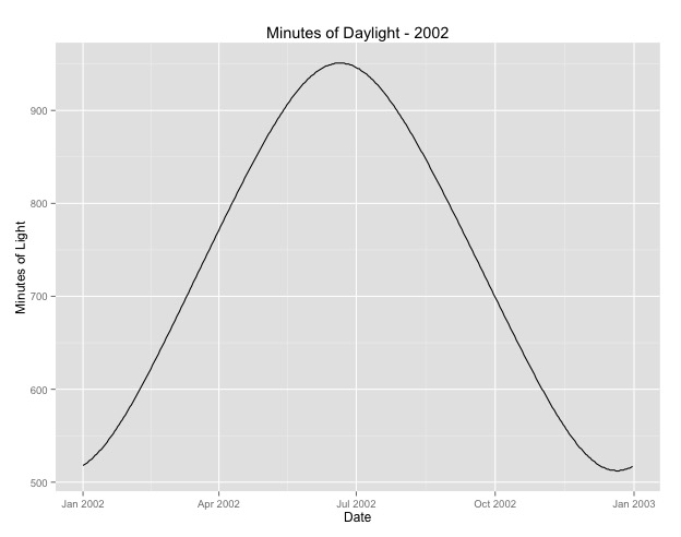
enter image description here

When I use this data rather than month of the year, the effect is still significant, but the effect is very, very small. The residual deviance is much larger than the models above. If daylight hours is a better model for seasons, and the fit is not as good, is this more evidence of very small seasonal effect?

> summary(daylightFit)

Call:
glm(formula = aggregatedDailyCount ~ t + daylightMinutes, family = "poisson", 
    data = aggregatedDailyNoLeap)

Deviance Residuals: 
    Min       1Q   Median       3Q      Max  
-3.0003  -0.6684  -0.0407   0.5930   3.8269  

Coefficients:
                  Estimate Std. Error z value Pr(>|z|)    
(Intercept)      3.545e+00  4.759e-02  74.493   <2e-16 ***
t               -5.230e-05  8.216e-05  -0.637   0.5244    
daylightMinutes  1.418e-04  5.720e-05   2.479   0.0132 *  
---
Signif. codes:  0 ‘***’ 0.001 ‘**’ 0.01 ‘*’ 0.05 ‘.’ 0.1 ‘ ’ 1

(Dispersion parameter for poisson family taken to be 1)

    Null deviance: 380.22  on 364  degrees of freedom
Residual deviance: 373.01  on 362  degrees of freedom
AIC: 2375

Number of Fisher Scoring iterations: 4

I'm posting the daylight hours in case anyone wants to play around with this. Note, this is not a leap year, so if you want to put in the minutes for the leap years, either extrapolate or retrieve the data.

state.daylight.2002.csv

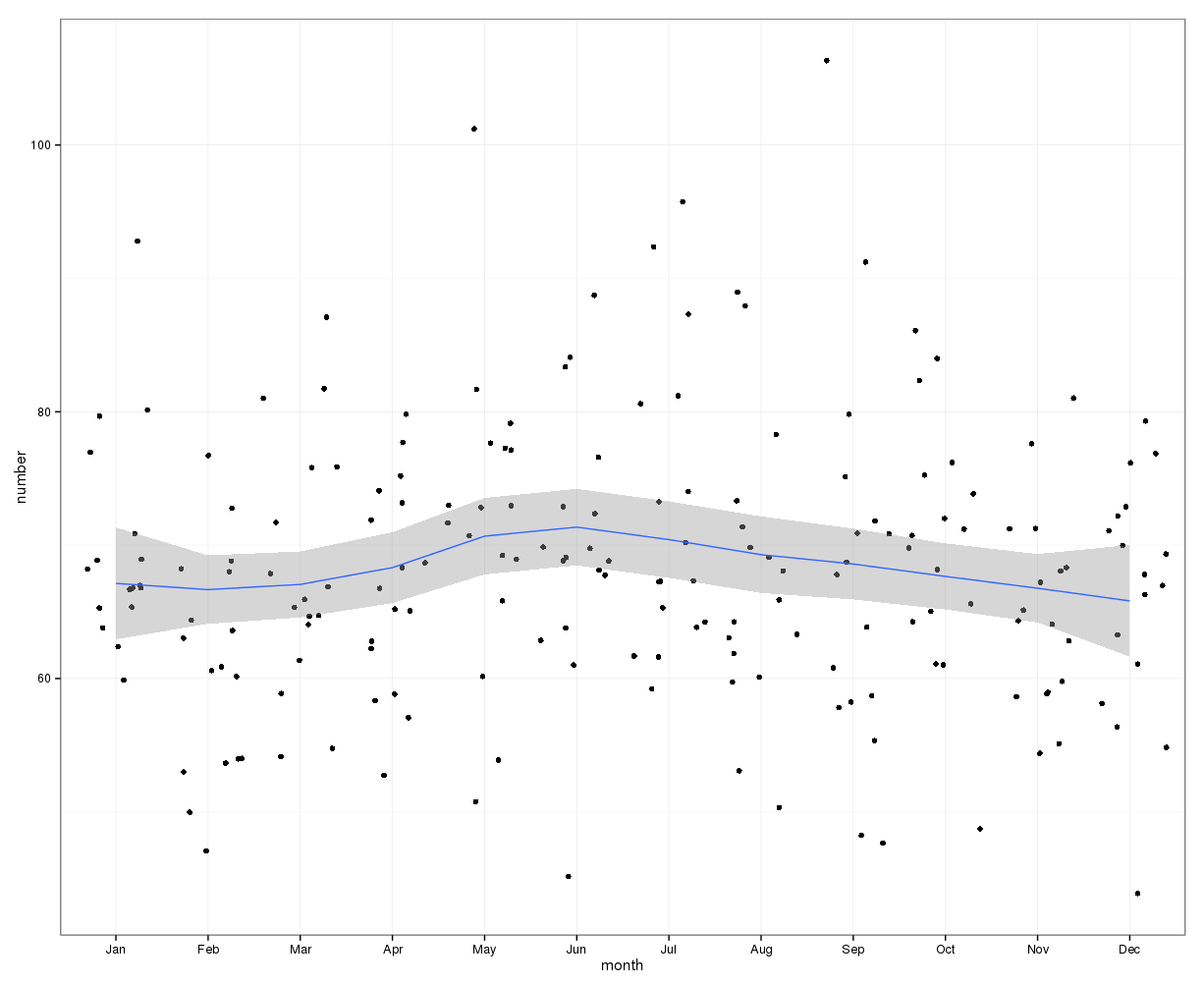
[Edit to add plot from deleted answer (hopefully rnso doesn't mind me moving the plot in the deleted answer up here to the question. svannoy, if you don't want this added after all, you can revert it)]
enter image description here

$\endgroup$
16
  • 1
    $\begingroup$ The wording "one of our 50 states" implies that all readers belong to the United States. Manifestly many aliens lurk here too. $\endgroup$
    – Nick Cox
    Commented Apr 7, 2015 at 16:53
  • 1
    $\begingroup$ Is that from a public dataset? Could you make the week-by-week or even day-by-day data available? $\endgroup$
    – Elvis
    Commented Apr 9, 2015 at 7:22
  • 1
    $\begingroup$ @Elvis - I've posted a link to the daily count data. The data comes from death certificates which are 'public record' but require a process to obtain; however, the aggregated count data does not. PS - I tried the link myself and it worked, but I've not posted to a public dropbox folder in this way before so please let me know if the link does not work. $\endgroup$
    – svannoy
    Commented Apr 14, 2015 at 12:27
  • 1
    $\begingroup$ Since your data are counts, I'd expect variance to be related to the mean. The usual time series models don't account for that (however, you might try say a transformation, perhaps a Freeman-Tukey, say), or you could look at a time series model that's designed for count data. (If you don't do this it may not be a huge problem since the number only ranges over a factor of two or so.) $\endgroup$
    – Glen_b
    Commented Apr 14, 2015 at 13:54
  • 1
    $\begingroup$ forecaster -- because in count data spread is related to mean. e.g. consider a Poisson count $y_t$, with mean $\mu_t$. In that case, $\text{Var}(y_t)=\mu_t$, so as the mean increases, the variance (and so also the spread) increases. [Indeed, often you find spread to be related to mean in some way for almost any data that has an upper or lower bound; there are clear reasons why this might be expected in those cases.] $\endgroup$
    – Glen_b
    Commented Apr 17, 2015 at 1:36

4 Answers 4

13
$\begingroup$

What about a Poisson regression?

I created a data frame containing your data, plus an index t for the time (in months) and a variable monthdays for the number of days in each month.

T <- read.table("suicide.txt", header=TRUE)
U <- data.frame( year = as.numeric(rep(rownames(T),each=12)), 
         month = rep(colnames(T),nrow(T)), 
         t = seq(0, length = nrow(T)*ncol(T)), 
         suicides = as.vector(t(T)))
U$monthdays <- c(31,28,31,30,31,30,31,31,30,31,30,31)
U$monthdays[ !(U$year %% 4) & U$month == "Feb" ] <- 29

So it looks like this:

> head(U,14)
   year month  t suicides monthdays
1  1995   Jan  0       62        31
2  1995   Feb  1       47        28
3  1995   Mar  2       55        31
4  1995   Apr  3       74        30
5  1995   May  4       71        31
6  1995   Jun  5       70        30
7  1995   Jul  6       67        31
8  1995   Aug  7       69        31
9  1995   Sep  8       61        30
10 1995   Oct  9       76        31
11 1995   Nov 10       68        30
12 1995   Dec 11       68        31
13 1996   Jan 12       64        31
14 1996   Feb 13       69        29

Now let’s compare a model with a time effect and a number of days effect with a model in which we add a month effect:

> a0 <- glm( suicides ~ t + monthdays, family="poisson", data = U )
> a1 <- glm( suicides ~ t + monthdays + month, family="poisson", data = U )

Here is the summary of the "small" model:

> summary(a0)

Call:
glm(formula = suicides ~ t + monthdays, family = "poisson", data = U)

Deviance Residuals:
    Min       1Q   Median       3Q      Max
-2.7163  -0.6865  -0.1161   0.6363   3.2104

Coefficients:
             Estimate Std. Error z value Pr(>|z|)
(Intercept) 2.8060135  0.3259116   8.610  < 2e-16 ***
t           0.0013650  0.0001443   9.461  < 2e-16 ***
monthdays   0.0418509  0.0106874   3.916 9.01e-05 ***
---
Signif. codes:  0 ‘***’ 0.001 ‘**’ 0.01 ‘*’ 0.05 ‘.’ 0.1 ‘ ’ 1

(Dispersion parameter for poisson family taken to be 1)

    Null deviance: 302.67  on 203  degrees of freedom
Residual deviance: 196.64  on 201  degrees of freedom
AIC: 1437.2

Number of Fisher Scoring iterations: 4

You can see that the two variables have largely significant marginal effects. Now look at the larger model:

> summary(a1)

Call:
glm(formula = suicides ~ t + monthdays + month, family = "poisson",
    data = U)

Deviance Residuals:
     Min        1Q    Median        3Q       Max
-2.56164  -0.72363  -0.05581   0.58897   3.09423

Coefficients:
              Estimate Std. Error z value Pr(>|z|)
(Intercept)  1.4559200  2.1586699   0.674    0.500
t            0.0013810  0.0001446   9.550   <2e-16 ***
monthdays    0.0869293  0.0719304   1.209    0.227
monthAug    -0.0845759  0.0832327  -1.016    0.310
monthDec    -0.1094669  0.0833577  -1.313    0.189
monthFeb     0.0657800  0.1331944   0.494    0.621
monthJan    -0.0372652  0.0830087  -0.449    0.653
monthJul    -0.0125179  0.0828694  -0.151    0.880
monthJun     0.0452746  0.0414287   1.093    0.274
monthMar    -0.0638177  0.0831378  -0.768    0.443
monthMay    -0.0146418  0.0828840  -0.177    0.860
monthNov    -0.0381897  0.0422365  -0.904    0.366
monthOct    -0.0463416  0.0830329  -0.558    0.577
monthSep     0.0070567  0.0417829   0.169    0.866
---
Signif. codes:  0 ‘***’ 0.001 ‘**’ 0.01 ‘*’ 0.05 ‘.’ 0.1 ‘ ’ 1

(Dispersion parameter for poisson family taken to be 1)

    Null deviance: 302.67  on 203  degrees of freedom
Residual deviance: 182.72  on 190  degrees of freedom
AIC: 1445.3

Number of Fisher Scoring iterations: 4

Well, of course the monthdays effect vanishes; it can be estimated only thanks to leap years!! Keeping it in the model (and taking into account leap years) allows to use the residual deviances to compare the two models.

> anova(a0, a1, test="Chisq")
Analysis of Deviance Table

Model 1: suicides ~ t + monthdays
Model 2: suicides ~ t + monthdays + month
  Resid. Df Resid. Dev Df Deviance Pr(>Chi)
1       201     196.65
2       190     182.72 11   13.928    0.237

So, no (significant) month effect? But what about a seasonal effect? We can try to capture seasonality using two variables $\cos\left( {2\pi t \over 12}\right)$ and $\sin\left( {2\pi t \over 12}\right)$:

> a2 <- glm( suicides ~ t + monthdays + cos(2*pi*t/12) + sin(2*pi*t/12),
             family="poisson", data = U )
> summary(a2)

Call:
glm(formula = suicides ~ t + monthdays + cos(2 * pi * t/12) +
    sin(2 * pi * t/12), family = "poisson", data = U)

Deviance Residuals:
    Min       1Q   Median       3Q      Max
-2.4782  -0.7095  -0.0544   0.6471   3.2236

Coefficients:
                     Estimate Std. Error z value Pr(>|z|)
(Intercept)         2.8676170  0.3381954   8.479  < 2e-16 ***
t                   0.0013711  0.0001444   9.493  < 2e-16 ***
monthdays           0.0397990  0.0110877   3.589 0.000331 ***
cos(2 * pi * t/12) -0.0245589  0.0122658  -2.002 0.045261 *
sin(2 * pi * t/12)  0.0172967  0.0121591   1.423 0.154874
---
Signif. codes:  0 ‘***’ 0.001 ‘**’ 0.01 ‘*’ 0.05 ‘.’ 0.1 ‘ ’ 1

(Dispersion parameter for poisson family taken to be 1)

    Null deviance: 302.67  on 203  degrees of freedom
Residual deviance: 190.37  on 199  degrees of freedom
AIC: 1434.9

Number of Fisher Scoring iterations: 4

Now compare it with the null model:

> anova(a0, a2, test="Chisq")
Analysis of Deviance Table

Model 1: suicides ~ t + monthdays
Model 2: suicides ~ t + monthdays + cos(2 * pi * t/12) + sin(2 * pi *
    t/12)
  Resid. Df Resid. Dev Df Deviance Pr(>Chi)
1       201     196.65                   
2       199     190.38  2   6.2698   0.0435 *
---
Signif. codes:  0 ‘***’ 0.001 ‘**’ 0.01 ‘*’ 0.05 ‘.’ 0.1 ‘ ’ 1

So, one can surely say that this suggests a seasonal effect...

$\endgroup$
21
  • 2
    $\begingroup$ I like the idea of Poisson regression a lot (+1), I think it is a much more educated modelling assumption but "surely say" based on a value of 0.044? I would probably bootstrap things if anything first if I had such a $p$-value... $\endgroup$
    – usεr11852
    Commented Apr 8, 2015 at 8:52
  • 2
    $\begingroup$ I totally agree, that’s what I implied :) "One can surely say that this suggests an effect"; and not "There is an effect"! What I think interesting is this trigonometric transform, it is very natural and I don’t understand why it’s not seen more often. But this is only a starting point... bootstrapping, assessing the model... lots to do. $\endgroup$
    – Elvis
    Commented Apr 8, 2015 at 9:21
  • 1
    $\begingroup$ No probs! My bad then, I was unable to detect the joke. :) $\endgroup$
    – usεr11852
    Commented Apr 8, 2015 at 19:10
  • 2
    $\begingroup$ +1. Poisson meets Fourier.... I think economists and some others emphasise indicator variables because seasonality can be spikey, but the trigonometric approach often helps. $\endgroup$
    – Nick Cox
    Commented Apr 8, 2015 at 19:25
  • 2
    $\begingroup$ Indeed. A tutorial review I wrote is accessible at stata-journal.com/article.html?article=st0116 $\endgroup$
    – Nick Cox
    Commented Apr 8, 2015 at 23:30
8
$\begingroup$

A chi-square test is a good approach as a preliminary view to your question.

The stl decomposition can be misleading as a tool to test for the presence of seasonality. This procedure manages to return a stable seasonal pattern even if a white noise (random signal with no structure) is passed as input. Try for example:

plot(stl(ts(rnorm(144), frequency=12), s.window="periodic"))

Looking at the orders chosen by an automatic ARIMA model selection procedure is also a bit risky since a seasonal ARIMA model does not always involve seasonality (for details see this discussion). In this case, the chosen model generates seasonal cycles and the comment by @RichardHardy is reasonable, however, a further insight is required in order to conclude that suicides are driven by a seasonal pattern.

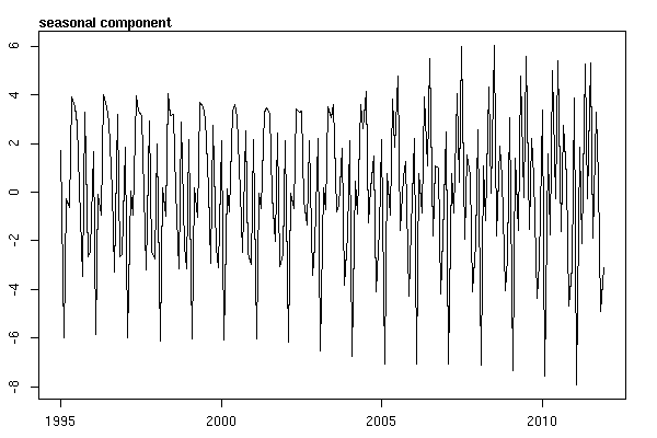
Below, I summarize some results based on the analysis of the monthly series that you posted. This is the seasonal component estimated upon the basic structural time series model:

require(stsm)
m <- stsm.model(model = "llm+seas", y = x)
fit <- stsmFit(m, stsm.method = "maxlik.td.scoring")
plot(tsSmooth(fit)$states[,2], ylab = "")
mtext(text = "seasonal component", side = 3, adj = 0, font = 2)

estimated seasonal component

A similar component was extracted using the software TRAMO-SEATS with default options. We can see that the estimated seasonal pattern is not stable across time and, hence, does not support the hypothesis of a recurrent pattern in the number of suicides across months during the sample period. Running the software X-13ARIMA-SEATS with default options, the combined test for seasonality concluded that identifiable seasonality is not present.

Edit (see this answer and my comment below for a definition of identifiable seasonality).

Given the nature of your data, it would be worth complementing this analysis based on time series methods with a model for count data (e.g. Poisson model) and test for the significance of seasonality in that model. Adding the tag count-data to your question may result in more views and potential answers in this direction.

$\endgroup$
4
  • $\begingroup$ Thanks @javiacalle, I'll be investigating the methods you suggest. Can I ask about your conclusion of the graph you posted, is it the fact that the amplitude increases as years progress that is the basis of your comment, "we can see that the estimated seasonal pattern is not stable across time", or does that include the more subtle observation that the shape of each peak is slightly different? I'm a assumming the former, but we know where assumptions lead us. $\endgroup$
    – svannoy
    Commented Apr 8, 2015 at 1:26
  • 2
    $\begingroup$ In addition to the monthly seasonality one could ask about the day-of-week seasonality. Actually I wouldn't be surprised if some days of the week are more or less prone to suicide. A $\chi2$ test should give you an answer in seconds. $\endgroup$
    – oDDsKooL
    Commented Apr 8, 2015 at 7:07
  • $\begingroup$ @svannoy The main conclusion based on the time series methods used in my answer is that there isn't a clear seasonal pattern in the sample data. Despite seasonal cycles explain part of the variability of the data, a seasonal pattern cannot be identified reliably since it is obscured by a high degree of irregular fluctuations (this could also be checked displaying the gain function of the chosen ARIMA model shown in the question). $\endgroup$
    – javlacalle
    Commented Apr 8, 2015 at 9:21
  • $\begingroup$ @oDDsKooL I also have done the chi-square test on day of the week, Saturday/Sunday are a bit below expectations and Monday/Tuesday are just above.... $\endgroup$
    – svannoy
    Commented Apr 8, 2015 at 13:56
7
$\begingroup$

As noted in my comment, this is a very interesting problem. Detecting seasonality is not a statistical exercise alone. A reasonable approach would be to consult theory and experts such as:

  • Psychologist
  • Psychiatrist
  • Sociologist

on this problem to understand "why" there would be seasonality to supplement data analysis. Coming to the data, I used an excellent decomposition method called unobserved components model (UCM) which is a form of state space method. See also this very accessible article by Koopman. My approach is similar to @Javlacalle. It not only provides a tool to decompose time series data but also objectively assesses the presence or absence of seasonality via significance testing. I'm not a big fan of significance testing on non-experimental data but I don't know of any other procedure that you would be able to test your hypothesis on presence/absence of seasonality on a time series data.

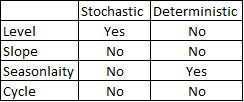
Many ignore but a very important feature that one would want to understand is the type of seasonality:

  1. Stochastic - changes randomly and tough to predict
  2. Deterministic - does not change, perfectly predictable. You could use dummy or trigonometry (sin/cos etc.,) to model

For a lengthy time series data such as yours, it is possible that seasonality might have changed over time. Again UCM is the only approach that I know that can detect these stochastic/deterministic seasonality. UCM can decompose your problem into following "components":

Time Series Data = level + Slope + Seasonality + Cycle + Causal + Error(Noise).

You could also test if level, slope, cycle is deterministic or stochastic. Please note that level + slope = trend. Below I present some analysis on your data using UCM. I used SAS to do the analysis.

data input;
format date mmddyy10.;
date = intnx( 'month', '1jan1995'd, _n_-1 );
      input deaths@@;
datalines;
62    47  55  74  71  70  67  69  61  76  68  68
64    69  68  53  72  73  62  63  64  72  55  61
71    61  64  63  60  64  67  50  48  49  59  72
67    54  72  69  78  45  59  53  48  65  64  44
69    64  65  58  73  83  70  73  58  75  71  58
60    54  67  59  54  69  62  60  58  61  68  56
67    60  54  57  51  61  67  63  55  70  54  55
65    68  65  72  79  72  64  70  59  66  63  66
69    50  59  67  73  77  64  66  71  68  59  69
68    61  66  62  69  84  73  62  71  64  59  70
67    53  76  65  77  68  65  60  68  71  60  79
65    54  65  68  69  68  81  64  69  71  67  67
77    63  61  78  73  69  92  68  72  61  65  77
67    73  81  73  66  63  96  71  75  74  81  63
80    68  76  65  82  69  74  88  80  86  78  76
80    77  82  80  77  70  81  89  91  82  71  73
93    64  87  75  101 89  87  78  106 84  64  71
;
run;

ods graphics on;
 proc ucm data = input plots=all; 
      id date interval = month; 
      model deaths ; 
      irregular ; 
      level checkbreak; 
      season length = 12 type=trig var = 0 noest; * Note I have used trigonometry to model seasonality;
   run;

   ods graphics off;

After several iterations considering different components and combinations, I ended with a parsimonious model of the following form:

There is a stochastic level + deterministic seasonality + some outliers and the data does not have any other detectable features.

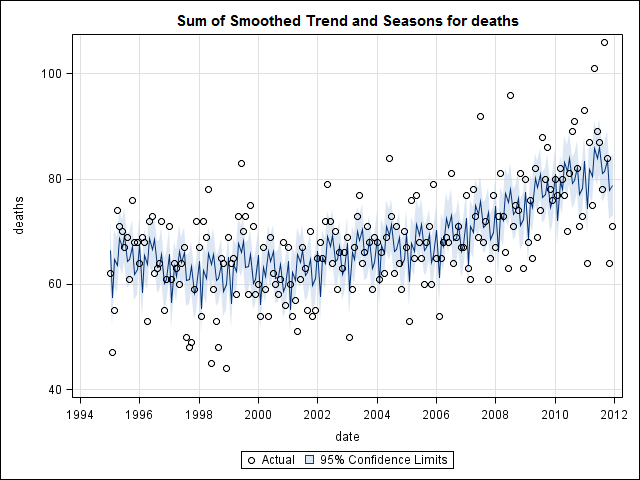
enter image description here

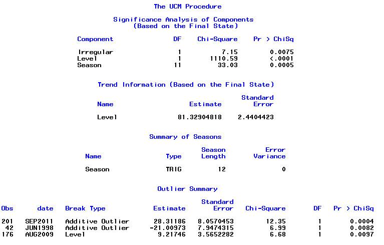
Below is significance analysis of various components. Notice that I used trigonometry (that is sin/cos in the seasonality statement in PROC UCM) similar to @Elvis and @Nick Cox. You could also use dummy coding in UCM and when I tested both gave similar results. See this documentation for differences between the two ways to model seasonality in SAS.

enter image description here

As shown above you have outliers: two pulses and one level shift in 2009 (Did economy/housing bubble play a role after 2009 ??) which could be explained by further deep dive analysis. A good feature of using Proc UCM is that it provides excellent graphical output.

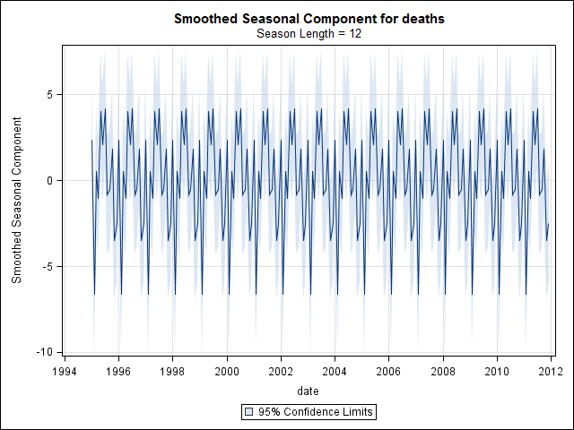
Below is seasonality and a combined trend and seasonality plot. Whatever is left over is noise.

enter image description here enter image description here

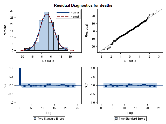
A more important diagnostic test if you want to use p values and significance testing is to check if your residuals are pattern-less and normally distributed which is satisfied in the above model using UCM and as shown below in the residual diagnostic plots like acf/pacf and others.

enter image description here

Conclusion: Based on data analysis using UCM and significance testing the data appears to have seasonality and we see high number of deaths in summer months of May/June/July and lowest in winter months of December and February.

Additional Considerations: Please also consider the practical significance of the magnitude of seasonal variation. To negate counterfactual arguments please consult domain experts to further complement and validate your hypothesis.

I'm by no means saying that this is the only approach to solve this problem. The feature that I like about UCM is that it allows you to explicitly model all the time series features and is highly visual as well.

$\endgroup$
5
  • $\begingroup$ Thanks for this answer and for interesting comments. I don't know UCM, it seems very interesting, I'll try to keep that in mind... $\endgroup$
    – Elvis
    Commented Apr 12, 2015 at 20:15
  • $\begingroup$ (+1) Interesting analysis. I would still be cautious about concluding the presence of a significant deterministic seasonal pattern but your results call for a closer look into this possibility. The Canova and Hansen test for seasonal stability could be helpful, it is described for example here. $\endgroup$
    – javlacalle
    Commented Apr 12, 2015 at 20:27
  • $\begingroup$ Using the implementation available in the software gretl (default options in a model with seasonal dummies and a first order lag), the null of stability is rejected at the 5% significance level for September and October. Using the seasonal trigonometric cycles, stability of the fundamental seasonal cycle of frequency $\pi/6$ is not rejected at the 5% level, which agrees with the conclusions by @Elvis. $\endgroup$
    – javlacalle
    Commented Apr 12, 2015 at 20:28
  • 1
    $\begingroup$ +1. Many interesting and helpful comments. To your list of psychologist, psychiatrist, sociologist could be added meteorologist/climatologist. Such a person would want to add that no two years are identical in rainfall and temperature cycles. I would have guessed crudely at more depression in winter (shorter day lengths, etc.), but so much for a guess given some data. $\endgroup$
    – Nick Cox
    Commented Apr 12, 2015 at 21:07
  • $\begingroup$ Thanks @forecaster, this adds a lot to my learning. I am a psychologist, with a public health degree. I'd add epidemiologist to your list. As I mention in the beginning, there is a lot of mythology (aka theorizing) about seasonal trends and suicide. One can make strong arguments for seasonal trends, in any direction so we need quantitative analyses to (dis)confirm. From a public health perspective, if we found sharp discontinuities we could target interventions. I'm not seeing that in this data. From a theory-of-suicide perspective, confirming even small trends could inform theory development. $\endgroup$
    – svannoy
    Commented Apr 13, 2015 at 12:16
1
$\begingroup$

For initial visual estimation, following graph can be used. Plotting the monthly data with loess curve and its 95% confidence interval, it appears that there is a mid-year rise peaking at June. Other factors may be causing the data to have wide distribution, hence the seasonal trend may be getting masked in this raw data loess plot. The data points have been jittered.

enter image description here

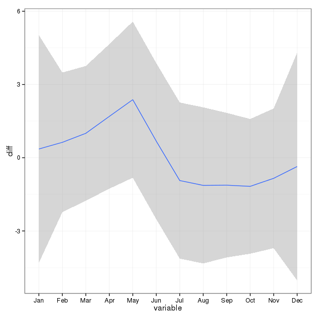
Edit: Following plot shows loess curve and confidence interval for change in number of cases from the number in the previous month:

enter image description here

This also shows that during the months in first half of the year, the number of cases keep rising, while they are falling in the second half of the year. This also suggest a peak in mid-year. However, the confidence intervals are wide and goes across 0, i.e. no change, throughout the year, indicating a lack of statistical significance.

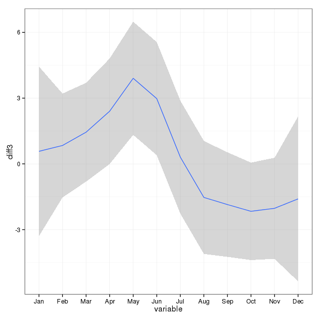
The difference of a month's number can be compared with average of previous 3 months' values:

enter image description here

This shows a clear increase in numbers in May and a fall in October.

$\endgroup$
5
  • $\begingroup$ (-1) There are already three high-quality answers to this question. Your answer also does not answer the posted question - you could post it as a comment. You do not provide answer how this data could be analyzed. $\endgroup$
    – Tim
    Commented Apr 12, 2015 at 20:03
  • $\begingroup$ I had earlier posted comment here (see below the question), but I cannot post figure in comments. $\endgroup$
    – rnso
    Commented Apr 13, 2015 at 1:00
  • $\begingroup$ Although I understand the editorial here, I will say that @rnso has provided a nice graph that illustrates the potential seasonal component nicely and should have been a part of my original post. $\endgroup$
    – svannoy
    Commented Apr 14, 2015 at 12:32
  • $\begingroup$ I understand that and agree, but still this is not an answer but rather a comment or improvement. @rnso could have suggested to you via comment that you could look on or include such plot. $\endgroup$
    – Tim
    Commented Apr 17, 2015 at 10:59
  • $\begingroup$ @Glen_b , @ Tim : I have added another plot that might be useful and that I cannot put in a comment. $\endgroup$
    – rnso
    Commented Apr 18, 2015 at 10:34

Your Answer

By clicking “Post Your Answer”, you agree to our terms of service and acknowledge you have read our privacy policy.

Not the answer you're looking for? Browse other questions tagged or ask your own question.