5
$\begingroup$

I have about 500 time series with different trends, and each time series represents a given nb of transactions. (Volumes follow a long tail distribution).

I would like to plot a summary graph on which I can quickly see trends off all my series and the volume information.

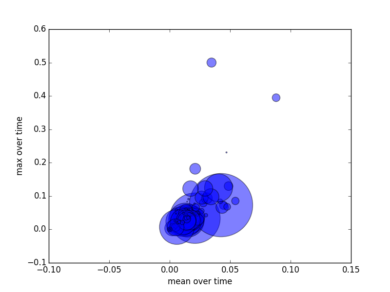
I ended up with mean vs max scatter plot where each point corresponds to 1 time series and the circle size is proportional to the volume. (The computation of the trend is not critical here, could be the slope of my time series, weighted average on last point vs full series, etc..)

Here is my current result which is not really readable: summary Do you have any idea? Thanks;
$\endgroup$
3
  • $\begingroup$ It really depends on what features of the time series you are interested in. I believe the most comonly used processing method in such case is Principal Component Analysis $\endgroup$
    – KishKash
    Commented May 7, 2015 at 18:30
  • 1
    $\begingroup$ Related: stats.stackexchange.com/questions/46334 $\endgroup$
    – whuber
    Commented May 8, 2015 at 15:46
  • $\begingroup$ I can't follow your situation. What are the different time series? Are they numbers of sales at a given point? Why do you care about mean vs max? What is it that you ultimately want to know about a given time series? What is it that you ultimately want to know about the collection of time series? $\endgroup$ Commented May 8, 2015 at 17:28

1 Answer 1

3
$\begingroup$

Your view is not bad. You lose a lot of detail due to over-striking and summarizing, but that's OK if you only care about the outliers and those summary stats.

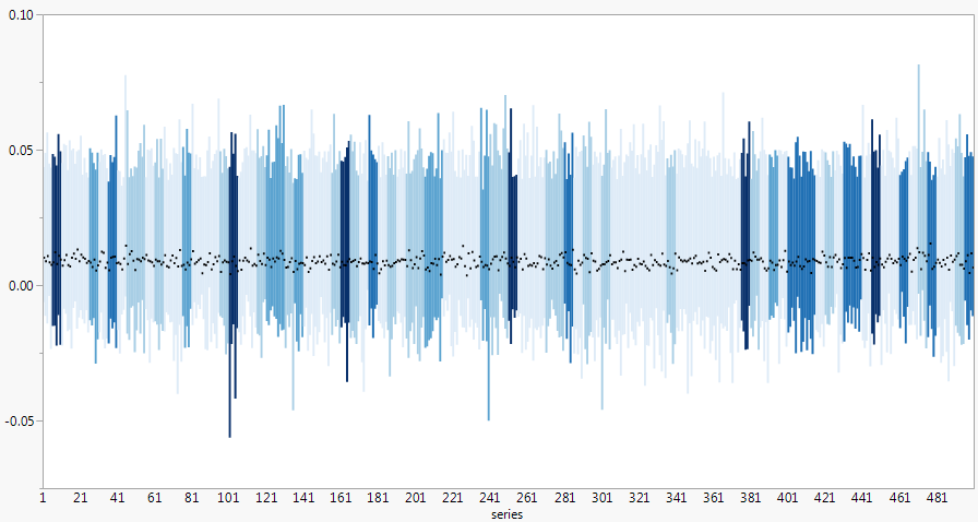
500 is pushing the limit, but an alternative that allows more summary stats and avoids over-striking is to put the series number on the X axis and the summary stats on the Y axis. Here's a mock-up showing min, mean, and max for each series on the Y axis and coloring by another variable such as volume. The coloring could be a continuous gradient though I've used discrete levels to allow more license for a non-linear scaling since you mentioned the volume has a long tail. That is, the color ranges might be 0-1, 1-10, 10-500, ...

enter image description here

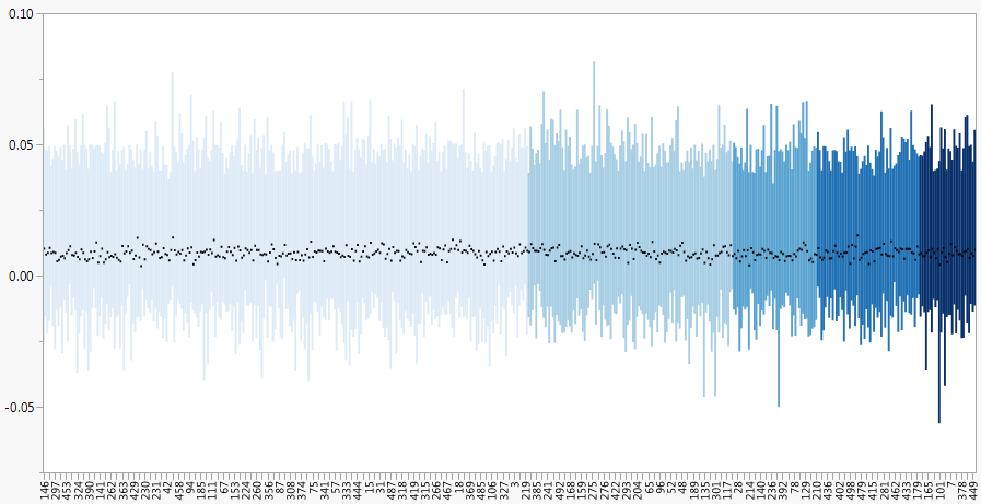
If the series number is not important for the static view (it will presumably be available if you hover over or click on an interesting bar), you can order the X axis by volume, mean or some other variable. enter image description here

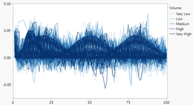
Overlaying 500 time series with transparency is not out of the question. You don't get any sense of measures like the mean, but you can see big trends and any outlying series.

enter image description here

$\endgroup$

Your Answer

By clicking “Post Your Answer”, you agree to our terms of service and acknowledge you have read our privacy policy.

Not the answer you're looking for? Browse other questions tagged or ask your own question.