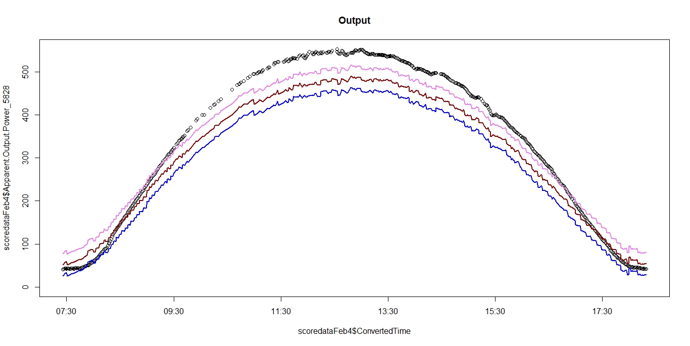
 linear regression model is fitting the data properly as in shape of the curve of predicted value is same as curve of actual value but the predicted values are lower than the actual values. Imagine the actual curve being pulled down in the graph to give predicted curve. Can anyone suggest why is this happening?
In the image- black points are the actual value and red line is the fitted value, pink and blue are prediction interval value(prediction upper and prediction lower)
x axis is not an explanatory variable used to train the model, it is just the timestamp of data collection
-
$\begingroup$ There is almost certainly some problem in the way the regression model is set up. It would help to see how the model is set up and a plot of the data points and fitted curve. $\endgroup$– EdMCommented May 19, 2015 at 13:42
-
$\begingroup$ reg<-lm(formula = Output ~ Power + Thermal+ Temperature + Hour , data = train) summary(reg) pred.interval<- predict(reg, test, interval ="prediction", level= 0.95) i am not able to add photo of the curve, but imagine as the actual data point curve is bell shaped and it is pulled down from the middle to give fitted value curve(the fitted values are matching the data points at the end point of the data point curve but is pulled down in the centre). The fit and shape of the two curves are same. @EdM $\endgroup$– AnalyticsEnthusiastCommented May 19, 2015 at 13:49
-
1$\begingroup$ What "curves" are you talking about? Your regression is multivariate; plotting the fit correctly would require five dimensions! If you would care to post an image somewhere on the Web, you could link to it to show what's going on. $\endgroup$– whuber ♦Commented May 19, 2015 at 13:55
-
$\begingroup$ @whuber i am talking about the plot of output variable. My regression is multivariate and i am predicting output by using the linear regression model trained on train dataset. When i am plotting the actual output variable and predicted output variable(x axis is time)then the above described pattern is observed. (the data is not time series) $\endgroup$– AnalyticsEnthusiastCommented May 19, 2015 at 13:59
-
1$\begingroup$ This is a plot of the response (and, apparently, some predictions) against one single explanatory variable. It tells you little (apart from that the model does not fit well). There are (far) better ways to evaluate your regression model. $\endgroup$– whuber ♦Commented May 19, 2015 at 14:10
1 Answer
A linear model with an intercept term will always predict the mean of the response correctly on the training data. That is, the mean of the observed response is always equal to the mean of the predicted response. You could say that the intercept "memorized" the overall response mean of the training data.
That said, when you go to a held out data set, there is no guarantee that the overall mean will stay the same. This is especially true when your new data is collected out of time, or in a different region (or for many other reasons). This phenomena is often manifested in exactly the way that you are seeing: the model captures the shape of the data well, but the overall trend is shifted by a constant amount.
I see this all the time in my industry (insurance). There is a long lag from when a model is fit to when it can be put into production due to regulatory issues. During this time, macroeconomic forces can cause the average insurance loss to drift up or down, while the ratio between the propensities for two customers to have a loss stays constant. There is a whole gamut of techniques actuaries have developed to deal with these intercept shifts.
-
$\begingroup$ Thank you for the explanation. Can you suggest some remedial measure $\endgroup$ Commented May 19, 2015 at 14:15
-
$\begingroup$ Also, why is the model fitting for the values in the end. $\endgroup$ Commented May 19, 2015 at 14:16
-
$\begingroup$ What remedial measures you take, if any, is very dependent on what you actually want to use this model for / what you want to learn from the analysis. It looks like your model is predicting too high at the boundaries of time, and too large in the middle, this is probably due to a model mis-specification (like a non-linear effect that is correlated with the time variable you are plotting). $\endgroup$ Commented May 19, 2015 at 20:29
