11
$\begingroup$

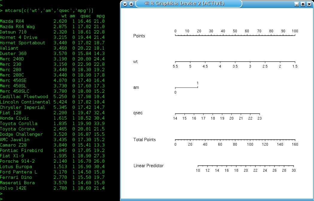
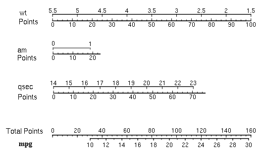
Following is a nomogram created from mtcars dataset with rms package for the formula:

mpg ~ wt + am + qsec

enter image description here

The model itself seems good with R2 of 0.85 and P<0.00001

> mod

Linear Regression Model

ols(formula = mpg ~ wt + am + qsec, data = mtcars)

                Model Likelihood     Discrimination    
                   Ratio Test           Indexes        
Obs       32    LR chi2     60.64    R2       0.850    
sigma 2.4588    d.f.            3    R2 adj   0.834    
d.f.      28    Pr(> chi2) 0.0000    g        6.456    

Residuals

    Min      1Q  Median      3Q     Max 
-3.4811 -1.5555 -0.7257  1.4110  4.6610 

          Coef    S.E.   t     Pr(>|t|)
Intercept  9.6178 6.9596  1.38 0.1779  
wt        -3.9165 0.7112 -5.51 <0.0001 
am         2.9358 1.4109  2.08 0.0467  
qsec       1.2259 0.2887  4.25 0.0002  

I am not clear what are these 'Points', 'Total Points' and 'Linear Predictor'. Which one of these represent mpg, the outcome variable? I will appreciate any explanation.

Edit: considering excellent suggestions by @Glen_b for easy reading of points etc, following could be an alternative nomogram:

enter image description here

Since outcome or response variable is available, it can be used instead of the term 'Linear Predictor'. It also become self-explanatory as to how the nomogram needs to be read.

$\endgroup$
1
  • $\begingroup$ nice diagram in edit there $\endgroup$
    – Glen_b
    Commented Jun 9, 2015 at 3:58

1 Answer 1

12
$\begingroup$

Well, since your model is linear, with the expected mpg equal to the linear predictor, you can read mpg straight off the linear predictor scale.

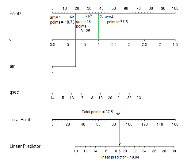
For each variable, you find its value on the relevant scale. For example, imagine we wanted to find a predicted mpg for a car with wt=4, am=1, qsec=18:
enter image description here

which gives a predicted mpg of about 18.94. Substituting into the equation gives 18.95, so that's pretty close. (In practice you would probably only work to the nearest whole point -- and so get about 2 figure accuracy - "19 mpg" - out, rather than 3-4 figures as here.)

One of the chief benefits of such a diagram to my mind is that you instantly see the relative effect of changes in the different predictor variables (IV) on the response (DV). Even when you don't need the diagram for any calculations, it can have great value in terms of simply displaying the relative effects of the variables.


Followup question from comments:

Does it work the same way for non-linear or polynomial regressions?

For cases where $E(Y)$ is nonlinear in some predictors, some minor - and perhaps obvious - modifications are needed. Imagine that we have $\hat{y} = b_0+b x_1+f(x_2)$

where either:

(a) $f$ is monotonic; or

(b) $f$ is not monotonic

In either case, the scale for $x_1$ would work exactly as above, but in case:

(a) the scale for $x_2$ won't be linear; e.g. if $f$ is monotonic decreasing but (roughly) quadratic, you might have something like this:

enter image description here

(b) the non-monotonic scale for $x_2$ will "break" at a turning point and flip over. e.g.

enter image description here

-- here the function $f(x)$ has a minimum somewhere around $x=2.23$

It's possible for such functions to have several turning points, where scales would break and flip over multiple times - but the axis line only has two sides.

With points-type nomograms this presents no difficulty, since one may move additional scale-sections up or down (or more generally, orthogonally to the direction of the axis) a little until no overlap occurs.

(More than one turning point can be a problem for alignment-type nomograms; one solution shown in Harrell's book is to offset all the scales slightly from a reference line, on which the value's position is actually taken.)


In the case of GLMs with nonlinear link function, the scales work as above, but the scale of the linear predictor will be marked with a nonlinear scale for $Y$, something like (a) above.

Examples of all of these situations can be found in Harrell's Regression Modeling Strategies.


Just a couple of side notes

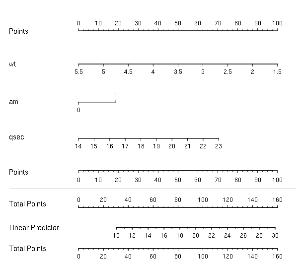
  1. I'd much prefer to see two points scales, at the top and bottom of the relevant section; otherwise it's hard to "line up" accurately because you have to guess what 'vertical' is. Something like this:
    enter image description here

    However, as I note in comments, for the last section of the diagram (total points and linear predictor) perhaps a better alternative to a second points scale would be to simply have a pair of back-to-back scales (total points on one side, linear predictor on the other), like this:

    enter image description here

    whereupon we avoid the need to know what 'vertical' is.

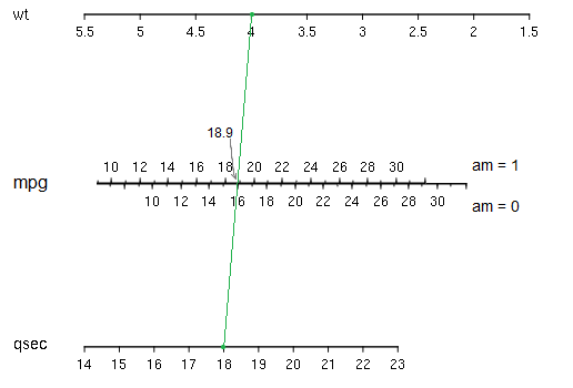
  2. With only two continuous predictors and a single binary factor, we can quite readily construct a more traditional alignment nomogram:
    enter image description here

    In this case you simply find the wt and qsec values on their scales and join them with a line; where they cross the mpg axis, we read off the value (while the am variable determines which side of the mpg axis you read). In a simple case like this, these kind of nomograms are faster and simpler to use, but can be less easy to generalize to many predictors, where they can become unwieldy. The points-style nomogram in your question (as implemented in Regression Modeling Strategies and in the rms package in R) can add more variables seamlessly. This can be quite an advantage when dealing with interactions.
$\endgroup$
17
  • $\begingroup$ Thanks for a clear, illustrated explanation. Does it work the same way for non-linear or polynomial regressions? $\endgroup$
    – rnso
    Commented Jun 4, 2015 at 6:37
  • 1
    $\begingroup$ I have edited my answer to respond to this additional question. $\endgroup$
    – Glen_b
    Commented Jun 6, 2015 at 5:37
  • 2
    $\begingroup$ This is an amazing post Glen. I think I'm going to modify the nomogram function's plot method to add the extra Points scale by default. Great suggestion!! $\endgroup$ Commented Jun 8, 2015 at 17:41
  • 1
    $\begingroup$ @FrankHarrell No, because you don't read any relationship between points and total points - they needn't even be on the same page. The problem is finding 'vertical' so you can read from total-points to the linear predictor accurately. If those two scales are very close or touching, rather than say two inches apart, it's not an issue. When they're inches apart, a few degrees of error in finding vertical can mean a fair bit of error in the result. You still need two points scales in the first section though, because you can have many predictors and they can't all be adjacent to the points scale. $\endgroup$
    – Glen_b
    Commented Jun 8, 2015 at 18:28
  • 1
    $\begingroup$ @FrankHarrell Personally I think a grid clutters the display, and tends to obscure its value; I avoid grids when I can. They also don't allow the same degree of precision in getting vertical unless the grid is as fine as the scale (which I think would be terrible visually), Without an option for one, I'd end up editing in a second points scale (just as I did here) to get it to be in what I'd see as a usable state for the two purposes I see it having (i. making reasonably accurate estimation of predicted values without obscuring ii. the clarity of the relative contributions to the response).. $\endgroup$
    – Glen_b
    Commented Jun 10, 2015 at 0:25

Your Answer

By clicking “Post Your Answer”, you agree to our terms of service and acknowledge you have read our privacy policy.

Not the answer you're looking for? Browse other questions tagged or ask your own question.