Preliminary Discussion
I felt I would add another visual example, but first I use a very simple piece of data to illustrate a basic and known point for people who already know a fair amount about standard deviation. We can simulate a simple randomly generated normal distribution in R, $x$, like so:
#### Set Seed and Sim Data ####
set.seed(123)
x <- rnorm(50,mean=0)
We can easily get the variance of $x$ by simply running var(x), which gives us $0.8198347$, indicating that our data fluctuates about this amount. Wanting to know how much this fluctuates around the mean with respect to the distribution, we may want the standard deviation instead.
Obtaining the standard deviation is easy, as we can run sd(x), which is $\text{SD}=0.9054472$. However, most of the distribution will be located within two standard deviations from the mean, which can be obtained with the code below:
upper <- 2*sd(x)
lower <- -2*sd(x)
upper
lower
The output from this code is:
> upper
[1] 1.810894
> lower
[1] -1.810894
Thus we should expect our data to fluctuate mostly around $1.81$ points above or below the mean. But what is an intuitive way to visualize this?
Fluctuation Plot
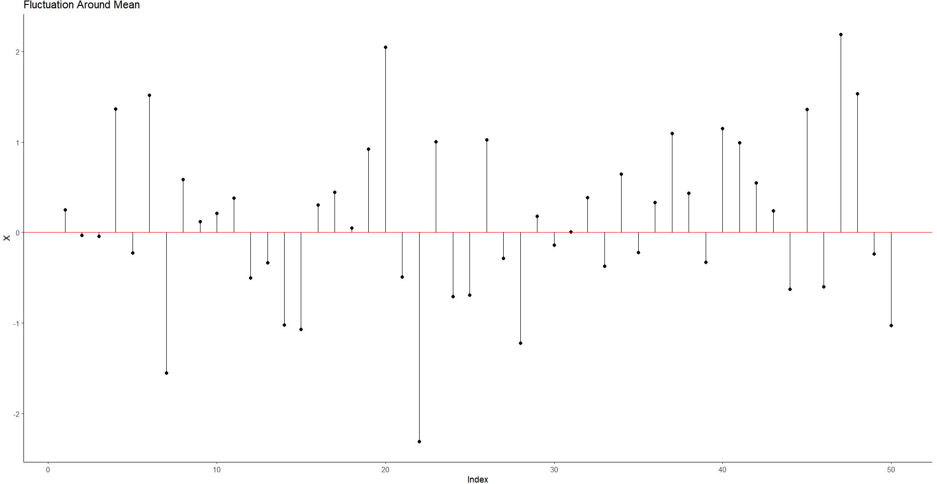
This idea isn't likely new, but one I like to look at when visualizing variation. Here I plot an index of each data point (basically the order of the data as it appears) and the distance each point is from the mean (the red line in the middle).
#### Plot Fluctuation Around Mean ####
library(tidyverse)
ggplot()+
  geom_point(aes(x=1:50,
                 y=x))+
  geom_hline(yintercept = 0,
             color="red")+
  geom_segment(
    aes(x=1:50,
        xend=1:50,
        y=0,
        yend=x)
  )+
  theme_classic()+
  labs(x='Index',
       y="X",
       title = "Fluctuation Around Mean")
We can get an intuitive sense here that variance here can be considered a distance measure, or a geometrical fluctuation of average distances from it's centerpoint of values.

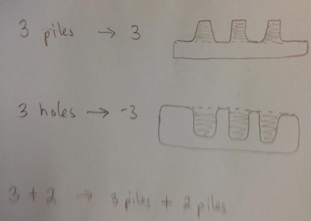
In some sense we can consider these in a similar way as the analogy given by positive and negative values. If we dig a hole 3 feet down, this gives us -3 feet, and if we pile dirt on top, we get 3 feet above ground. The variation in many holes and piles of dirt will average around a mean value of dirt piled or dug at a given time (see child's perspective of this idea below, see source here):

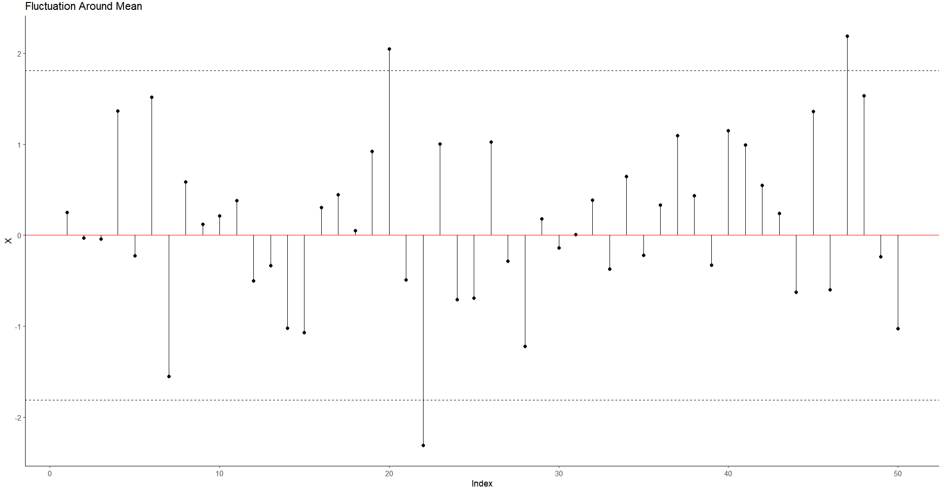
Note again that our variation should fluctuate in a normal distribution around 2 standard deviations. If we plot the $2 * SD$ values on the plot, we should expect the lines for all the points to situate mostly within the lines.
### Superimpose SD Lines ####
ggplot()+
  geom_point(aes(x=1:50,
                 y=x))+
  geom_hline(yintercept = 0,
             color="red")+
  geom_hline(linetype = "dashed",
             yintercept = upper)+
  geom_hline(linetype = "dashed",
             yintercept = lower )+
  geom_segment(
    aes(x=1:50,
        xend=1:50,
        y=0,
        yend=x)
  )+
  theme_classic()+
  labs(x='Index',
       y="X",
       title = "Fluctuation Around Mean")
As we see below:

While there are a few data points outside the range, most vary only between these regions. This in some sense gives a visual sense of how variance and standard deviation works.

