2
$\begingroup$

I've got spatio-temporal disease data at the county/annual level for 2000-2014. I'm analyzing it to try to pull out temporal variations in disease incidence and was told that I should generate a spatio-temporal variogram. The variogram appears to show a relationship but I'm having a hard time finding out how to interpret the graph (which is attached).

Is this graph showing that disease rates 10-15 years apart are more strongly correlated at <100 km, 200 km, and 500km? and that the temporal correlation drops off sharply at around 8 years apart?

If I remember correctly, the lower the gamma, the greater the autocorrelation? I've looked for a guide on interpretation for a while now but all I can find are guides on how to generate models from this data.

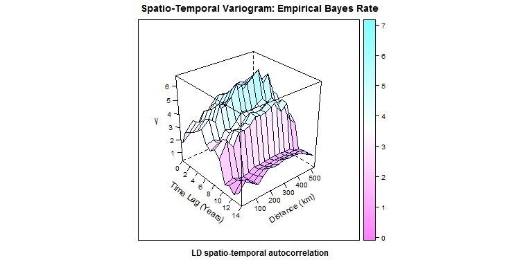
ST Variogram

$\endgroup$
4
  • $\begingroup$ Low $\gamma$ means high autocovariance. $\endgroup$
    – whuber
    Commented Dec 1, 2015 at 18:50
  • $\begingroup$ Right, that's what I thought. So there is a lot of covariance at ten or more years apart, is what this is showing. Right? $\endgroup$ Commented Dec 1, 2015 at 18:56
  • $\begingroup$ @RossWardrup, Am trying to plot a variogram similar to yours, in the gstat function I have the option of weeks, days and hours for temporal lag, however, my lag is in years. How did you go about this/ $\endgroup$ Commented Sep 29, 2017 at 5:00
  • $\begingroup$ can you please elaborate how you interpreted spatial correlation at 200kms . As far as , I can't see anywhere $\endgroup$ Commented Dec 10, 2023 at 8:57

1 Answer 1

2
$\begingroup$

A variogram is a measure of dissimilarity in space/time. The lower is the variogram value, the higher is the correlation between the two pairs of data points.

Thinking about spatio-temporal correlation simultaneously is often tricky. For exploratory analysis purpose, statisticians sometimes tend to separately think about the spatial variogram at zero-time lag and the temporal variogram at zero-spatial lag, which are the two line plots you see when you look at the figure from the front and side planes. Variograms often give you a rough estimate about how your space-time correlation looks like. However, accurate estimates are usually evaluated by fitting a covariance model to your data.

From the figure above, I can draw the following observations:

  1. There seems to exist a strong temporal correlation up to almost 8 years apart (which is what the statisticians call: temporal range), after which correlation starts to die out.
  2. There seems to exist a fairly spatial correlation up to 200 kms apart.
  3. Your data seems to exhibit (a nugget effect), meaning that the data is noisy, because the intercept of the spatial and temporal variograms should be zero if the data is perfectly non-noisy. But in your case, the temporal variogram and spatial variograms have non-zero values for the intercepts.
  4. From the wigly look of the space-time surface, I might conclude that your data seems to exhibit some spatial-temporal interaction, which might support the argument of fitting a non-separable covariance model to the data, rather than separable models.
$\endgroup$
2
  • $\begingroup$ The OP says "data at the county/annual level for 2000-2014" which could suggest the possibility of artifacts due fewer sample-pairs at longer time lags? Commonly variograms are plotted with some standard-error estimate, to prevent over-interpreting this type of artifact. $\endgroup$
    – GeoMatt22
    Commented Nov 18, 2016 at 22:34
  • $\begingroup$ That's correct. That's why plotting binned versions of spatial and temporal variograms separately would help and provide useful insights to visualize such "standard errors", along with the information of "how many data points" fall in each bin. $\endgroup$
    – rodrigo
    Commented Nov 18, 2016 at 22:42

Your Answer

By clicking “Post Your Answer”, you agree to our terms of service and acknowledge you have read our privacy policy.

Not the answer you're looking for? Browse other questions tagged or ask your own question.