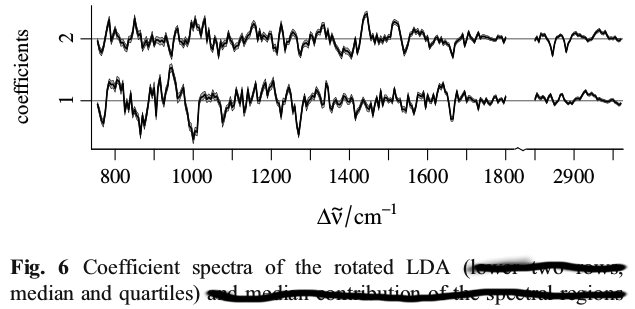
Given a cross validated generalised linear model with about 5-10 coefficients across 10 folds, is it appropriate to plot all the coefficients on one graph using multiple line charts? That is:
- Have the folds numbered 1 to 10 on the x-axis.
- Plot a line chart for each model covariate, so that the y-value is the model coefficient for that covariate on the respective fold.
I would like to do this as it shows:
- How the model coefficients compare to each other in scale.
- The flatness of the line shows the stability of the coefficients to some extent.
What I do not like is:
- There is no linear relationship between the folds so a line chart would not be usually suitable; in other cases like this a scatterplot or bar plot would be preferred.
- The horizontal width of the plot artificially affects the flatness of the line.
Does anyone have any comments on this methodology or can recommend other ways of showing the cross validated coefficients?

