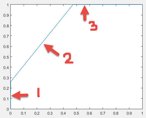
I gather from the comments that you only have 2 unique predicted values. When you present some data to the classifier to make predictions, it gives either A or B as an output, rather than a continuous outcome in some range. For example, logistic regression gives output in (0,1), so any real number between 0 and 1 (such as 0.2, 0.123123, or 0.996) is a legitimate prediction. But your model might only give 0.0 or 1.0.
Because your ROC curve must go from (0,0) to (1,1) and be non-decreasing, and you have 2 unique prediction values, you can only have 2 points in between. Thus, the plot you have.
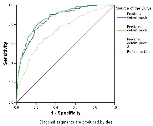
Most ROC curves are produced by models that give continuous outcomes. Because there are more decision points, there are more opportunities to measure error rates rates. That produces the kind of ROC curve in the second figure. By way of contrast, for example, logistic regression gives output in (0,1), so any real number between 0 and 1 (such as 0.2, 0.123123, or 0.996) is a legitimate prediction. But your model might only give 0.0 or 1.0.


