60
$\begingroup$

I have read enough threads on QQplots here to understand that a QQplot can be more informative than other normality tests. However, I am inexperienced with interpreting QQplots. I googled a lot; I found a lot of graphs of non-normal QQplots, but no clear rules on how to interpret them, other than what it seems to be comparison with know distributions plus "gut feeling".

I would like to know if you have (or you know of) any rule of thumb to help you decide for non-normality.

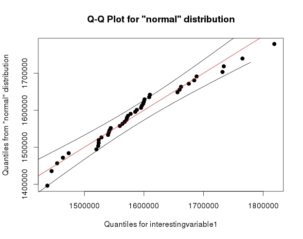
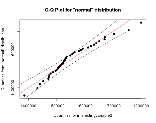
This question came up when I saw these two graphs: graph 2 graph 1

I understand that the decision of non-normality depends on the data and what I want to do with them; however, my question is: generally, when do the observed departures from the straight line constitute enough evidence to make unreasonable the approximation of normality?

For what it's worth, the Shapiro-Wilk test failed to reject the hypothesis of non-normality in both cases.

$\endgroup$
2
  • 3
    $\begingroup$ the confidence bands around the QQ line are pretty cool. Can you share the R code you used to obtain them? $\endgroup$
    – user603
    Commented Aug 8, 2014 at 10:23
  • 8
    $\begingroup$ It's just qqPlot() from {qualityTools} :) $\endgroup$ Commented Aug 8, 2014 at 17:44

5 Answers 5

64
$\begingroup$

Note that the Shapiro-Wilk is a powerful test of normality.

The best approach is really to have a good idea of how sensitive any procedure you want to use is to various kinds of non-normality (how badly non-normal does it have to be in that way for it to affect your inference more than you can accept).

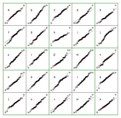
An informal approach for looking at the plots would be to generate a number of data sets that are actually normal of the same sample size as the one you have - (for example, say 24 of them). Plot your real data among a grid of such plots (5x5 in the case of 24 random sets). If it's not especially unusual looking (the worst looking one, say), it's reasonably consistent with normality.
enter image description here

To my eye, data set "Z" in the center looks roughly on a par with "o" and "v" and maybe even "h", while "d" and "f" look slightly worse. "Z" is the real data. While I don't believe for a moment that it's actually normal, it's not particularly unusual-looking when you compare it with normal data.

[Edit: I just conducted a random poll --- well, I asked my daughter, but at a fairly random time -- and her choice for the least like a straight line was "d". So 100% of those surveyed thought "d" was the most-odd one.]

More formal approach would be to do a Shapiro-Francia test (which is effectively based on the correlation in the QQ-plot), but (a) it's not even as powerful as the Shapiro Wilk test, and (b) formal testing answers a question (sometimes) that you should already know the answer to anyway (the distribution your data were drawn from isn't exactly normal), instead of the question you need answered (how badly does that matter?).


As requested, code for the above display. Nothing fancy involved:

    z = lm(dist~speed,cars)$residual
    n = length(z)
    xz = cbind(matrix(rnorm(12*n), nr=n), z, 
         matrix(rnorm(12*n), nr=n))
    colnames(xz) = c(letters[1:12],"Z",letters[13:24])
    
    opar = par()
    par(mfrow=c(5,5));
    par(mar=c(0.5,0.5,0.5,0.5))
    par(oma=c(1,1,1,1));
    
    ytpos = (apply(xz,2,min)+3*apply(xz,2,max))/4
    cn = colnames(xz)
    
    for(i in 1:25) {
      qqnorm(xz[, i], axes=FALSE, ylab= colnames(xz)[i], 
             xlab="", main="")
      qqline(xz[,i],col=2,lty=2)
      box("figure", col="darkgreen")
      text(-1.5,ytpos[i],cn[i])
    }
    
    par(opar)

Note that this was just for the purposes of illustration; I wanted a small data set that looked mildly non-normal which is why I used the residuals from a linear regression on the cars data (the model isn't quite appropriate). However, if I was actually generating such a display for a set of residuals for a regression, I'd regress all 25 data sets on the same $x$'s as in the model, and display QQ plots of their residuals, since residuals have some structure not present in normal random numbers.

(I've been making sets of plots like this since the mid-80s at least. How can you interpret plots if you are unfamiliar with how they behave when the assumptions hold --- and when they don't?)

See more:

Buja, A., Cook, D. Hofmann, H., Lawrence, M. Lee, E.-K., Swayne, D.F and Wickham, H. (2009) Statistical Inference for exploratory data analysis and model diagnostics Phil. Trans. R. Soc. A 2009 367, 4361-4383 doi: 10.1098/rsta.2009.0120


Edit: I mentioned this issue in my second paragraph but I want to emphasize the point again, in case it gets forgotten along the way. What usually matters is not whether you can tell something is not-actually-normal (whether by formal test or by looking at a plot) but rather how much it matters for what you would be using that model to do: How sensitive are the properties you care about to the amount and manner of lack of fit you might have between your model and the actual population?

The answer to the question "is the population I'm sampling actually normally distributed" is, essentially always, "no" (you don't need a test or a plot for that), but the question is rather "how much does it matter?". If the answer is "not much at all", the fact that the assumption is false is of little practical consequence. A plot can help some since it at least shows you something of the 'amount and manner' of deviation between the sample and the distributional model, so it's a starting point for considering whether it would matter. However, whether it does depends on the properties of what you are doing (consider a t-test vs a test of variance for example; the t-test can in general tolerate much more substantial deviations from the assumptions that are made in its derivation than an F-ratio test of equality variances can).
$\endgroup$
2
  • 10
    $\begingroup$ +1. I really like the idea to compare the QQ-plots of your sample with some randomly generated ones! $\endgroup$ Commented Aug 7, 2014 at 15:22
  • 3
    $\begingroup$ I just discovered I never responded to your request, greymatter0. There's not really room, to put my whole script, but I'll outline the gist of it. I played with plot options -- opar=par(); par(mfrow=c(5,5)); par(mar=c(0.5,0.5,0.5,0.5)); par(oma=c(1,1,1,1)) then in a loop over i I did qqnorm(xz[,i],axes=FALSE,ylab= colnames(xz)[i],xlab="",main=""); qqline(xz[,i],col=2,lty=2); box("figure", col="darkgreen") then at the end par(opar) to set the options back to whatever they were before. That leaves out some of the details but you should be able to manage from there. $\endgroup$
    – Glen_b
    Commented Sep 8, 2014 at 9:56
28
+100
$\begingroup$

Without contradicting any of the excellent answers here, I have one rule of thumb which is often (but not always) decisive. (A passing comment in the answer by @Dante seems pertinent too.)

It sometimes seems too obvious to state, but here you are.

I am happy to call a distribution non-normal if I think I can offer a different description that is clearly more appropriate.

So, if there is minor curvature and/or irregularity in the tails of a normal quantile-quantile plot, but approximate straightness on a gamma quantile-quantile plot, I can say "That's not well characterised as a normal; it's more like a gamma".

It's no accident that this echoes a standard argument in history and philosophy of science, not to mention general scientific practice, that a hypothesis is most clearly and effectively refuted when you have a better one to put in its place. (Cue: allusions to Karl Popper, Thomas S. Kuhn, and so forth.)

It is true that for beginners, and indeed for everyone, there is a smooth gradation between "That is normal, except for minor irregularities which we always expect" and "That is very different from normal, except for some rough similarity which we often get".

Confidence(-like) envelopes and multiple simulated samples can help mightily, and I use and recommend both, but this can be helpful too. (Incidentally, comparing with a portfolio of simulations is a repeated recent re-invention, but goes back at least as far as Shewhart in 1931.)

I'll echo my top line. Sometimes no brand-name distribution appears to fit at all, and you have to move forward as best you can.

$\endgroup$
15
$\begingroup$

Like @Glen_b said, you can compare your data with the data you're sure is normal - the data you generated yourself, and then rely on your gut feeling :)

The following is an example from OpenIntro Statistics textbook

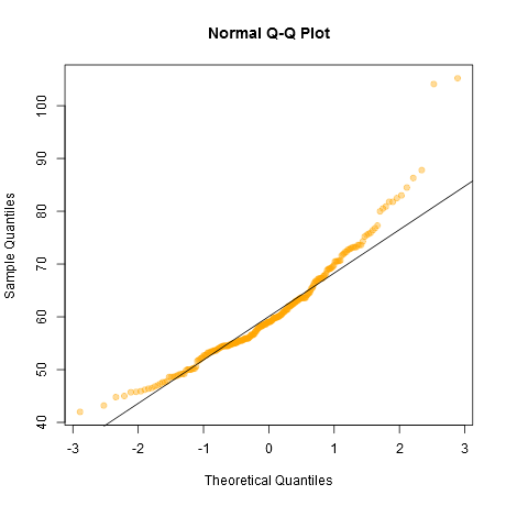
Let's have a look at this Q-Q Plot:

qq1

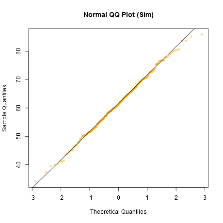
Is it normal? Let's compare it with normally distributed data:

qq2

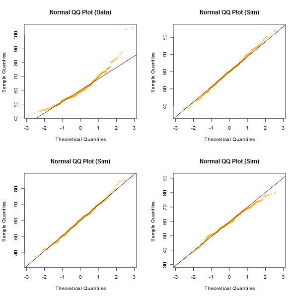
This one looks better than our data, so our data doesn't seem normal. Let's make sure by simulating it several times and plotting side-by-side

qq3

So our gut feeling tells us that the sample is not likely to be distributed normally.

Here's the R code to do this

load(url("http://www.openintro.org/stat/data/bdims.RData"))
fdims = subset(bdims, bdims$sex == 0)

qqnorm(fdims$wgt, col=adjustcolor("orange", 0.4), pch=19)
qqline(fdims$wgt)

qqnormsim = function(dat, dim=c(2,2)) {
  par(mfrow=dim)
  qqnorm(dat, col=adjustcolor("orange", 0.4), 
         pch=19, cex=0.7, main="Normal QQ Plot (Data)")
  qqline(dat)
  for (i in 1:(prod(dim) - 1)) {
    simnorm = rnorm(n=length(dat), mean=mean(dat), sd=sd(dat))
    qqnorm(simnorm, col=adjustcolor("orange", 0.4), 
           pch=19, cex=0.7,
           main="Normal QQ Plot (Sim)")
    qqline(simnorm)
  }
  par(mfrow=c(1, 1))
}
qqnormsim(fdims$wgt)
$\endgroup$
12
$\begingroup$

There are many tests of normality. One usually focuses on the null hypothesis, namely, "$H_0: F=Normal$". However, little attention is paid to the alternative hypothesis: "against what"?

Typically, tests that consider any other distribution as the alternative hypothesis have low power when compared against tests with the right alternative hypothesis (see, for instance, 1 and 2).

There is an interesting R package with the implementation of several nonparametric normality tests ('nortest', http://cran.r-project.org/web/packages/nortest/index.html). As mentioned in the papers above, the likelihood ratio test, with appropriate alternative hypothesis, is more powerful than these tests.

The idea mentioned by @Glen_b about comparing your sample against random samples from your (fitted) model is mentioned in my second reference. They are called "QQ-Envelopes" or "QQ-Fans". This implicitly requires having a model to generate the data from and, consequently, an alternative hypothesis.

$\endgroup$
7
$\begingroup$

When teaching my regression modeling strategies course, this topic always troubles my students and me. I tell them that our graphical assessments are always subjective, and I tend to worry about the graphs more early in the day than later when I'm tired. Adding formal statistical tests doesn't help enough: tests can pick up trivial non-normality for very large sample sizes and miss important non-normality for small $n$. I prefer using methods that do not assume normality that are efficient, e.g., ordinal regression for continuous $Y$.

$\endgroup$
2
  • 1
    $\begingroup$ +1. If you have five minutes @Franck, could you take a look at this thread: stats.meta.stackexchange.com/questions/4743 and weigh in there? It's about our tags for ordinal/ordered logit/probit - there is a whole bunch or related tags, and some inconsistency in how [ordinal] tag is used, so I am suggesting to tidy up these tags. It would be great to know your opinion about the best way to organize them. $\endgroup$
    – amoeba
    Commented Apr 15, 2017 at 19:09
  • 1
    $\begingroup$ Start with the post about the rms orm function with an example for a continuous $Y$. Can't find it at the moment ... $\endgroup$ Commented Apr 15, 2017 at 21:26

Your Answer

By clicking “Post Your Answer”, you agree to our terms of service and acknowledge you have read our privacy policy.

Not the answer you're looking for? Browse other questions tagged or ask your own question.